Homework 6: Flexbox & Image Scaling Practice
In this homework, you'll practice using flexbox to create layouts and practice scaling images to reduce their file size.
The course material needed to complete this assignment was covered in classes 8 and 10.
Learning Objectives
- Practice layout using Flexbox.
- Identify and dissect layouts on existing websites.
- Scale image files to reduce their file size.
Help & Support Resources
We want you to get the help and support you need. Use the course's support resources for help with this assignment.
Git Repository & Codespace
-
Create your assignment repository.
Visit https://landrace.infosci.cornell.edu/courses/info1300-2026fa/repos/hw6 in your browser to create your assignment repository.
-
Open your assignment repository in GitHub.
After creating your repository, visit https://landrace.infosci.cornell.edu/courses/info1300-2026fa/repos/hw6 in your browser and follow the link to open the repository on github.com
-
Open your assignment repository as a codespace.
Submission Requirements
Professionalism means meeting the client's requirements. Not doing less and not doing more.
Your submission should meet the requirements specified for this assignment and no more (or less). If you do more than the requirements, you will receive a 0 for the assignment. If you do less than the requirements, you will receive a 0 for the assignment.
Your assignment should meet the following requirements for credit:
-
Submit your own original work (design and code) for this assignment.
No credit is provided for submitting design and/or code that is taken from the course-provided examples.
-
Your code should be original. However, the structure of the code will mirror the class examples.
The structure of your code will align with the class examples. This is to be expected. We are learning web programming and there's only so many ways to structure code to solve its problems.
-
You are required to use the methods and techniques covered in class.
No credit is provided for using methods that are not covered in this class.
You may not use any methods that have not been covered in class prior to the release of this assignment.
-
Your assignment's website should be visible in the browser and functional upon launching the development web server using Go Live.
If your assignment's website does not launch using this method or is not visible in the browser after launching the development web server, we are unable to provide any credit.
-
All files should be in the location specified in this document for credit.
Professionalism is important. Incorrectly placed files will not be graded; no partial credit is provided either.
-
Follow the submission instructions below.
Submit all materials to your GitHub repository's main branch for this assignment. When you're finished stage, commit, and push your submission to GitHub. Then fill-out the submission form to complete your submission.
Failure to complete the submission form will result in 0 credit; no submission form = no submission. No leniency. No exceptions.
Instructions
Part I: More Flexbox Practice
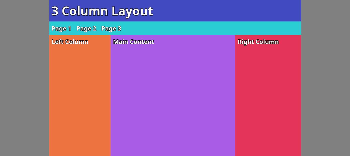
Credit: 5 points. Completion credit awarded for a rendered webpage that closely resembles the provided layout implemented using only flexbox.
Using what you've learned about flexbox, style flexbox.html to match the following layout using only flexbox.
- Review your notes from the flexbox lecture.
- Plan before you code.
- You will need to change both the HTML and the CSS.
- Use
flex-growso that the main content area fills the most space when the window is resized. - Your result need not be exact, but it should be close.
Part II: Images in Markdown
Credit: 5 points. An image of McGraw Tower should be visible in the rendered Markdown file via Codespaces' Markdown: Open Preview feature. Markdown syntax should be used to display the image.
For this assignment, you will need to share designs that you have drawn/annotated. You need to display these in Markdown so that we can grade them.
What is Markdown?
Markdown is a lightweight markup language that you can use to add formatting elements to plaintext text documents. It's become the predominant way to write documentation for software projects, and is used extensively on platforms like GitHub. It's something you should know before you head out into industry.
Markdown is simply a plain text file, like HTML, but instead of an .html extension, it uses a .md extension.
Did you know that Markdown is used to format the posts in GitHub discussions and in Gradescope regrade requests?
Markdown Syntax Basics
When writing Markdown, there are a few basic syntax rules to know:
- Headings are created by placing one or more
#characters at the beginning of a line. The number of#characters determines the level of the heading. - Paragraphs are created by simply writing text on a new line. To create a new paragraph, leave a blank line between lines of text.
- Lists can be created using
-for unordered lists and numbers followed by a period for ordered lists. - Links are created using the syntax
[link text](URL). - Images are embedded using the syntax
. - Blockquotes are created by placing a
>character at the beginning of a line. - Inline code is created by wrapping text in backticks (
`), while code blocks are created by indenting lines with four spaces or using triple backticks (```). - Bold text is created by wrapping text in double asterisks (
**bold**) or double underscores (__bold__). - Italic text is created by wrapping text in single underscores (
_italic_).
Refer to the official Markdown Reference Documentation when necessary.
Rendering Markdown
Much like how HTML is rendered in the browser, Markdown files are also rendered. Your Markdown files will be rendered to grade them.
-
Open your Markdown file to edit it in Codespaces.
-
In Codespaces open the View menu and select Command Palette.... In the Command Palette, type
Markdown: Open Previewand select it. This will open a preview pane that shows how your Markdown file will look when rendered.
Everything, including images, must be visible in Markdown: Open Preview for us to grade it. If it's not visible, then we can't grade it. We also can't provide partial credit either.
Practice Images in Markdown
You will be expected to create valid Markdown files for the project in this course. Use this assignment to become familiar with Markdown syntax.
-
Open the
README.mdfile in the root of your repository. -
Add the
images/mcgraw-tower.jpgto Part II in theREADME.mdfile.Refer to the section above for the syntax to embed an image in Markdown.
Only valid web image formats are permitted. You should only use
.jpgor.pngimages..heicimages are not permitted.Follow the guidelines you learned in class for setting alt text for images.
noteYou are required to use proper Markdown syntax for credit. HTML syntax will receive 0 credit.
-
Now render your Markdown file to ensure that the image is visible.
Refer to the section above for rendering Markdown.
If an image of McGraw Tower is not visible in Markdown: Open Preview, revise your Markdown file until it is visible.
ImportantIf your rendered Markdown does not display your work, you will not receive credit for it because learning to properly use Markdown is a learning objective of this course. No exceptions and no partial credit.
Part III: Flexbox Inspiration and Planning
Credit: 10 points. Three complete and correct flexbox planning sketches must be present in the design-plan folder and rendered in the README.md file.
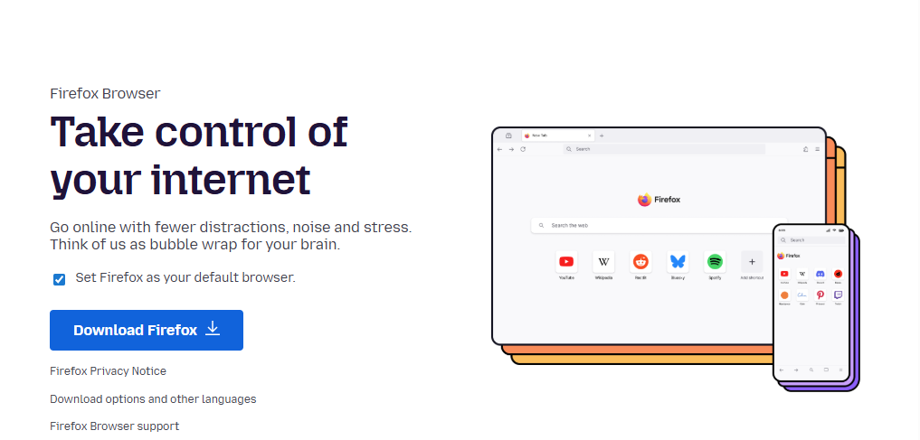
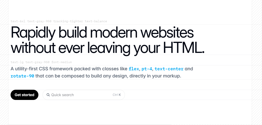
Before you design a website, you should look at other well-designed websites for inspiration and to reinforce the design principles that you have learned. Below are three excellent examples of websites that properly employ the design principles we've covered.

-
Analyze the layout of each of the example websites above.
Study where content is stacked on top of each other and where it is side-by-side.
-
Create one flexbox planning sketch for each example website.
I recommend downloading the screenshots above and drawing on them digitally. But you can also draw the planning sketches on a blank background if you prefer.
Each planning sketch should identify the flexbox container drawn as a box and the container's HTML element. Each planning sketch should also identify the child items each drawn as a box and labeled as an HTML element.
Hint: There are four flexboxes total for all three websites.
-
Upload each planning sketch to the
design-planfolder as a PNG or JPG file. (No.heicfiles.)Then render each planning sketch in the
README.mdfile.
Part IV: Responsive Design
Credit: 5 points. A design sketch for narrow and wide screens is provided. The design adheres to the constraints provided.
We learned that centering everything on a webpage is poor design. Not only does the design look amateurish, but it also harms the usability of the webpage (the content doesn't guide the user's eye through the content.)
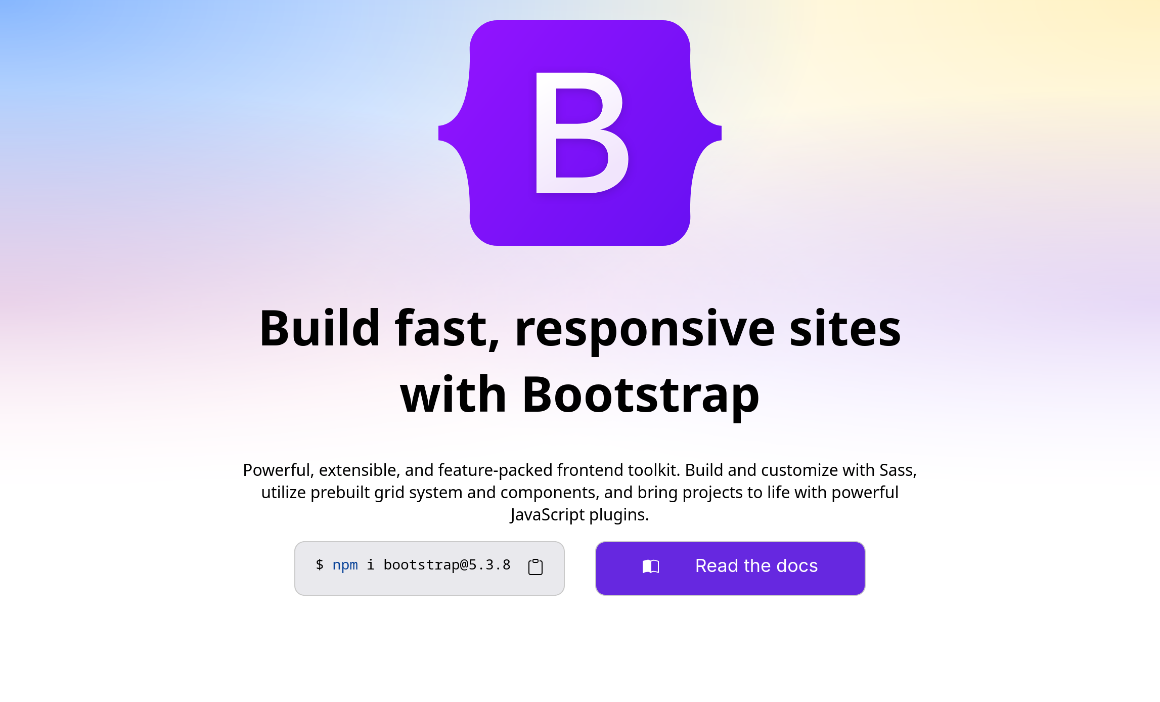
In this part, you will fix the design. Before changing code, you should sketch out a new design. However, you have the following constraints as you sketch your design:
- You must use the same content that already exists. No more, no less.
- Your design must contain at least 2 elements that are side-by-side. (You will later plan and implement this as a flexbox.)
- When you plan and implement your design (in a later part), at least one flexbox must contain another flexbox inside it.
- Your design must employ the design principles we have learned in this class.
Study the example websites in the previous part for inspiration.
No credit is provided for designs that do not follow these constraints. No credit is provided for submitting the exact same design as the current website.
-
Create a design sketch for narrow screens.
Upload an image of your design sketch to the
design-planfolder. (No.heicfiles.)Then render your design sketch in
README.md. -
Create a design sketch for wide screens.
Upload an image of your design sketch to the
design-planfolder. (No.heicfiles.)Then render your design sketch in
README.md.
Part V: Revised Design Implementation
Credit: 15 points. A reasonable flexbox planning sketch is provided. The HTML and CSS code is modified to implement the new design for wide screens. The implementation adheres to the constraints provided and is reasonably consistent with the design sketch.
In this part, you will implement your new design for the Bootstrap website for only wide screens. (Ignore the narrow screen design you created in the previous part.)
Your implementation must adhere to the constraints provided in the previous part and must align with your design sketch in the previous part. If your implementation is not reasonably consistent with your design sketch, you will receive no credit for this part. (In industry, you must design and plan first, and then code.)
-
Create a flexbox planning sketch for your new design.
Include the flexbox planning sketch in
README.md. -
Modify the HTML and CSS to implement your new design for wide screens only.
You may change
bootstrap.htmlandstyles/bootstrap.css.
Part VI: Image Resizing vs. Scaling
Credit: 5 points. The image of McGraw Tower and the Bootstrap logo are always usable regardless of the browser's width. The image of McGraw Tower is scaled to be no larger than necessary.
When using images on our websites we have two things that we need to keep in mind: 1) we need the image to be a usable size on the page, and 2) we need to be respectful of our clients' bandwidth.
-
Open
index.htmland look at the image of McGraw tower and the Bootstrap logo present.These images have not been resized or scaled. We want to avoid setting either image to a fixed pixel width, as then it will not efficiently utilize all the available horizontal space on a variety of screen sizes.
Set the
widthproperty to100%for<img>elements. The images should now not overspill the screen. -
Change the width of your browser to be very narrow.
When you think that the image of McGraw Tower is too small to be usable anymore, widen your browser until it becomes usable again. This is your minimum width. Use the Inspector in your browser to identify the current width of the image, and write this value down somewhere.
-
Change the width of your browser to be very wide.
When you think that the image of McGraw Tower is too wide to be usable anymore, narrow your browser until it becomes usable again. This is your maximum width. Use the Inspector in your browser to identify the current width of the image, and write this value down somewhere.
-
Set the
max-widthandmin-widthproperties for the McGraw Tower image only, so that it will stay within these bounds.Do not set these properties for the Bootstrap logo.
-
Now, how can we be more respectful to our clients?
This file is 2.9MB in size, because the actual image itself is 2250x1500px. However, we only need to be as wide as you determined in the previous step. Therefore, our clients do not need to download such a large image if they will never see it so large.
Download
mcgraw-tower.jpgto your computer and use whatever program you would like, and scale the image to be only twice as wide as the clients will see it in their browser. Uploadmcgraw-tower_small.jpgto your images folder and replacemcgraw-tower.jpgwith it inindex.html. When you're finished scaling your image, check the file size of the newly scaled image and double check that the image file is smaller than the original 2.9MB.Remember, scaling an image changes the actual image file itself to be smaller.
In class the professor demonstrated scaling a raster image using the GNU Image Manipulation Program (GIMP). You can use GIMP or any other program you like. Preview on Mac or Paint are alternative options. These apps will often call scaling "resizing" which is misleading because what they are really doing is scaling the image file itself to be smaller.
-
Repeat these steps with
bootstrap_logo.svg.noteVector images cannot be scaled.
Part VII: Flexbox Froggy (Optional)
This part is optional.
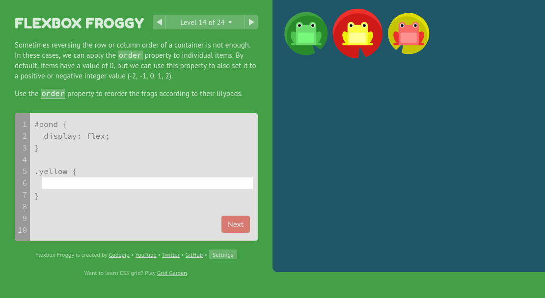
Flexbox is tricky. Play a few rounds of Flexbox Froggy to practice your Flexbox skills!
Submission
Stage, commit and push all changed files in your Git repository to the GitHub server. (All commits should reside on the main branch.)
Complete the submission form for hw6 to submit the assignment.
Note: The submission form asks you to check your submission. Checking your work will ensure you receive credit for this assignment. We ask you to check your submission because this is where some students lose points. It's easy to forget something and checking your work prevents the heartache of getting a 0 because your submission wasn't submitted in a way that we can access and grade it.
Contributors
Copyright © 2017 - 2026:
- Kyle Harms
- Grant Storey
- Sharon Jeong
- Axel Bax