(Big) Homework 7: Responsive Methods + Media Query Practice
In this homework you'll practice using responsive methods and in particular, media queries.
The course material needed to complete this assignment was covered in classes 8, 10, 11, and 12.
Learning Objectives
- Troubleshoot CSS and CSS media queries.
- Implement media queries in CSS to dynamically change the layout of a webpage.
- Inspect a website using the browser's Developer Tools.
- Practice coding a responsive design for wider screens using media queries.
Help & Support Resources
We want you to get the help and support you need. Use the course's support resources for help with this assignment.
Git Repository & Codespace
-
Create your assignment repository.
Visit https://landrace.infosci.cornell.edu/courses/info1300-2026fa/repos/hw7 in your browser to create your assignment repository.
-
Open your assignment repository in GitHub.
After creating your repository, visit https://landrace.infosci.cornell.edu/courses/info1300-2026fa/repos/hw7 in your browser and follow the link to open the repository on github.com
-
Open your assignment repository as a codespace.
Submission Requirements
Professionalism means meeting the client's requirements. Not doing less and not doing more.
Your submission should meet the requirements specified for this assignment and no more (or less). If you do more than the requirements, you will receive a 0 for the assignment. If you do less than the requirements, you will receive a 0 for the assignment.
Your assignment should meet the following requirements for credit:
-
Submit your own original work (design and code) for this assignment.
No credit is provided for submitting design and/or code that is taken from the course-provided examples.
-
Your code should be original. However, the structure of the code will mirror the class examples.
The structure of your code will align with the class examples. This is to be expected. We are learning web programming and there's only so many ways to structure code to solve its problems.
-
You are required to use the methods and techniques covered in class.
No credit is provided for using methods that are not covered in this class.
You may not use any methods that have not been covered in class prior to the release of this assignment.
-
Your assignment's website should be visible in the browser and functional upon launching the development web server using Go Live.
If your assignment's website does not launch using this method or is not visible in the browser after launching the development web server, we are unable to provide any credit.
-
All files should be in the location specified in this document for credit.
Professionalism is important. Incorrectly placed files will not be graded; no partial credit is provided either.
-
Follow the submission instructions below.
Submit all materials to your GitHub repository's main branch for this assignment. When you're finished stage, commit, and push your submission to GitHub. Then fill-out the submission form to complete your submission.
Failure to complete the submission form will result in 0 credit; no submission form = no submission. No leniency. No exceptions.
Instructions
Part I: Troubleshooting CSS Code
Credit: 5 points. Credit provided for a working implementation that meets the requirements below.
One of the most common problems with media queries is invalid CSS. In this part, you'll practice troubleshooting CSS.
Troubleshoot the CSS for part1.html. The CSS is located in styles/part1.css.
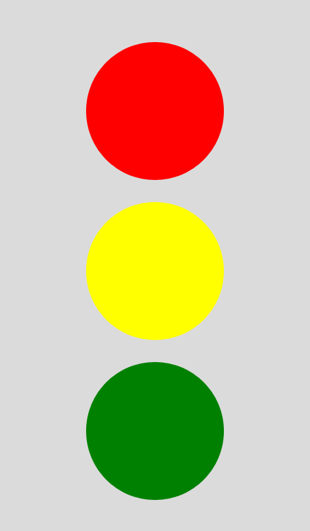
Only when the screen width is less than 800 pixels, the 3 elements should be stacked on top of each other with the red element on top and the green element on the bottom. It should look something like this:
You may not change the HTML, except for the <head> element. You may only change the CSS after the TODO comment in styles/part1.css.
Troubleshooting Tips:
-
Review your class notes.
Check that your CSS implementation matches what we learned in class. If your code is different from what we learned in class, then it's possible that your CSS is incorrect.
-
Check that your HTML includes the following meta element in your
<head>element.<meta name="viewport" content="width=device-width, initial-scale=1">This meta element is necessary for media queries to work correctly on mobile devices.
-
If your media query (or CSS) isn't working, validate your CSS.
If your CSS isn't valid, then the browser will often ignore the invalid CSS. This is especially true for media queries. Validate your CSS and fix any validation errors. You can safely ignore validation warnings.
-
Check that your media query is turning on and off by setting the background color of the
<html>or<body>element to be something very noticeable, likelimegreen ormagenta.@media (min-width: 1000px) {html {background-color: lime;}} -
Check your browser's dev tools inspector to see if the CSS is being applied.
The inspector is especially helpful for troubleshooting CSS issues. If you don't see your CSS applied in the inspector, then that tells you something is incorrect about your CSS.
Part II: Media Query Practice
Credit: 5 points. Credit provided for a working implementation that meets the requirements below.
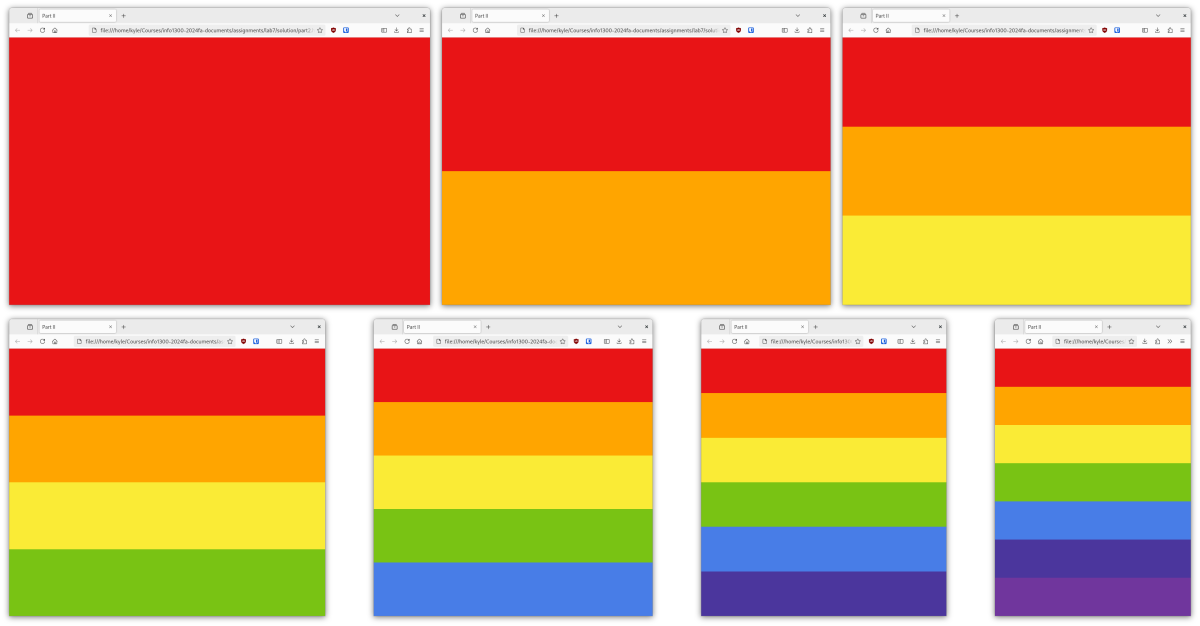
In this part, you'll implement a media query breakpoint for every color of the rainbow. When the browser width is wide, the page will be entirely red, however as you gradually shrink the browser window's width, the colors of the rainbow will appear starting with red, then orange, yellow, green, blue, indigo, and lastly violet.
When you've finished this part, your website should look something like this:
-
Red: We've already implemented the red responsive breakpoint for you.
There's nothing for you to do.
-
Orange: Add a media query to grow the orange element when the screen width is less than 1200 pixels wide.
You may not change the HTML. You may only change the CSS after the TODO comment in styles/part2.css.
This rainbow is implemented with flexbox. Change the
flex-growproperty of the orange element to1when the screen width is less than 1200 pixels wide. -
Yellow, Green, Blue, Indigo, Violet: Add a media query breakpoint for the remaining colors of the rainbow.
You may not change the HTML. You may only change the CSS after the TODO comment in styles/part2.css.
Color Media Query Breakpoint Yellow < 1100 pixels Green < 1000 pixels Blue < 900 pixels Indigo < 800 pixels Violet < 700 pixels -
Test your media queries by resizing the browser width from wide to narrow and narrow to wide.
The colors should progressively appear as the width narrows and disappear as the width widens.
Part III: Media Query and Responsive Design Practice
Credit: 10 points. Credit provided for creating a fully responsive website that meets the requirements below.
Next, you'll practice implementing the media queries to implement the responsive design of a bakery website.
Remember to use the reference documentation if you need it! The "A Complete Guide to Flexbox" is particularly useful for this exercise.
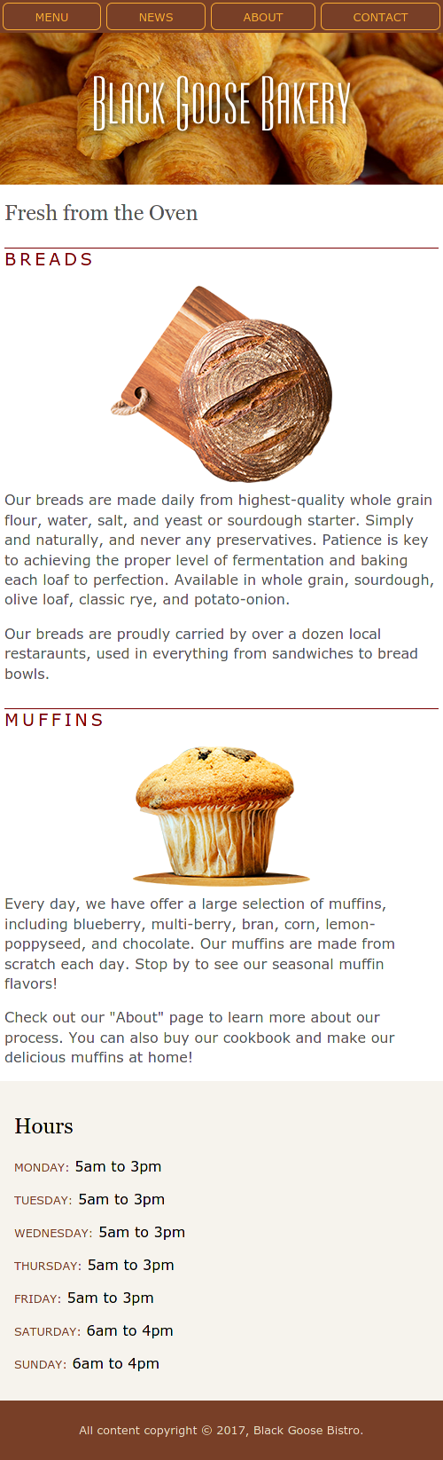
Open part3.html in the browser. You'll see a web page for the Black Goose Bakery. Resize the browser's width. Does the design work well for narrow or wider screens? You should notice that the current design works well for narrow screens, but not so much for wider screens. Let's fix that!
Here's the current design for narrow screens:
Here's a possible design for wider screens:
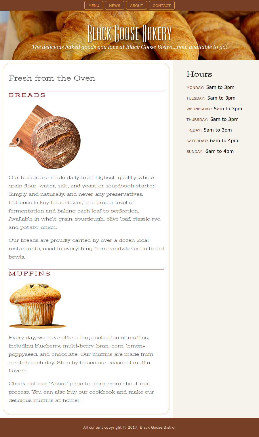
Your responsive design does not need to be pixel perfect to the screenshot above. Somewhat close is good enough! You will receive credit if the responsive design is somewhat close (You've got the big ideas like the sidebar, main border, non-stretched centered navigation links, and non-centered images working).
Make the following changes to the website to support wider screens:
-
Change only the CSS. You may not change the HTML for this part.
Changing the HTML is not necessary for this part.
-
Add a media query for wider screens after the narrow screen CSS code.
All the provided CSS code is functional for narrow screens. None of it needs to be changed
Resize the browser window from narrow to wide, when the content appears to be no longer usable at narrow widths, inspect the
htmlelement in the browser's dev tools and use its width for your media query breakpoint. (This is the same technique that was demo'd in class.) -
Add a sidebar for the hours.
HintThe
page-middleclass holds<main>and<aside>elements. It may be useful as a flexbox container. -
Add a border to the main content.
Hintborder: double 4px #EADDC4;border-radius: 25px; -
Remove image centering to keep the bread images aligned with header and text.
HintSet the left and right margins.
-
Reduce the width of the navigation elements.
Hint ICheckout the documentation for
flex: none. It might be helpful for the<li>elements in the nav bar.Noteflex: noneis equivalent to:flex-grow: 0;flex-shrink: 0;flex-basis: auto;Hint IITry
justify-contentfor the<ul>flexbox in the nav bar.
This exercise is adapted from materials in Learning Web Design (5th Edition) by Jennifer Robins.
Part IV: A Fully Responsive Website
Credit: 60 points. Correctness. Partial credit provided. Full credit provided for a polished and professional fully responsive website that meets the requirements below.
You will implement a fully responsive single-page website for the Apple Harvest Festival.
The HTML and CSS files have already been created for you (part4.html and part4.css).
Your website must meet the following requirements:
- Use the Apple Harvest content provided. You may edit the HTML as needed, but your design should not add or remove content.
- Use the design sketches provided.
- Implement the design for both narrow and wide screens as mobile-first.
- Your website must be fully responsive.
- The content must always be usable on narrow and wide screens.
- Horizontal scrolling should not be required; no credit if a horizontal scrollbar is present in the rendered website.
- Responsive breakpoints should ensure that the content is always usable.
- You must utilize flexboxes where appropriate.
- Provide your own social media icons. Cite using the course citation policy.
- Your final website should be polished and professional.
- Employ the best practices covered in class for the website. This includes well-structured content and valid HTML/CSS.
- Implement your website using only the methods and techniques covered in class.
Copying the design, HTML, or CSS from the class examples or homeworks will result in 0 credit. (Copying and then modifying will also result in 0 credit.)
-
(10 points) Implement the narrow screen design.
Using all the responsive methods we've learned, implement the following narrow screen design in
part4.htmlandpart4.css: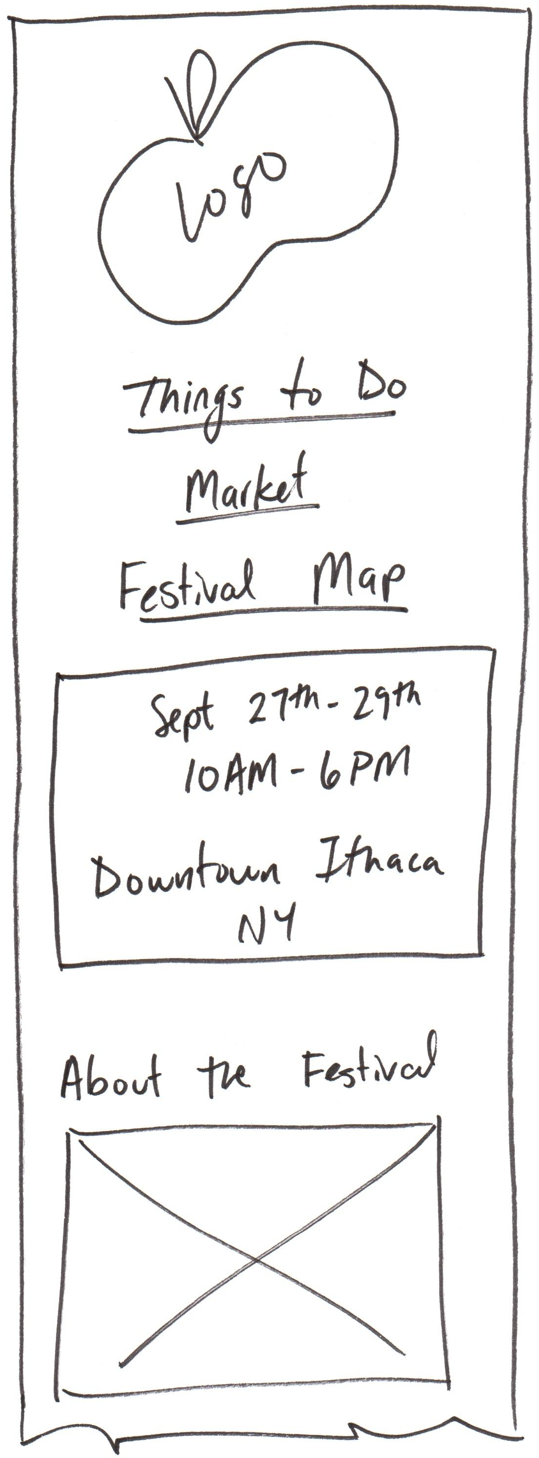
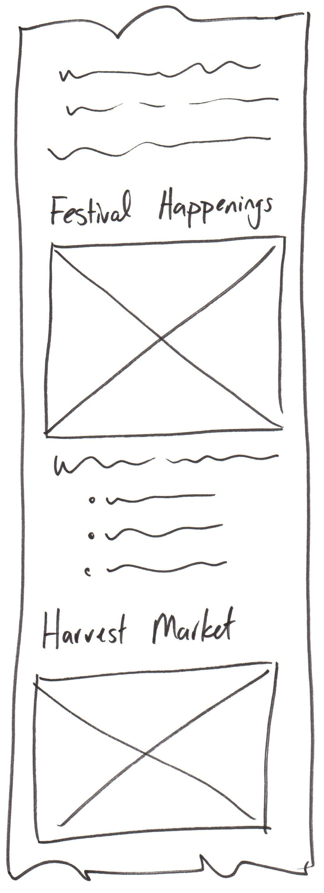
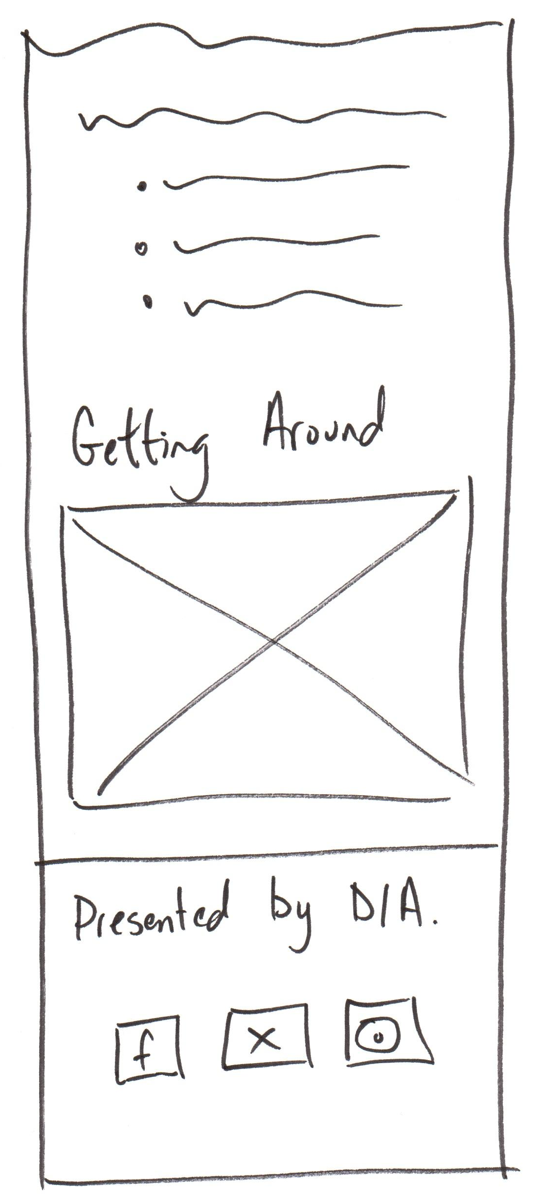
You may modify (including reorder) the HTML and CSS as needed to implement the design.
Hint:
display: nonecan be used to hide elements.Note: You may display a comma between the date and time even though it's not included in the reference design for narrow screens.
-
(10 points) Implement the wide screen design.
Using all the responsive methods we've learned, implement the following wide screen design in
part4.htmlandpart4.css: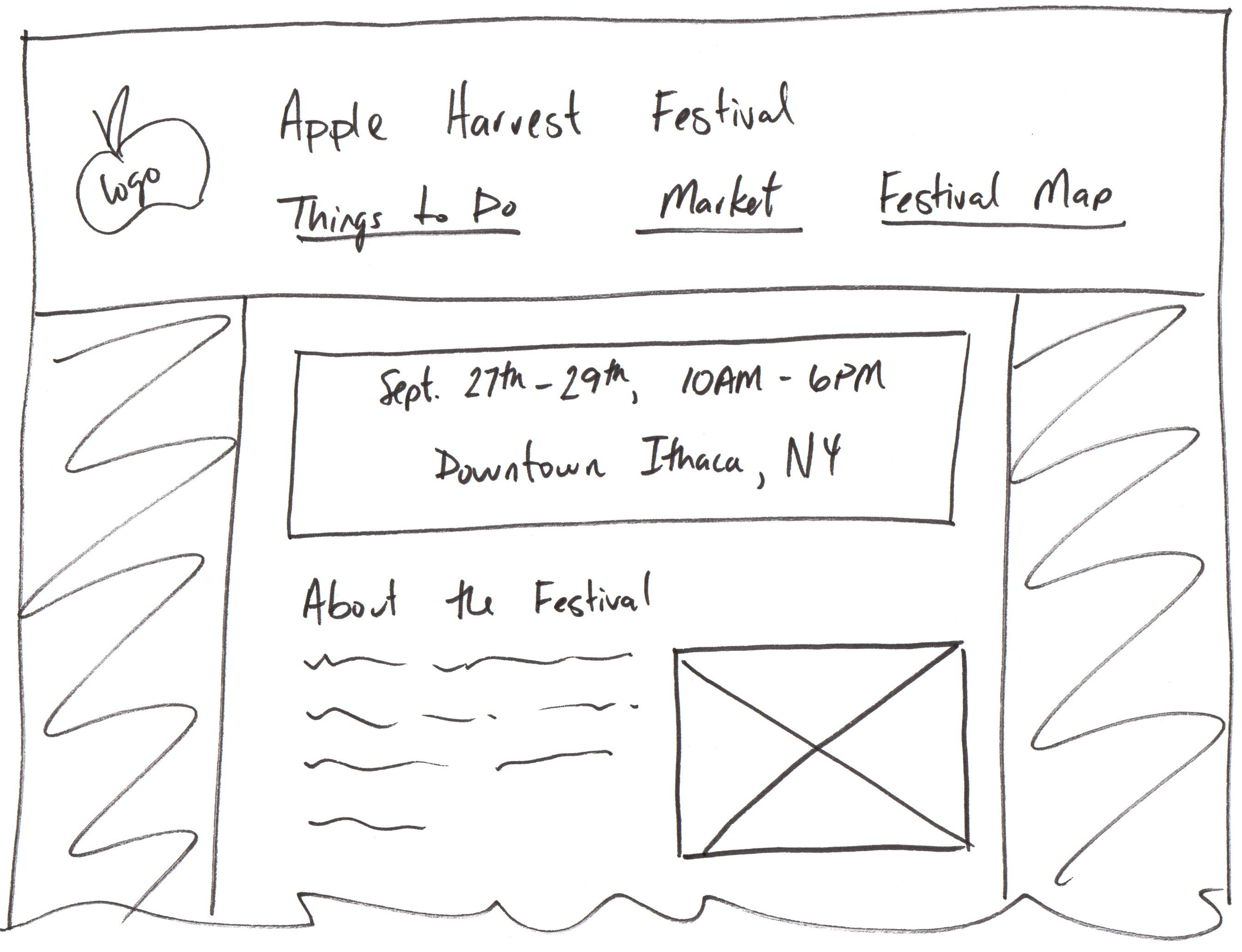
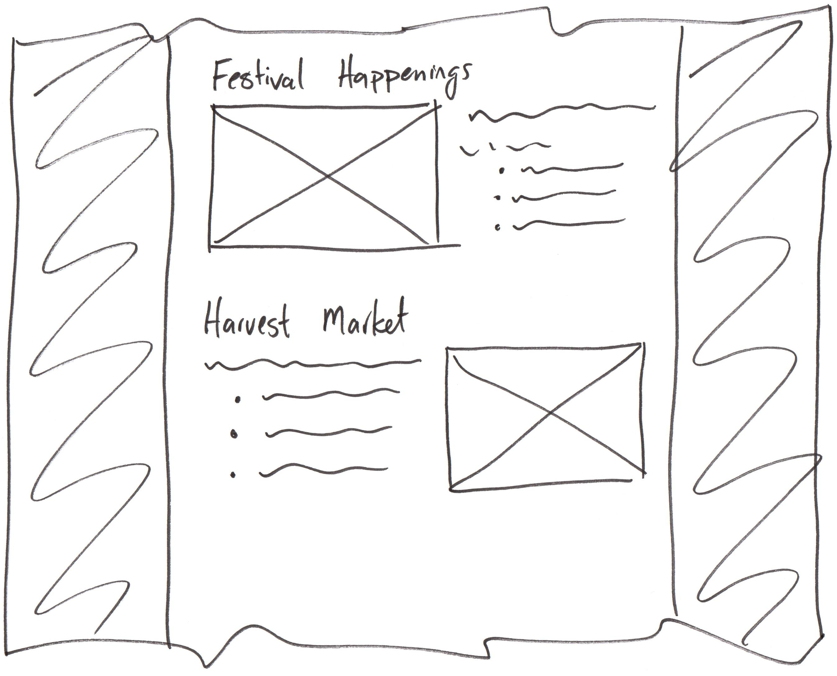
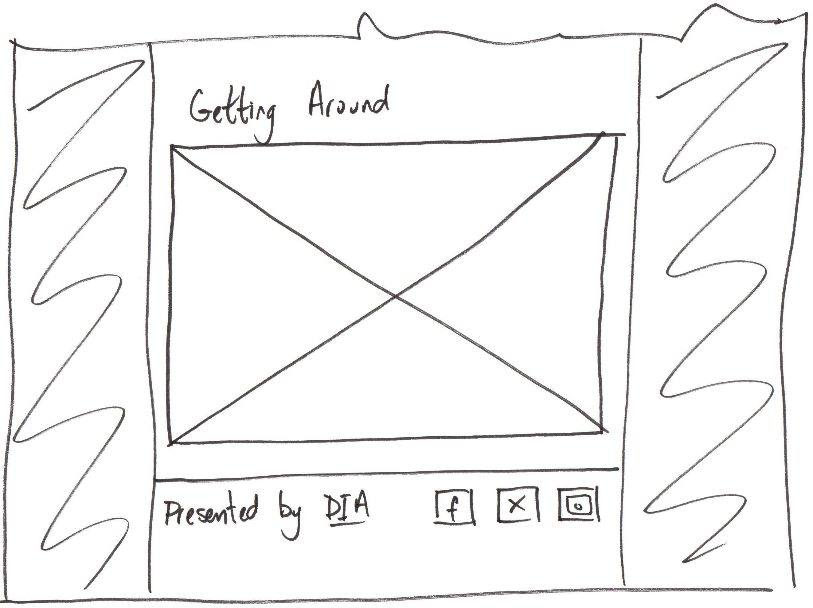
You may modify (including reorder) the HTML and CSS as needed to implement the design.
Hint:
display: initialordisplay: blockcan be used to show elements.Updated Design: For each of the page sections, you may place the heading above both the text and image. (Updated and original designs will receive full credit; you may implement either design for full credit. Original design can be found here: Original Wide 1, Original Wide 2, Original Wide 3)
-
(10 points) Test your design for responsiveness.
Resize the browser window from narrow to wide and wide to narrow. The design should adapt to the screen width.
Implement additional responsive breakpoints as necessary to always keep the content usable.
Check that the content is always usable at any width. Verify that a horizontal scrollbar is never present.
-
(5 points) Implement single-page navigation.
Using the method taught in class, each link in the navigation should scroll to the corresponding section of the page.
-
(5 points) Implement
srcsetfor the doughnuts<picture>element.Use the vertical doughnuts image for narrow screens and the horizontal doughnuts image for wide screens.
Do not implement this in your CSS file. This should be implemented as a
srcsetfor the<picture>element in the HTML file. -
(5 points) Polish your website.
Implement a polished and professional website that employs visual design principles.
-
(5 points) Scale all images to be no wider than their maximum size in your design.
With your final design complete, ensure that all images are scaled to be no wider than their maximum size in your design.
-
(10 points) Evaluate your website for best practices.
Evaluate your website for best practices. Ensure that your HTML and CSS are well-structured and valid. Validate your HTML and CSS using the W3C validation tools.
Submission
Stage, commit and push all changed files in your Git repository to the GitHub server. (All commits should reside on the main branch.)
Complete the submission form for hw7 to submit the assignment.
Note: The submission form asks you to check your submission. Checking your work will ensure you receive credit for this assignment. We ask you to check your submission because this is where some students lose points. It's easy to forget something and checking your work prevents the heartache of getting a 0 because your submission wasn't submitted in a way that we can access and grade it.
Contributors
The following individuals made contributions to this assignment:
- Kyle Harms
- Grant Storey
- Axel Bax