Project, Final Milestone: A Responsive Website with Static Interactivity
Credit: ~80 points. Graded for correctness against the requirements provided in the document.
For this project, you will design and code an original, ambitious, usable, and accessible responsive static 3–5 page interactive website from scratch designed for a cohesive audience with substantial content (primarily text).
This is an opportunity for you to demonstrate your front-end web design and development knowledge and showcase your creativity in a portfolio-worthy website.
Your website may be about anything. It's your choice. It might be a personal/professional website; it might be a site that emphasizes some aspect of your interests or activities (e.g. a hobby or an interest of yours, etc.)
Throughout this project, you will employ the user-centered design process to design and code your website for a cohesive audience with clear goals. You are required to design and plan your site first, and then code it.
As a general rule, use the methods and strategies we've learned and practiced in class. In web programming, there are many ways to solve a coding problem. For credit, you should only use the approaches presented in this class.
Learning Objectives
- Design and implement a professional quality responsive static website with client-side interactivity using HTML, CSS, and JavaScript.
- Apply visual design principles to communicate effectively with the users.
- Design usable client-side interactivity to assist a website's audience in accomplishing their goals.
- Design accessible interactivity that effectively uses affordances, visibility, feedback, and familiarity.
- Use HTML, CSS, and JavaScript together to facilitate client-side interactivity.
- Implement JavaScript interactivity using code snippets to demonstrate effective integration among the 3 browser layers: structural, presentation, and behavioral.
- Evaluate your own work against a set of requirements.
Help & Support Resources
We want you to get the help and support you need. Use the course's support resources for help with this assignment.
Git Repository & Codespace
-
Create your assignment repository.
Visit https://landrace.infosci.cornell.edu/courses/info1300-2026fa/repos/project in your browser to create your assignment repository.
-
Open your assignment repository in GitHub.
After creating your repository, visit https://landrace.infosci.cornell.edu/courses/info1300-2026fa/repos/project in your browser and follow the link to open the repository on github.com
-
Open your assignment repository as a codespace.
Submission Requirements
Professionalism means meeting the client's requirements. Not doing less and not doing more.
Your submission should meet the requirements specified for this assignment and no more (or less). If you do more than the requirements, you will receive a 0 for the assignment. If you do less than the requirements, you won't receive full credit.
Your assignment should meet the following requirements for credit:
-
Submit your own original work (design and code) for this assignment.
No credit is provided for submitting design and/or code that is taken from the course-provided examples or other assignments.
-
Your code should be original. However, the structure of the code will mirror the class examples.
The structure of your code will align with the class examples. This is to be expected. We are learning web programming and there's only so many ways to structure code to solve its problems.
-
You are required to use the methods and techniques covered in class.
No credit is provided for using methods that are not covered in this class.
You may not use any methods that have not been covered in class prior to the release of this assignment.
-
Your assignment's website should be visible in the browser and functional upon launching the development web server using Go Live.
If your assignment's website does not launch using this method or is not visible in the browser after launching the development web server, we are unable to provide any credit.
-
All files should be in the location specified in this document for credit.
Professionalism is important. Incorrectly placed files will not be graded; no partial credit is provided either.
-
All textual content and images should be visible in the design journal when using "Markdown: Open Preview" for credit.
If it's not visible in the Markdown preview, then we can't grade it. We also can't provide partial credit either.
All images in Markdown must be web-safe formats:
.jpg,.jpeg,.png, or.gif. No credit is provided for images in other formats. -
Follow the submission instructions below.
Submit all materials to your GitHub repository's main branch for this assignment. When you're finished, stage, commit, and push your submission to GitHub. Then fill-out the submission form to complete your submission.
Failure to complete the submission form will result in 0 credit; no submission form = no submission. No leniency. No exceptions.
Milestone Requirements
Your milestone and final submission should adhere to these requirements.
Scope Requirements
-
Your website may be about anything of your choosing.
It's your choice. It might be a personal/professional website; a portfolio website; it might be a site that emphasizes some aspect of your interests or activities (i.e. a hobby or an interest of yours, etc.)
-
Your website should be original, ambitious, usable, and accessible.
The website you design and code should be 3–5 pages, each with substantial content.
Your website should demonstrate your creativity and mastery of front-end web design and development. A website that is "minimalist" or "plays it safe" will not receive full credit.
-
Your website should be impressive.
This project should demonstrate your mastery of the course learning objectives and that you can apply them in a professional context.
You need to go beyond the basic examples provided in lecture and homeworks.
-
Design and code your website from scratch.
You may not use any pre-existing website templates, web builders, themes, or frameworks (e.g. Wix, TailwindCSS, etc.)
You may not copy an existing website and modify it; you may not redesign an existing website.
You must design and code your website from the ground up.
-
Your website should have substantial content.
Each page should be content-rich with substantial content. Nothing should be minimal.
The majority of the content should be written text. However, you are also required to include images as decoration and content.
Your website's content should not be primarily images. (You are not designing an image gallery; you are designing a content-rich website.)
-
Your website should be static with client-side interactivity.
The website will be coded using HTML and CSS, with interactivity implemented using only the provided JavaScript snippets.
-
The website should be in English.
We cannot grade websites in other languages; no credit is provided for non-English websites.
Design Process Requirements
-
Plan before you code.
Plan your website in the design journal before coding.
The design journal is used to document your entire design process from start to finish.
-
Thoroughly document your design process and provide a rationale for your design choices.
We want to see the ideas that you considered, but didn't make the final cut. We want to see the evolution of your design and your reasons for changing it.
We want to understand the design decisions you made.
-
All design/planning content, including images, should be legible and visible in your design journal when using "Markdown: Open Preview".
If we are unable to understand or read your handwriting, we are unable to provide any credit.
We are unable to provide credit for design content, including images, not visible in the Markdown preview.
Design Requirements
-
Your static client-side interactivity (hamburger drop-down navigation menu and a modal) should be well-designed and accessible. It should employ visual design principles and interaction design principles.
Your design should make effective use of accessible visual and interaction design principles: alignment, hierarchy, contrast, proximity, affordances, visibility, feedback, familiarity, etc.
Your design should include both a hamburger navigation drop-down menu and at least one modal.
Your hamburger button and menu should exist on every page of the website for narrow widths. The hamburger button and menu should not be present for wide widths.
You need to design at least one modal for the website. The modal should be used to enhance your audience's experience and help them accomplish their goals. (A modal is not a cookie banner; no credit is provided for any type of banner.)
-
The interactivity should be ambitious, significant, and reasonably complex.
This project should demonstrate your mastery of the course learning objectives. Your interactivity should be impressive. You need to go beyond the basic examples provided in lecture and homeworks. Designing a hamburger menu and one modal meets this requirement. Copying the course provided examples and modifying them does not.
You may design additional interactivity if you wish, however no credit is provided.
-
The interactivity should be styled to match the existing design of your website.
The interactivity should look like it belongs on the site. We are asking you to add a feature to an existing site and fully integrate it into the design; the interactivity should not appear "tacked on" and simply added to the site because this project made you do it.
The design of all buttons should match the aesthetic of the design of your website. No credit is provided for using the default browser styles for buttons.
-
All interactivity should enhance your audience's experience and help them accomplish their goals.
Interactivity should serve a purpose in relation to the audience's goals. Avoid adding interactivity for the sake of adding interactivity.
tipAsk yourself "if I were a user of this site, would I find this interactivity frustrating/annoying or helpful?" If your answer is helpful, you're probably on the right track!
-
Your interactivity should be familiar to your site's audience by employing common interactivity design patterns.
Your hamburger drop-down navigation menu should be a small button that appears at the top of the screen for narrow widths only. When clicked/tapped the full navigation menu should appear. When clicked again the navigation menu should be hidden away. (i.e. toggle) The hamburger menu should appear on every page of the website. A traditional navigation bar should be used for wide widths; no hamburger menu (i.e. hamburger button) should be visible for wide widths.
Your modal should be a pop-up element that appears over the top of the web page when an element is clicked. (This is often used in a grid of thumbnails to show a larger version of an image when the user clicks/taps a thumbnail.) The modal should appear over the entire page and prevent clicking of the page underneath. The user should be able to close the modal with a close button in the top right-hand corner (and with the Escape key). The website should be visible underneath the modal with some form of transparency effect. The modal should fill the entire screen for narrow and wide widths. No scrolling should be necessary to use the modal.
-
Your website's design (including interactivity) should be fully responsive and ensure content is always usable regardless of screen width or pointing device.
The website should be usable on both wide screens (i.e. desktop/laptop) and narrow screens (i.e. mobile devices).
The website should be usable on both fine pointer (i.e. mouse/trackpad) and coarse pointer (i.e. touchscreen) devices.
-
Your website's design (including interactivity) should work well in both light mode and dark mode.
If your website's existing theme (from the previous milestones) is light, add a dark theme. If your website's existing theme is dark, add a light theme.
When the user's device prefers a light color scheme, your website should use a light theme. When the user's device prefers a dark color scheme, your website should use a dark theme. Both themes should be legible (sufficient contrast), usable, and match the aesthetic of your website's design.
-
The implemented fully responsive design of your website, including the interactivity, should be polished, professional, and complete.
It should be polished and ready to use in your portfolio. It should appear to be a professionally authored website.
Remember, details matter for professional work. Little misalignments, inconsistent spacing, using the default browser style, etc. will detract from the professionalism of your design. For full credit your design should be extremely polished.
-
The design of your website, including interactivity, should be 3-5 pages, usable, accessible, and address the goals of your audience.
The content should be organized and structured to meet the goals of your audience.
For example, the current page should be clearly indicated in the navigation. Important content should be located prominently and not take a backseat to decoration (e.g. some hero images).
-
Your implemented design, including interactivity, should be reasonably complex and ambitious.
Your design should have many flexboxes. Some flexboxes should be nested inside other flexboxes. (Yes, it counts if your interactivity design uses flexboxes.)
Your design should be interesting. It should probably use colored boxes, decorative images, and interesting decorative elements. If your design is "minimal", you should expect a lower design grade. Your website's design should impress.
-
Your implemented design, including interactivity, should employ the principles discussed and practiced in class.
Prioritize content over decoration. (But don't forget decoration entirely! Decoration is important for a professional quality design.)
Your design should employ common web, responsive, and interactivity design patterns.
Your design should employ visual and interaction design principles to communicate effectively with your audience.
The main body should have a maximum width to ensure readability that does not require any horizontal scrolling.
-
Your implemented design, including interactivity, should employ familiar web design patterns.
At minimum, this includes the following for every page:
- A header with page title
- A navigation bar that is the same for all pages
- A footer
Website Requirements
-
Implement accessible interactivity for your website using your planning from the previous milestone and the provided JavaScript snippets.
dangerYou are required to use the provided JavaScript snippets to implement your interactivity. You may not modify the snippets, including the comments. Use them exactly as provided. If any JavaScript code exists in your interactivity that is not from the provided snippets, or you have modified the snippets, you will receive 0 credit for the assignment.
While this may seem unfair, this assignment is design to help you learn how the three browser layers communicate with each other. The snippets based approached is designed to help you demonstrate your understanding of this concept.
-
Implement your accessible interactivity using only the methods and techniques covered in class.
Program all HTML elements needed for the interactivity. Program all CSS classes for the interactivity. Set the default state of the interactivity using CSS classes specified on the HTML elements in the HTML code. Use the provided JavaScript snippets to implement the interactivity's behavior. Use the methods and techniques covered in class to ensure your interactivity is accessible.
If you use any methods or techniques not covered in class for your interactivity, you will receive 0 credit for this milestone. This includes any of the HTML and CSS only interactivity techniques listed under Prohibited.
-
The interactivity must be functional for credit.
We are only able to grade your interactivity (design and code) if it is functional. If it doesn't work, then we can't grade it. If it doesn't work, we are not able to provide partial credit either; non-functional interactivity will receive 0 credit. Test your interactivity thoroughly before submitting this milestone.
-
Your JavaScript code should be error free. (warnings are okay)
There is no validator for JavaScript like HTML and CSS. To check for errors in your JavaScript, run your code and test it while checking the Console in the browser's developer tools. If there are errors in the console, then you have errors in your JavaScript code, and you must fix them.
-
Use external JavaScript. Inline or internal JavaScript is prohibited.
Your JavaScript files should exist in the "scripts" folder.
No JavaScript code may exist in your HTML code. This includes using the
onclick=HTML attribute and JavaScript code inside the<script>tag. -
Your multipage website should be fully responsive and implemented as mobile first.
It should be fully responsive for wide screens and narrow screens and fully responsive for fine screen pointers (i.e. mouse/trackpad) and coarse screen pointers (i.e. touchscreens).
-
Use only responsive methods and techniques covered in class.
You are required to use relative dimensions and min and max dimensions.
You are required to use media queries.
You are required to implement light and dark mode using the
prefers-color-schememedia query. (Implement whichever theme your website does not already have.)You are required to implement at least one responsive image using the
<picture>element with at least one<source>element.No credit is provided for using responsive methods that are not covered in this class. (You may not use JavaScript for responsiveness.)
-
Revise AI generated light/dark mode CSS to produce a professional quality theme.
You should use GitHub Copilot to kick-start your light or dark mode CSS. Include your prompt in a CSS comment above your
prefers-color-schememedia query.You should make substantial revisions to the AI generated code to ensure your new theme meets the milestone requirements and is of professional quality.
-
Your implementation should include many flexboxes, including some nested flexboxes.
The flexboxes should impact the layout in some meaningful way; no credit is provided for simply using column flexboxes (inside of column flexboxes) for elements that would have been stacked vertically anyway. (You need to demonstrate that you understand flexboxes and can use them effectively.)
-
Your HTML, CSS, and JavaScript code should employ the best practices covered in class.
For example, your HTML, CSS, and JavaScript code should be properly indented. Your CSS should include minimal duplicate code (i.e. do not copy and paste CSS code to style multiple elements; use classes instead). Your homepage should be named index.html (all lowercase) and should reside at the root of your repository.
In industry your boss will expect your code to employ best practices, and they will not provide you a rubric of those practices. While not listed here, your code is expected to follow all best practices covered in class.
-
Your website's content, including the interactivity, should be accessible.
Content should be visible and usable by all users, including users with disabilities.
Your content should be well-structured using appropriate HTML elements.
You should use appropriate
alttext for all images.Use HTML buttons (
<button>) for all user actions for your interactivity.<button>elements are important for the accessibility of your interactivity. Never use<button>for links (i.e.<a>). It is not accessible!Your website should never require horizontal scrolling; all content should fit within the viewport width and not overflow beyond the viewport/screen's width.
-
Scale all media files to be no larger than double their maximum rendered size.
Respect user's bandwidth and reduce the file size of all images to be no larger than double their maximum rendered size on the website.
-
All media files (i.e. images, videos, etc.) should be located in an
imagesormediafolder at the root of your repository.If you include video files, they should be less than 10MB each. (GitHub has file size limits.)
-
Use only external styling with exactly one CSS file. Do not use inline or internal styling.
Use a single CSS file for the entire site:
styles/site.css. All styling should be defined in this file.Do not use inline (
style="") or internal (<style>) styling. -
Cite all content according to the course citation policy.
-
HTML, CSS, and JavaScript is free of errors (warnings okay) when validated.
Prohibited
If any of the following prohibited items are included in your milestone, you will receive no credit for the entire milestone. No exceptions.
-
You may not implement interactivity with HTML and CSS only techniques.
All interactivity (e.g. showing/hiding your hamburger menu or modal) must be implemented with the provided JavaScript snippets.
This includes, but is not limited to:
- HTML
data-attributes - The CSS
:targetpseudo-class (e.g.<a href="#menu">links that show/hide the menu) - The "checkbox hack" (e.g.
<input type="checkbox">with the CSS:checkedpseudo-class) - The
<details>and<summary>HTML elements - The
popoverHTML attribute - The CSS
:focus,:focus-within, or:has()pseudo-classes to show/hide interactivity
- HTML
-
You may not include any hotlinked resources.
All resources should be local to your repository/website.
You may not embed videos (or other resources) from other websites, like YouTube or Instagram.
You may not use Google Fonts. However, you may download font files and include them locally in your repository and use them via
@font-facein your CSS. -
You may not use any CSS libraries or frameworks (e.g. Bootstrap, Tailwind, etc.) or hotlinked font resources.
You may not copy their code into your CSS either. (If your CSS classes use same name as a framework class, you will receive no credit for your CSS.)
-
You may not use HTML forms on your website.
Forms require server-side code. We can only program client-side (front-end) code in this course.
You may not use the
<input>,<textarea>,<select>,<option>,<form>HTML elements.
Milestone Instructions
In this milestone you will implement your website's interactivity (hamburger menu and modal), use AI to assist in supporting light and dark mode, scale all image files, and polish your website's responsive design to ready it for your portfolio.
-
You may stage, commit, and push as many times as you want to back up your work. Responsible UX engineers back up their work frequently.
-
Please don't wait until the last minute; technologies don't always cooperate and require some fiddling, especially the first time you use them.
Each milestone builds on the previous milestone. If you are going to use your resubmission accommodation for Milestone 3, you should do so before starting the final milestone.
If you wait until after starting the final milestone, you will have to undo your final milestone work to resubmit Milestone 3.
No final milestone work may be present in milestone 3 resubmissions. If final milestone work is present in your milestone 3 resubmission, you will receive a 0 for milestone 3. No exceptions.
Review the Project Requirements
When working for a client, you'll need to check their requirements frequently to ensure you're meeting their expectations. You don't want to spend weeks working on something only to discover at the last minute that what you've been working on doesn't meet their requirements.
Carefully read the milestone requirements. I would strongly encourage you to take notes when reviewing the requirements. (Taking notes will help you remember the requirements while you're working on the milestone.)
Synchronize your Repository
Synchronize your repository to obtain the Final Milestone resources.
-
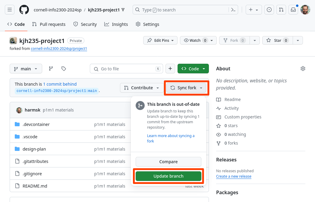
View your project repository on GitHub. Select Sync fork and then Update branch. This will synchronize the milestone 3 resources into your repository.
-
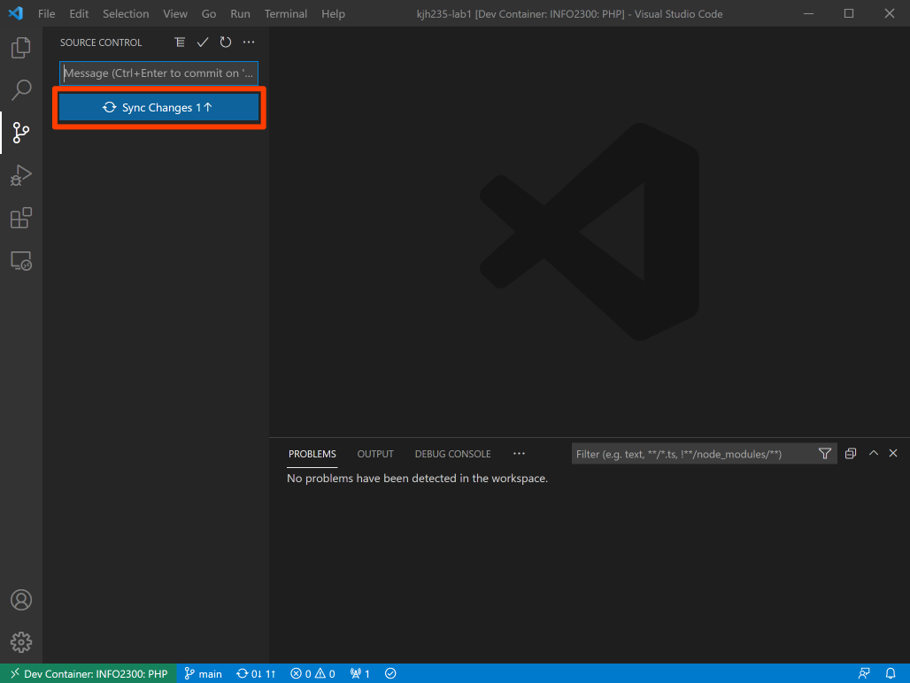
In your codespace, open the Source Control pane from the Activity Bar and click Sync Changes.
-
You should now be able to open the design-plan/milestone-final.md design journal in your codespace.
If you do not see the design-plan/milestone-final.md file, visit office hours. (Do not download a copy of the file and try to manually add it to your repository. You will break our ability to grade your assignment.) Avoid asking for help in the discussion forum for this issue. We rarely can resolve these issues in the forum.
Implement the JavaScript for your Planned Interactivity using the Provided Snippets
Implement your pseudocode plan from the previous milestone using the provided interactivity snippets in your Codespace.
Start by getting the JavaScript code working; don't worry about styling for now. Simply get the basic interactivity to work. Start with implementing the modal first, and then implement the hamburger menu.
This is the most important part of this milestone. If your interactivity doesn't work, we aren't able to provide partial credit. Please get your interactivity working first.
Your hamburger menu may "glitch" when the page loads. This is normal and will not result in a deduction. You can mitigate the glitching effect by setting the initial CSS classes for the hamburger button and navigation to be hidden by default in the HTML.
You must use the provided snippets exactly. Insert each snippet from Codespaces' snippet menu and change only the TODO placeholders (and indentation). Any other change results in 0 credit for this entire milestone, including:
- writing the snippet code by hand
- using AI-generated code
- deleting or editing the snippet comments
- adding code that isn't a snippet
Tips
Use the background-color property in your interactivity CSS classes to make it easy to see if your addClass() removeClass() calls are working the way you expect (without display: none).
If something is hidden by default, temporarily remove the CSS class that hides the element. It's really hard to code/styling something you can't see. When you're done getting that element just right, add the hidden CSS class back.
You will need to use a media query to show and hide the hamburger button and change the flex direction of the navigation to a menu from a bar and vice versa.
Snippet Reference
| Type | Snippet | Description |
|---|---|---|
| Event | event: click element | When the user clicks/taps an element |
| Event | event: page ready | When the page finishes loading |
| Event | event: resize browser window | When the browser window is resized |
| Event | event: modal closed | When a modal is closed (close button or Escape key) |
| Action | action: add css class | Add a CSS class to an element |
| Action | action: remove css class | Remove a CSS class from an element |
| Action | action: open modal | Open a <dialog> as a modal |
| Action | action: close modal | Close a modal <dialog> |
| Action | action: debug console message | Log a message to the browser console |
| If | if: browser narrow or wide | Check if the browser is narrow or wide |
| If | if: element has css class | Check if an element has a specific CSS class (useful for toggling a CSS class) |
| Extra: Carousel | extra: carousel: initialize | Initialize code needed for a carousel |
| Extra: Carousel | extra: carousel: action: next slide | Show the next slide |
| Extra: Carousel | extra: carousel: action: previous slide | Show the previous slide |
| Extra: Carousel | extra: carousel: action: go to slide | Show a specific slide |
| Extra: Timer | extra: event: every n milliseconds | Run code repeatedly every n milliseconds. |
| Extra: Copy | extra: action: copy text to clipboard | Copy an element's visible text to the clipboard (use inside a click event) |
extra: snippets are optional and may be used if you wish to add additional interactivity to your website beyond the required hamburger menu and modal. No credit is provided for additional interactivity beyond the required hamburger menu and modal.
Troubleshooting Tips
If your interactivity is not working as intended, use the steps below to help troubleshoot and try to identify the problem. Remember, the TAs cannot tell you what's wrong with your code nor fix it for you. The first thing the TAs will ask you during office hours is which of these steps you've tried.
- Did you load the JavaScript file in the HTML?
- Is the JavaScript loaded as the very last element in the
<body>? - Is jQuery loaded before your JavaScript file?
- Do all of your interactivity elements have a unique ID? (
id="") - Does your code match the snippet exactly? (Only the
TODOs change.) - Did you forget the
#in the selector in the snippet? - Did you mistakenly add a
.to the class name in the add/remove class snippet? - Are you adding a class when you should be removing one?
- Are you removing a class when you should be adding one?
- Does the CSS class exist in your CSS file?
- If the CSS class styling is subtle, temporarily make it loud:
background-color: red; - Use
action: debug console messageto test that an event works. - Is the HTML and CSS correct? Validate it!
- Are there errors in the JavaScript code? Check the console.
Dark/Light Mode
Using GitHub Copilot, implement light and dark mode for your website using the prefers-color-scheme media query.
If your current CSS theme is dark, you need a light media query. You need to tell the browser that your themes are reversed. Add the following to the top of your CSS file:
:root {
  color-scheme: dark light;
}
- With your CSS file active in Codespaces, prompt GitHub Copilot to generate a
prefers-color-schememedia query for your website's new theme (dark if your existing theme is light; light if your existing theme is dark). - Substantially revise the generated CSS so that your new theme is legible, usable, and matches the aesthetic of your website's design. Copilot frequently misses elements, picks colors with poor contrast, or duplicates CSS unnecessarily.
- Test both themes by switching your device's (or browser's) color scheme between light and dark. Check every page, including your hamburger menu and modal.
Scale all Image Files
Reduce the file size of all image files to be no larger than double their maximum rendered size on your website.
Why double? This allows for images to be crisp on high-DPI (Retina) displays while still respecting user's bandwidth.
Polish your Entire Website (Including Interactivity) and Ready it for your Portfolio
Your entire website's design will be graded in this milestone.
Your content should be well organized and structured to meet the goals of your audience. Your website should be fully responsive for narrow and wide screens as well as fine and coarse pointer devices. Your website, including the interactivity, should work well in both light and dark mode. Content and interactivity should be usable and accessible for all users, including users with disabilities. Your design should employ design principles and common design patterns. The design should be extremely polished and professional and ready to use in your portfolio.
Design Journal Reflection
Complete the design journal for the final milestone: design-plan/milestone-final.md
Check your Work
Review the milestone requirements and check that your milestone submission adheres to these requirements.
Double check that your HTML and CSS validate. Double check that your JavaScript is error free.
Everything in your design journal must be visible in the Markdown preview when using "Markdown: Open Preview" for credit. Not visible = no credit.
Remember that part of developing your professional skills is learning to check your work against requirements. You will not be provided a rubric in industry and I want you to be prepared.
Submission
Stage, commit and push all changed files in your Git repository to the GitHub server. (All commits should reside on the main branch.)
Complete the submission form for project-final to submit the assignment.
The submission form asks you to check your submission. Checking your work will ensure you receive credit for this assignment. We ask you to check your submission because this is where some students lose points. It's easy to forget something and checking your work prevents the heartache of getting a 0 because your submission wasn't submitted in a way that we can access and grade it.
Contributors
Copyright © 2017 - 2026:
- Kyle Harms