INFO 1300: Designing Layout & The Box Model
Class 6: Designing Layout & The Box Model
- Layout Design + Sketching
- The Box Model
- Dimensions – Fixed vs. Relative
- Margins and Padding
Copyright 2026, Kyle J. Harms
Cornell Unplugged 
The initiative encourages participants to reflect on how much time they spend connected to technology, and to bring awareness to three key issues:
- How excessive technology use can contribute to feelings of disconnection and social isolation.
- How unplugging can encourage thoughtful, innovative and human-centered forms of teaching and learning.
- How indiscriminate technology use can challenge sustainability goals and raise the environmental costs of computing and AI.
Review: <picture> & <img> Elements
src=relative URL (URL without scheme + domain)alt=text description of image for accessibility (and slow internet)
<picture>
  <img src="/images/tower.jpg" alt="McGraw Tower">
</picture>
Review: Supported Web Image Formats
| Format | Type | File extension | Pronunciation | When to use |
|---|---|---|---|---|
| JPEG/JPG | Raster | .jpg | "Jay-peg" | Good for photos |
| PNG | Raster | .png | "Ping" | Good for precise drawings (non-photo) like screenshots, logos, or charts/graphs |
| WEBP | Raster | .webp | "Web-pea" | Newer format that's good for both photos and drawings |
| SVG | Vector | .svg | "S-V-G" | Good for scalable line drawings |
| GIF | Raster | .gif | Good for small, limited-color animations |
Note: HEIC (.heic) images are not a web standard; HEIC mostly works with iPhones. Do not use .heic images on the web!
Review: Accessible Images
alt= attribute is required for accessible images:
-
Informative – simple concept or information (i.e. content)
alt="2 tacos and a burrito combo"(food on a restaurant menu) -
Functional – used to initiate action
alt="Search"(search icon) oralt="Print"(print icon) -
Decorative – doesn't add information to page's content
alt=""(hero image, artsy line, interesting non-content image, etc.)
Gotcha: <img> width= and height=
Do not "resize" an image by changing the width= and height= attributes:
<picture>
  <img src="/images/tower.jpg" alt="McGraw Tower" width="2250" height="1500">
</picture>
Why? Because "resizing" this way does not change the image's file size and will make your website slow to download on slow internet connections.
Scale the image file in a file editor to make the file size smaller instead. (We'll cover this later.)
Layout Design
Designing a Website's Layout
-
Find several example websites with layouts that align with your audience.
Tip: View the mobile site. (Resize your browser window.)
-
Analyze the example websites' layout.
- What makes the layout familiar to the audience?
- How are elements spaced on the page?
- How are the elements sized on the page?
- What is the spacing between elements?
-
Explore layout ideas through sketching.
Discussion: Mobile Layout Analysis


Example: Layout Analysis I
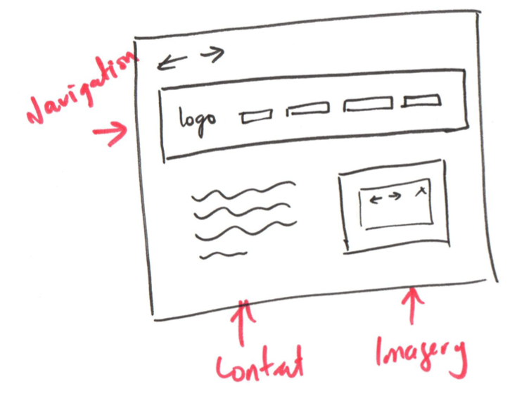
- Familiar!
- Logo/Title top-left
- Nav Menu below header
- Important content visible first thing on page:
<h2>+ content - Not cluttered: plenty of vertical space between elements
Example: Layout Analysis II
- Familiar!
- Sections are clearly defined
- Sometimes with extra space
- Sometimes with a border
- Sometimes with a color
- Content fills the width of screen
- Main links are styled as buttons
- Not cluttered: plenty of vertical space between elements
Would you know how to use this site? Why?

Best Practices: Familiar Layout
Familiar design is familiar to the site's users
Familiarity can lead to better usability.
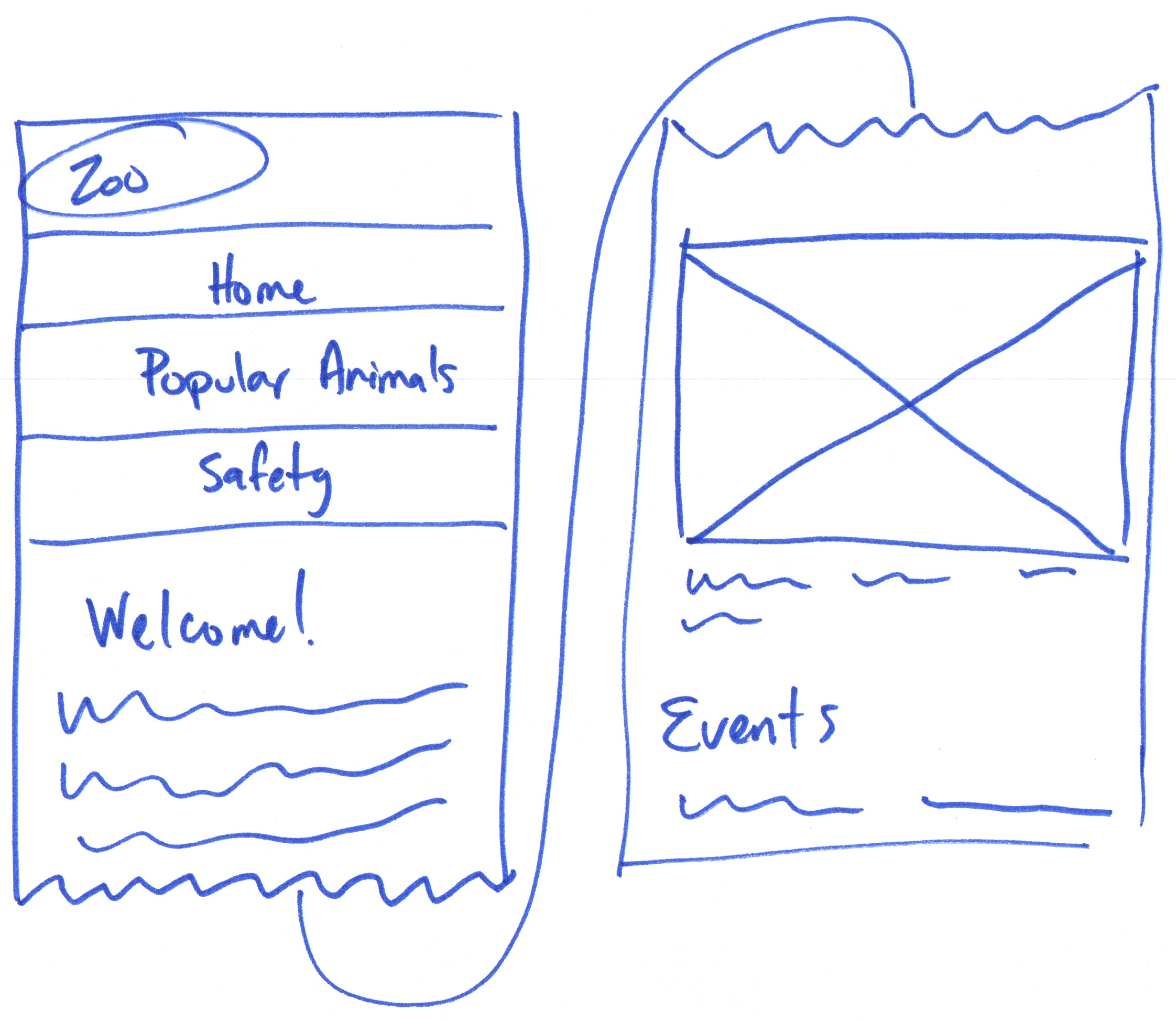
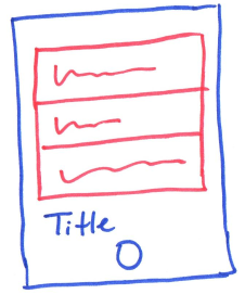
Sketching is about Ideation
Sketch: A distinct form of drawing which designers use to propose, explore, refine, and communicate ideas.
Sketching Rules
- This is about communicating ideas
- Hand drawn – line drawing
- Includes some details in order to communicate ideas
(e.g. navigation link & page title text) - Squiggly lines okay if not important for understanding the design
Example: Sketching
Activity: Your Turn, Sketch Practice
- Think about familiar layout design that you might use for the Ithaca Zoo website (mobile only).
- Discuss with a peer possible layouts for the Ithaca Zoo website.
- On the handout, sketch a possible layout for the Ithaca Zoo home page.
Remember to use layout designs that are familiar to the site's audience.
Tip: Open index.html in your codespace and review the content.
Spacing Elements
↓
The Box Model
The CSS Box Model
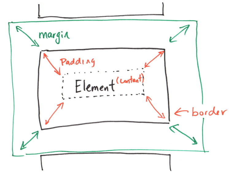
Margin: The space outside the box, between the box and other elements.
Border: The edge of the box.
Padding: The space inside the box, between the content and the border.
Box Model – CSS Properties
Every HTML element renders as a box.
width,height– The dimensions of the box. (fixed or relative)margin– The spacing between element boxes. (outside the box)border– The outside edge of the box.padding– The spacing between the edge of the box and the content. (inside the box)
Box Model
Element Dimensions
Dimensions: Fixed vs. Relative
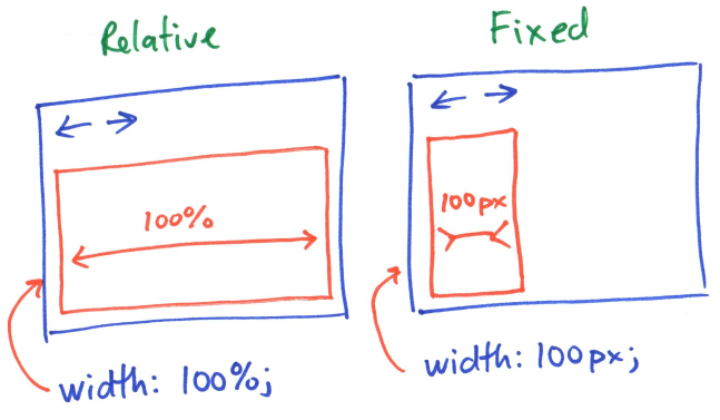
width: 100%;
width: 100px;
Dimension Units
Relative Units
Percent (%) – Relative dimensions; 100% = width of parent element Ems (em) – Relative dimensions; 1em = font size of parent element Rems (rem) – Relative dimensions; 1rem = font size of root element
Fixed Units
Pixels (px) – Fixed dimensions; 1px = 1/96th of an inch on a screen Points (pt) – Fixed dimensions; 1pt = 1/72nd of an inch on a screen
Fixed vs. Relative Examples
width: 220px; /* fixed */
This paragraph is 220 pixels wide.
width: 100%; /* relative */
min-width: 375px;
max-width: 800px; /* image file's width */
Usable Content: Set min-width so that the image is still legible on small screens (e.g. iPhone SE)
Prevent Pixelation: Set max-width so that the image does not exceed the image file's width.

Gotcha: Default Element Sizing
Some elements, like headings and <p> are sized relative by default. Their width is 100% of the parent element. (These are block elements.)
However, some elements, like <a> are sized fixed by default. (These are inline elements.)
You can change an inline element to a block element by changing its display: property to block (or inline-block).
a {
  display: block;
}
Gotcha: Do not Resize Images with CSS!
Always set max-width to the image file's width.
If the width is too large, scale the image file in a file editor to make the file size smaller instead.
Note: Does not apply to vector (i.e. SVG) images. You may use max-width to resize vector images.
Gotcha: Setting Dimensions for <img>
<picture> does not render an image.
The <img> element renders the image.
Do not set dimensions on the <picture> element.
Set dimensions on the <img> element.
<picture>
  <img src="/images/tower.jpg"
    alt="McGraw Tower">
</picture>
picture img {
  width: 100%;
  min-width: 375px;
  max-width: 800px;
}
Activity: Usable Content Dimensions
-
Open the Ithaca Zoo website.
Resize the width of your browser window to see which elements overflow the browser's width.
Observe which elements that fill to the browser's width and those that go beyond.
-
Update the CSS for the Ithaca Zoo website to use relative dimensions for elements that overflow the browser's width.
width: 100%;
min-width: 375px;
max-width: 800px;
width: 220px;
Box Model
Element Margins and Padding
Margins and Padding
Margin: The space outside the box, between the box and other elements.
Padding: The space inside the box, between the content and the border.
Example: margin / padding
background-color: gray;
margin: 40px 80px;
padding: 20px 0;
left/right margin: 80px top/bottom padding: 20px left/right padding: 0
background-color: gray;
margin-top: 10px;
margin-right: 20px;
padding-left: 10px;
padding-bottom: 10px;
Thumbs Up/Down: The Box Model
Margin: Thumbs Up Padding: Thumbs Down
- You want to add space between an
<h2>and<p>element. - You've added a background-color to an element, but its text is right next to the edge of the element. You want to add some space between the text and the edge of the element.
- You want an
<img>to not touch the edge of the browser window. You want some space between the image and the edge of the browser window.
Activity: Margin/Padding Practice
On the Ithaca Zoo website, add margins and padding to improve the usability/readability of the content.
Suggestion: Provide some space between the content and the edge of the browser window.
Tip: Temporary Background Color
Temporarily changing the background color of an element can often help you see the box model. This helps to understand what margin/padding you're changing.
background-color: red;
Tip: Dev Tools Inspector
Where are those "hidden" (default) margins and padding coming from?
Right-click on an element and select Inspect to open the Dev Tools Inspector.
Use CSS to override the default margin and padding!
Gotcha: Margin Collapsing
The top and bottom margins of boxes are often combined (collapsed) into a single margin.
<p>Example A</p>
<p>Example B</p>
<p>Example C</p>
p {
  margin-top: 25px;
  margin-bottom: 50px;
}
Example A (🠕 25px; 🠗 50px)
Example B (🠕 50px; 🠗 50px)
Example C (🠕 50px; 🠗 50px)
Gotcha: Box Dimensions + Border + Padding
(Default) Content Box
Content box width does not include the size of the border + padding.
  width: 100px;
  border: 5px solid black;
  padding: 10px;
130px = 5px + 10px + 100px + 10px + 5px
(Recommended) Border Box (box-sizing: border-box;)
Border box width does include the size of the border + padding
box-sizing: border-box;
width: 100px;
border: 5px solid black;
padding: 10px;
100px
Activity: Navigation Menu
Working with a peer try and implement a navigation menu for the Ithaca Zoo website.
Hint:
nav menu li {
  list-style: none;
}
Gotcha: Dimensions for Inline Elements
Some elements are inline by default (e.g. <a>).
If you wish to change the dimensions of an inline element, you must first change its display: property to block.
nav menu li a {
  display: block;
  padding: 10px;
}
What's Next
Homework 4 released today.
Fri, Sept 18th, 11:59 PM: Practice Quiz 3 (Classes 6 + 7, Homework 4)
Sun, Sept 20th, 11:59 PM: Homework 4 due
Mon, Sept 21st, 11:59 PM: Exam I