INFO 1300: Layout with Flexbox
Class 8: Layout with Flexbox
- Exam I Primer
- Familiar Layout - Mobile & Desktop
- Framed Main Content
- Layout with Flexbox
Copyright 2026, Kyle J. Harms
Exam I
Exam I
Exam 1 is this upcoming Wednesday, September 23rd, 2026, during our regularly scheduled class time (1:25pm - 2:40pm; 75 minutes).
Location posted on Canvas (randomly assigned).
Covers all material covered in classes 1-7 (the first 4 weeks of the semester), homeworks 1-4, and practice quizzes 1-3.
Paper-based, closed-book, no computers or electronic devices allowed. 10-15 questions, same format as the practice quizzes.
Exam I: Study Guide
- Class 1: Introduction, Static Websites
- Class 2: An Introduction to HTML
- Class 3: Introduction to CSS
- Class 4: Multi-Page Websites, Content Organization, URLs, & Navigation
- Class 5: Images
- Class 6: Designing Layout & The Box Model
- Class 7: Designing a Website's Theme
</Exam I>
<Exam II>
Review: Visual Design Principles
Visual design affects the way a website's visitors feel about a site.
- Color – foreground (text) vs. background contrast
- Imagery – pictures, screenshots, 😀 faces 😦, and symbols
- Typography – fonts, variants, weight, and style
- Shape – hard lines vs. soft edges
- Alignment – well aligned $=$ professional vs. centered $=$ amateur
Review: Centering Block Elements
-
Must be a block element:
img {display: block;} -
Set
widthand/ormax-widthproperty. -
Set left and right margins to
auto.margin-left: auto;margin-right: auto;

Review: CSS Class Selector
. is used to select elements by their class attribute.
.rounded-corners {
border-radius: 20px;
}
.centered {
display: block;
margin-left: auto;
margin-right: auto;
}
class attribute specifies one or more class names for an HTML element.
<img class="centered rounded-corners" ... >

Review: <div>for Layout/Styling
<div> does not provide any structure. It is only for layout/styling!
<div>
  <p>This is paragraph resides inside a div.</p>
  <picture>
    <img src="images/mcgraw-tower.jpg">
  </picture>
  <p>So does this paragraph.</p>
</div>
This is paragraph resides inside a div.
So does this paragraph.
Familiar Layout: Mobile vs. Desktop
Mobile Layout
- Logo/Title top-left corner
- Navigation menu below header
- Content fills width of screen
- Images fill 100% of the width
- All content is "stacked" vertically
- Footer at bottom of page
Desktop Layout
???
Discussion: Mobile vs. Desktop Layouts

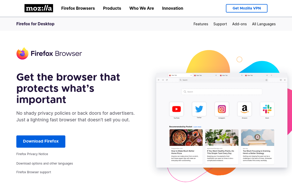
Discussion: Desktop Layout
Discussion: Desktop Layout – Wide Screens
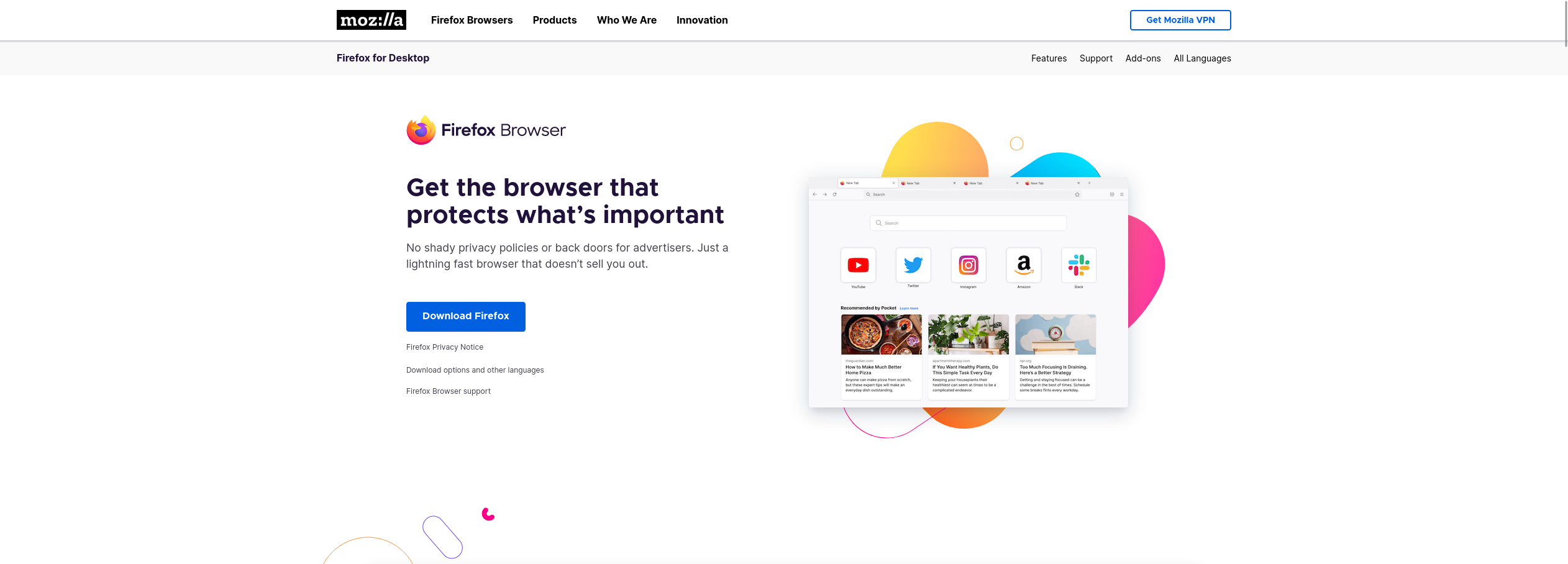
Familiar Layout: Mobile vs. Desktop
Mobile Layout
- Logo/Title top-left corner
- Navigation menu below header
- Content fills width of screen
- Images fill 100% of the width
- All content is "stacked" vertically
- Footer at bottom of page
Desktop Layout
- Framed Content – content is often a fixed "readable" width (~1000px)
- Header with logo/title
- Navigation bar in header
- Content in columns / sidebars
- Footer at bottom of page
Planning a Layout & Composition
-
Identify common design patterns familiar to your users.
-
Explore layout and composition ideas through sketching.
-
Frame the content for readability. Not too small (e.g. 400px), and
not too wide (e.g. 1000px).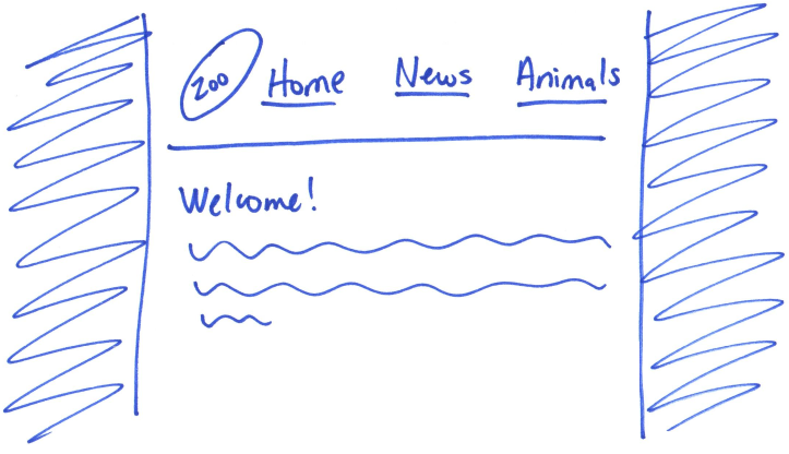
-
Plan the final layout before implementing in code.
Framed Main Content
Activity: Framed Content – Fixed Readable Width
Complete Part I on your handout.
Plan framing the main content of the Ithaca Zoo's website so that it's always a readable width.
Content never gets too wide or too narrow to be readable.
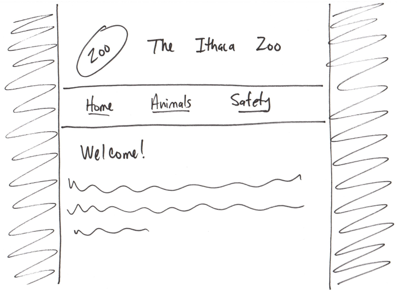
(Design Sketch)
Example: Framed Content
html {
  background-color: lightgray;
}

body {
  background-color: white;

  width: 100%;
  min-width: 375px;
  max-width: 1000px;
  margin: 1em auto;
}
Side-by-Side Element Layout
"Side-by-Side" Element Layout
- Navigation Bars
- Side Bars
- Content in Columns
- ...
Layout Methods
FloatsTablesHTML/CSS/JavaScript librariesCSS grid- Flexbox!
Flexbox
Flexbox: a nestable one dimensional layout container model.
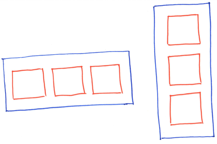
Nestable: For complex layouts, use flexboxes inside of flexboxes.
Flexbox 1-D Containers
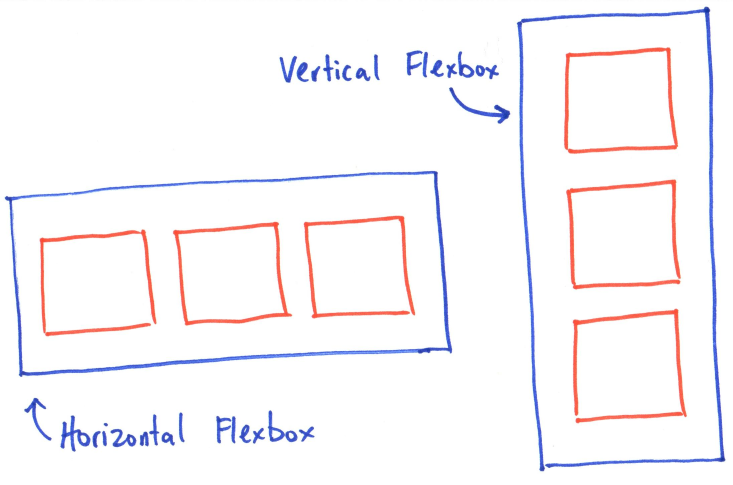
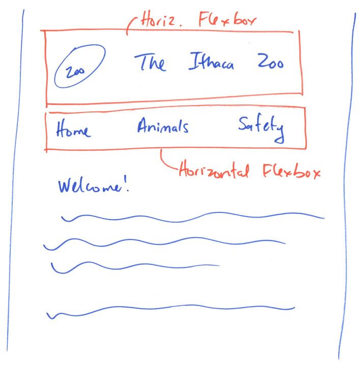
Activity: Where are the flexboxes?
Where do we need horizontal and vertical flexboxes for our layout?
Example: Where are the flexboxes?
Flexbox Requirements
-
A container element (often, but not always,
<div>).Style it using a CSS class selector!
-
Layout direction:
row(horizontal) orcolumn(vertical).Horizontal: child elements side-by-side Vertical: child element stacked on-top of each other
-
Elements inside (child elements) the container.
Only the direct children of the container are laid out.
Step 1: A Container Element
If your HTML does not have a container element, add one!
If no structural or semantic container exists, use <div>.
Define the container as a Flexbox by setting display: flex;.
Use a CSS class for styling: e.g. .sidebar, .horizontal, etc.
.container {
  display: flex;
}
Container Elements
Container: Any HTML element that has child elements as its "content."
<figure>
  <picture>
    <img>
  </picture>
  <figcaption>
    <cite>...</cite>
  </figcaption>
</figure>
<figure>is the container<picture>and<figcaption>are its "child" (children) elements- grandchildren
<img>is a "grandchild" element;<img>is not a child of<figure>container.<cite>is a "grandchild" element;<cite>is not a child of<figure>container.
<div> Containers
<div> has no semantic meaning or structure. It is primarily used as a container element (or for purely style reasons, like colored boxes).
<div class="bg-darkgray">

  <p>A div is often used for
    defining a container.</p>

  <p>This is a <strong>div container
    </strong> with two paragraphs.</p>

</div>
A div is often used for defining a container.
This is a div container with two paragraphs.
Step 2: Container Direction: row or column
Vertical
.container {
  display: flex;
  flex-direction: column;
}
McGraw Tower
Step 3: Elements Inside the Container
Any child elements (regardless of type) will do.
Only the direct children will lay out.
<div class="container">
  <picture><img></picture>
  <p>McGraw Tower</p>
  <picture><img></picture>
</div>
(<picture>, <p> are children; <img> is a grandchild.)
McGraw Tower
(Optional) Set Dimensions of Child Elements
<div class="container">
  <picture class="fixed"><img></picture>
  <picture class="stretch"><img></picture>
  <piecture class="fixed"><img></picture>
</div>
.fixed {
  width: 120px;
}
.stretch {
  flex-grow: 1;
}
Tip: Use flex-grow: for relative dimensions when using flexbox.
(See the documentation for details.)
Caution: Percentage dimensions
(width: 100%;) may not work as expected when using flexbox.
Demo: Flexbox
- A container element.
- Layout direction:
roworcolumn - Elements inside the container.
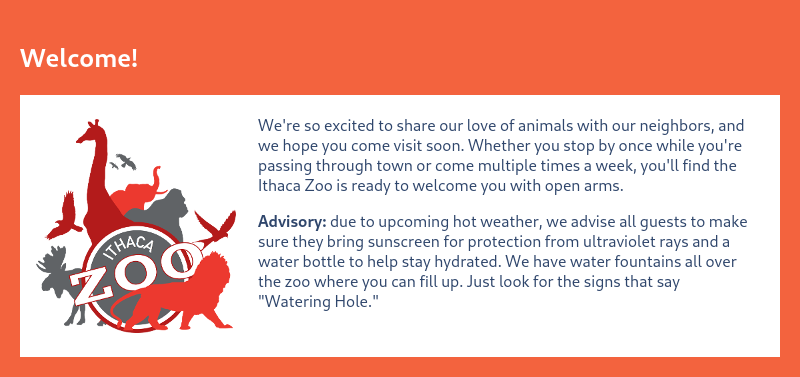
Design vs. Flexbox Planning Sketch
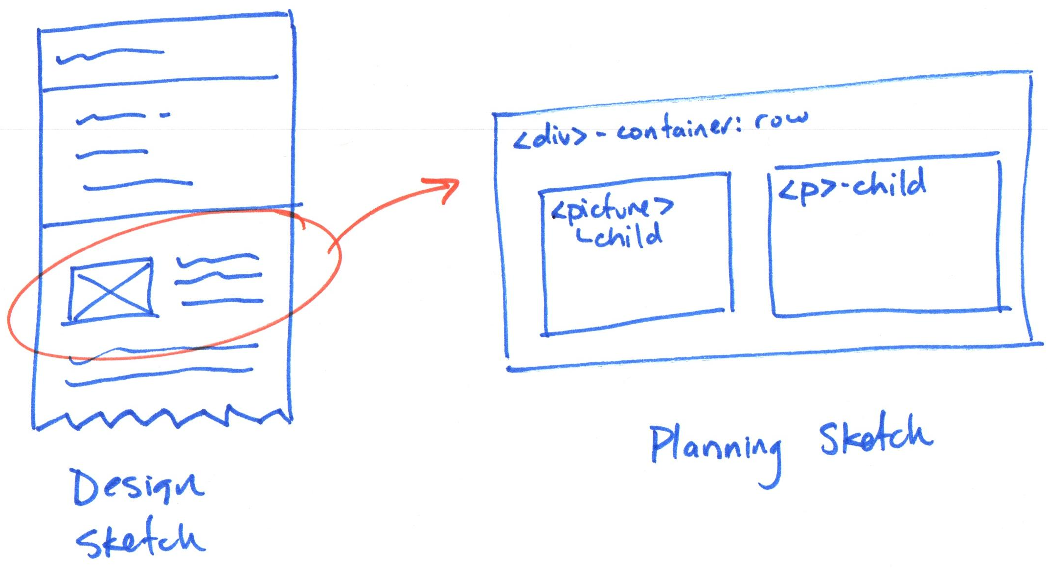
Planning sketches have flexbox annotations. Design sketches do not.
Flexbox Planning Sketches
Goal: Plan the implementation of your flexbox layout.
-
Draw a box for the container and label it.
Include the container's HTML element name. (e.g.
<div>– container) -
Label the container's flexbox direction:
roworcolumn. -
Draw a box for each child element and label it as a child.
Include the child element's name. (e.g.
<picture>– child)
Demo: Flexbox Planning Sketch
Activity: Navigation Bar Flexbox
Complete Part II of your handout and plan the CSS for a navigation bar layout.

Flexbox Requirements
- A container element.
- Layout direction:
roworcolumn - Elements inside the container.
Example: Navigation Bar
nav menu {
  display: flex;
  flex-direction: row;
}
Nested Flexboxes
You can nest flexboxes inside flexboxes.
<div class="two-column-flexbox">
  <section>...</section>
  <figure class="another-flexbox">
    <img>
    <figcaption>...</figcaption>
  </figure>
</div>
Use flexboxes inside flexboxes to create most layouts imaginable.
Flexbox Documentation
- Refer to the flexbox documentation.
- Seriously, use the documentation.
- No, really! Use the documentation. It's what the pros do!
Flexbox Tips
-
If your flexboxes aren't working, make a plan on paper, and
check that you've done each step! -
Grandchildren of a container are not affected by the flexbox
(only children). -
Use your browser's inspector to troubleshoot CSS issues.
-
Resize your browser window to verify layout for different sized screens.
-
Recall that the TAs are here to help you learn; the TAs will not fix your code/flexboxes for you.
What's Next
Homework 5 released today
Wed Sept 23, 2026: Exam I
Fri Sept 25, 2026: Homework 5 Office Hours during Sections