INFO 1300: Responsive Web Design
Class 10: Responsive Web Design
- Responsive Design
- Responsive Design Considerations
- Scaling Raster Image Files
Copyright 2026, Kyle J. Harms
Responsive Web Design
A design that responds to the needs of users and the devices they are using.
- Wide / Narrow Screen
- Click / Touch
- Low / High Definition
- Fast / Slow Internet
- Screen / Printer
Activity: Responsive Design (Part I)
Design (sketch) your business card on your handout.
Employ user-centered design:
- Who's your audience?
- What are their goals?
- What content should you include?
- Name?
- Cornell email?
- Photo?
Discussion: Responsive Web Design
Responsive Web Design: A design that responds to the needs of users and the devices they are using.
- Form groups of 2-3.
- Pick a website and visit on your laptop.
- Slowly resize the width of your browser window from wide to narrow.
- Carefully observe the changes to the website as the window shrinks.
- Discuss with a peer how a website's design changes depending on the device's characteristics (i.e. screen width).
Device Characteristics:
- Wide Screen vs. Narrow Screen
- Click vs. Touch
- Low Definition vs. High Definition
- Fast Internet vs. Slow Internet
- Screen vs. Printer
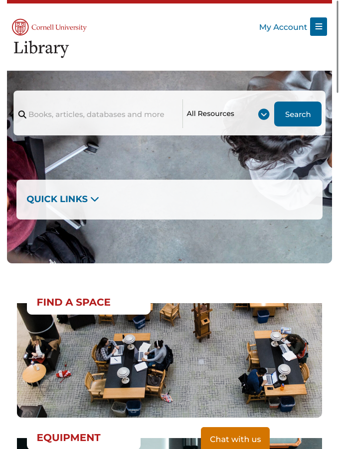
Mobile vs. Laptop / Narrow vs. Wide Screens
Mobile Narrow Screens
- Logo/Title top-left corner
- Navigation menu below header
- Content fills width of screen
- Images fill 100% of the width
- All content is "stacked" vertically
- Footer at bottom of page
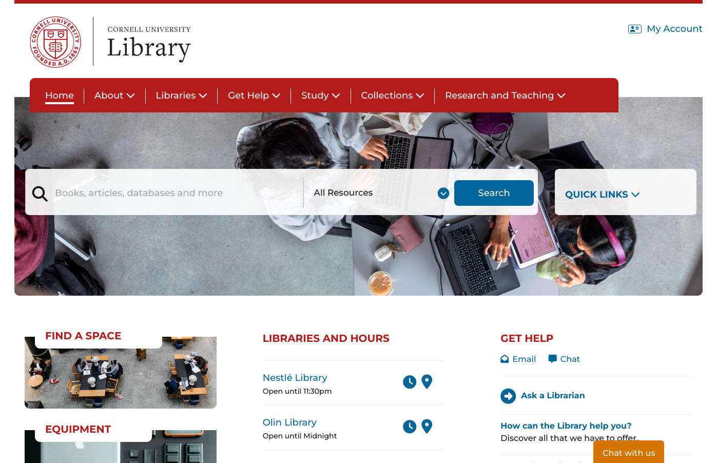
Laptop Wide Screens
- Framed Content – content is often a fixed "readable" width (~1000px)
- Header with logo/title
- Navigation bar in header
- Content in columns / sidebars
- Footer at bottom of page
Activity: Responsive Design (Part II)
Design your business card for narrow (tall) paper sizes on your handout.
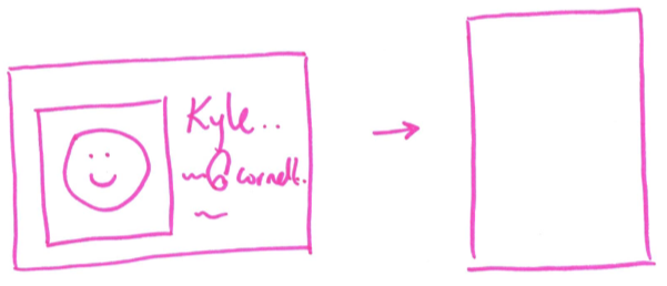
Reflect on the changes you observed when resizing the browser window earlier.
Takeaway: It's the Same Content!
It's the same business card!
It has the same content – the design simply reflects the characteristics / limitations of the medium.
In responsive web design, you are not designing two different sites (mobile and laptop).
You're designing one site that responds to the characteristics of how the site is accessed by the user (phone vs. laptop, etc.)
Responsive Web Design – Design Considerations
Design for how users will interact with a device. Employ common design patterns based on device characteristics.
Do not design for specific devices!
- Don't: design for the iPhone 18 Pro
- Do: design for any narrow screen
Responsive Web Design – Design for
Device Characteristics
- Screen Width
- "Clickable/Tapable" Area
- Readability
- Medium (Screen/Paper)
Screen Width
- Design using the available horizontal space.
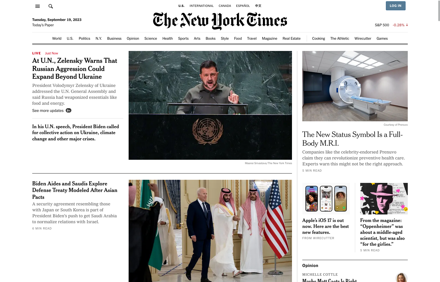
- Very wide content may be unusable (may depend on distance to screen.)
- On wide devices, consider "framing" the content or using narrower columns to keep the content a usable width.
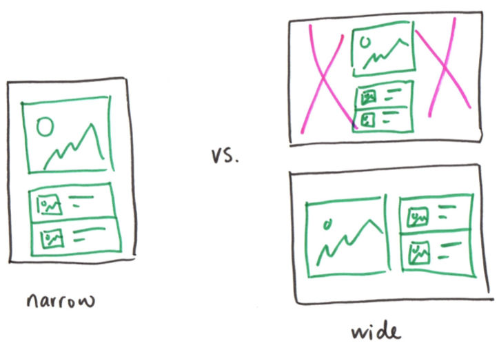
Example: Narrow vs. Wide Screens


"Clickable/Tapable" Area
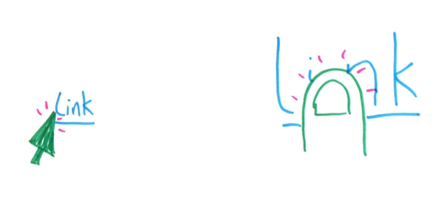
- A finger is less precise compared to a mouse/trackpad.
- "Touch" requires larger "clickable" targets.
Example: Large vs. Small "Clickable" Areas
Readability
- Keep blocks of text under 5-6 inches (~500-600px). Anything longer and users may lose their place when reading.
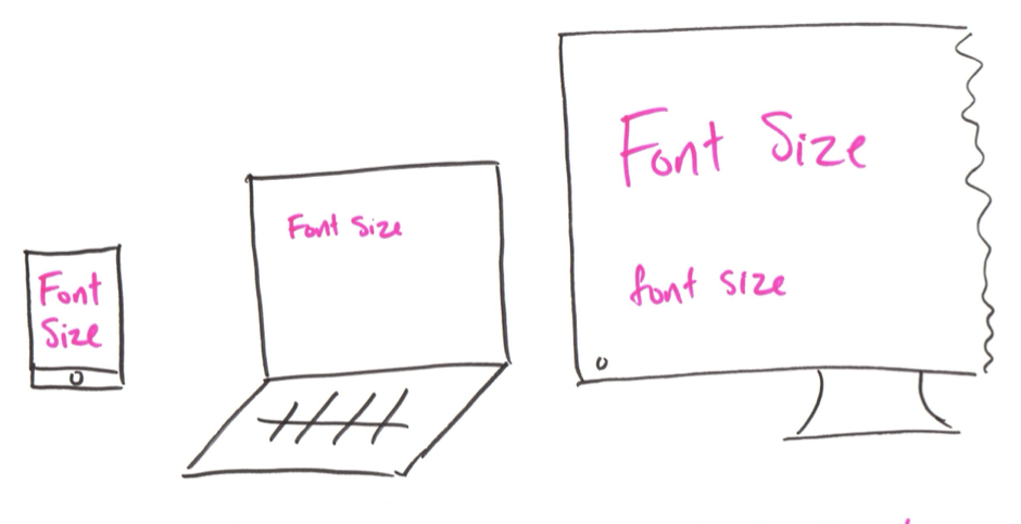
- Scale content based how users will read the content on their device.
- Smaller or far away screens are often harder to read.
Example: Larger vs. Small Font Points

Medium
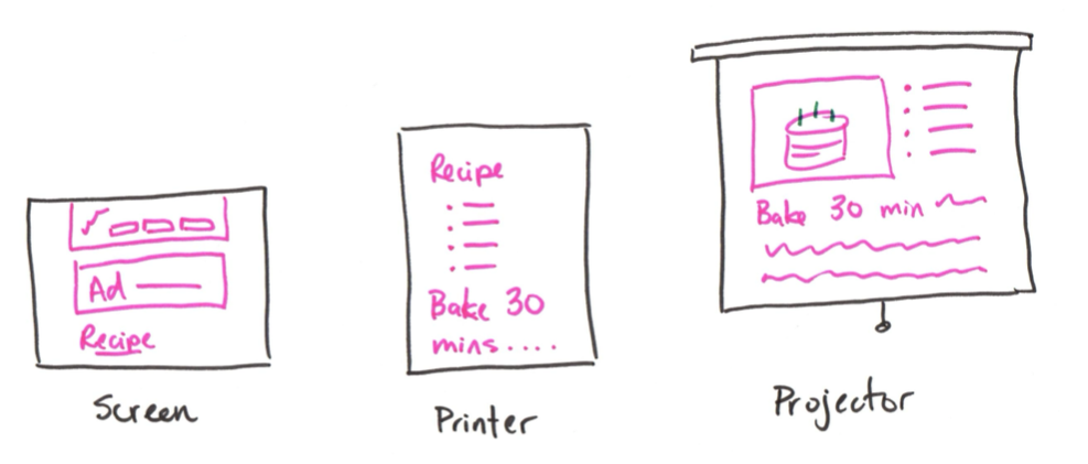
- Understand how and where your users will access and use your site's content.
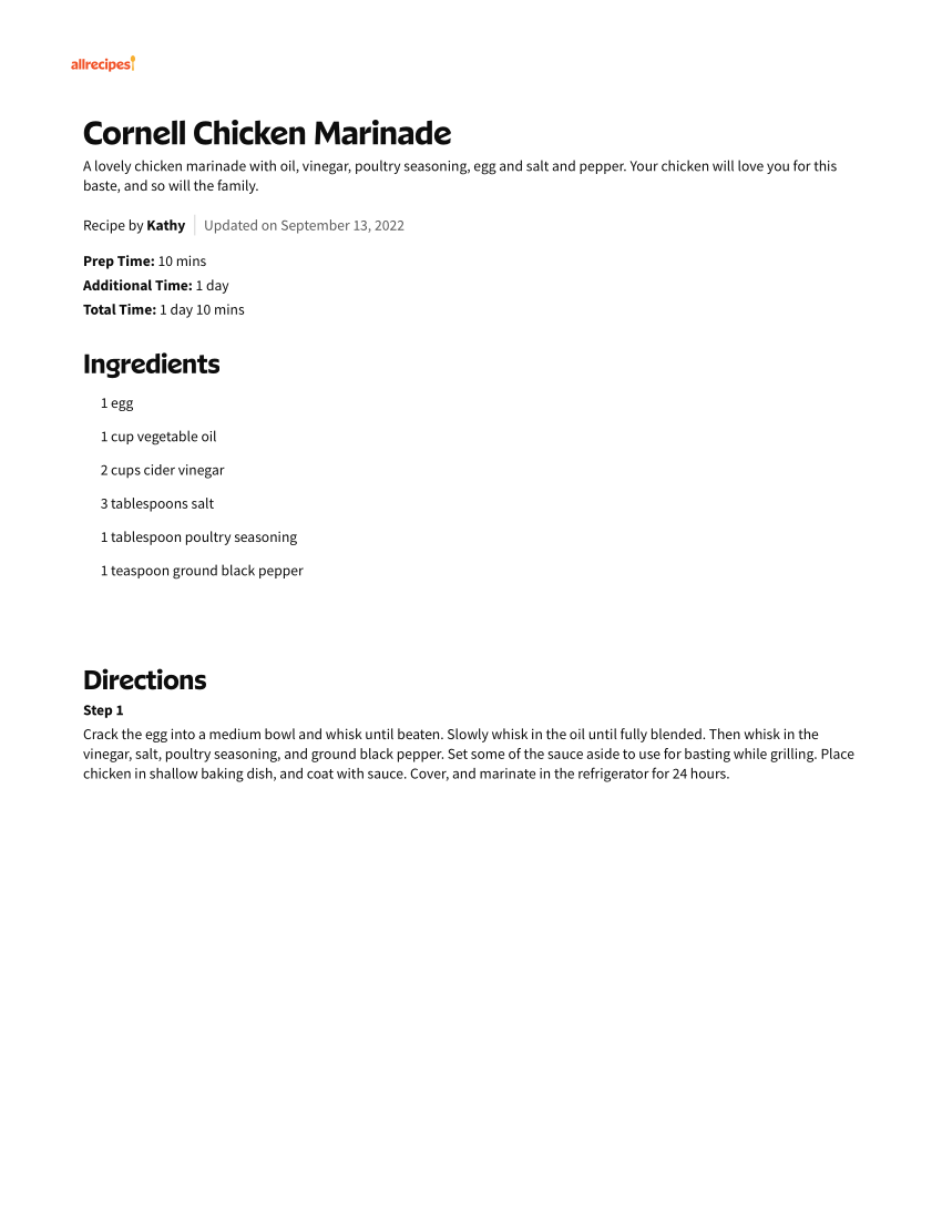
- Go beyond the screen – printers, projectors!
Example: Screen vs. Paper

Discussion: Responsive Web Design Critique (Part I)
-
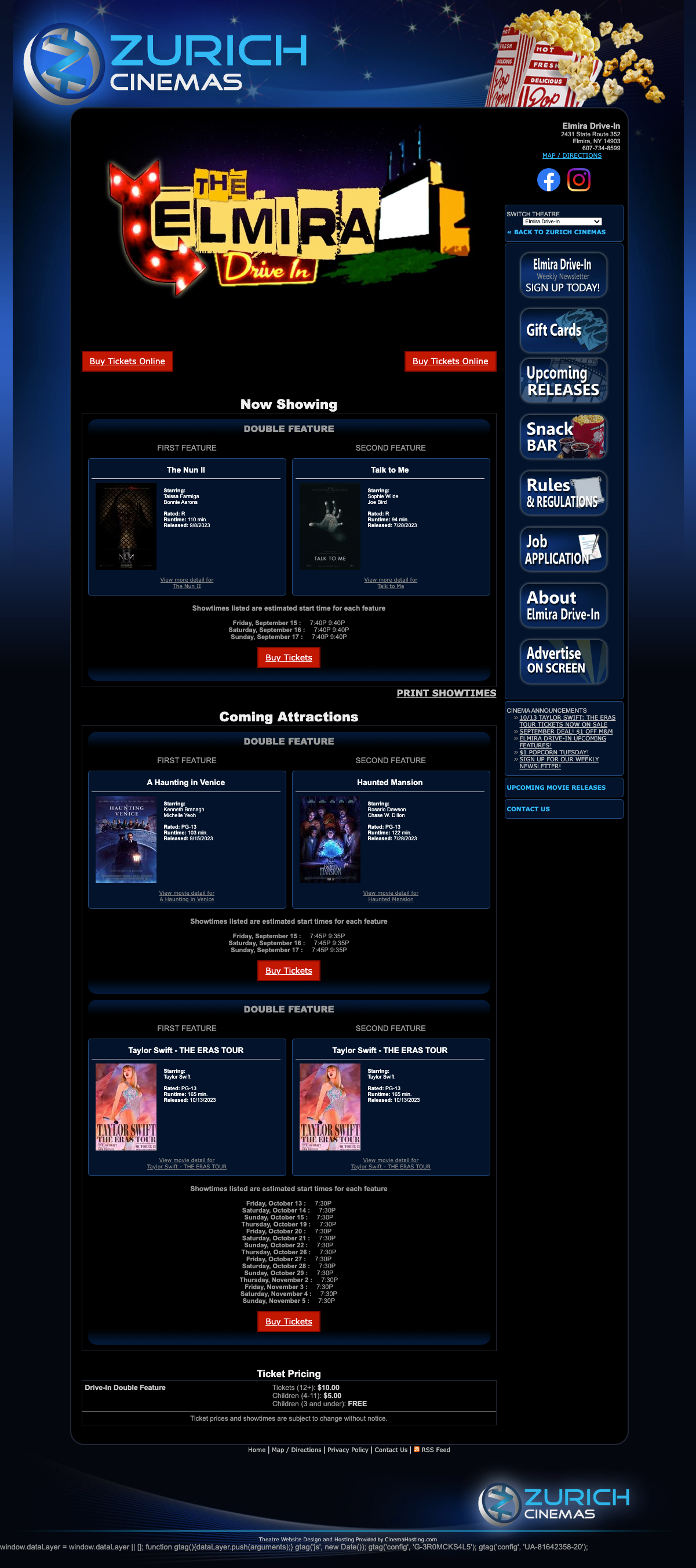
Reflect on the usability of this site for wide screen devices.
-
Discuss and critique the design for wide screen devices with a peer.
- Who is the audience?
- What are their goals?
- What content is necessary to address those goals?
Discussion: Responsive Web Design Critique (Part II)
-
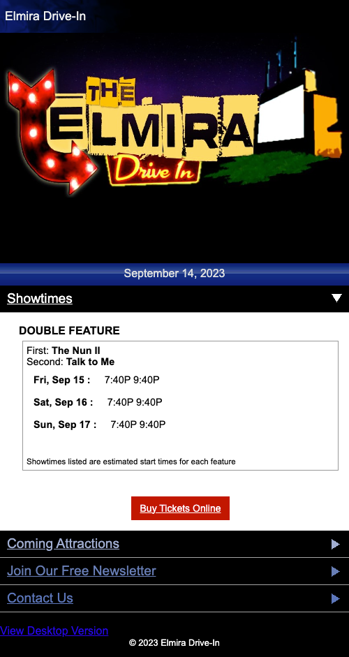
Reflect on the usability of this site for narrow screen devices.
-
Discuss and critique the design for narrow screen devices with a peer.
- Who is the audience?
- What are their goals when using mobile devices?
- Should the content be specific to mobile devices?
Critique: Disappearing Content
Gotcha: Disappearing Content
Don't design separate mobile and laptop sites.
Don't only show some content on some devices, but not others.
Design one website, with the same content, that simply reacts/responds to how the user accesses the website.
Responsive Design Patterns
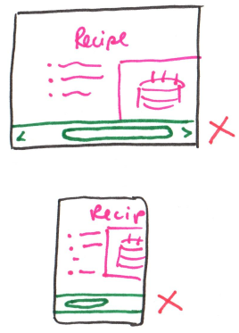
Responsive Design Patterns: Vertical Scroll
-
Web pages primarily scroll vertically.
-
Avoid horizontal scrolling.
Check that your website does not show a horizontal scrollbar on any device.
Responsive Design Patterns: Navigation
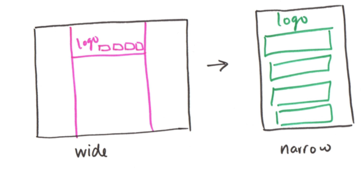
Caution: Mobile Navigation Design Patterns
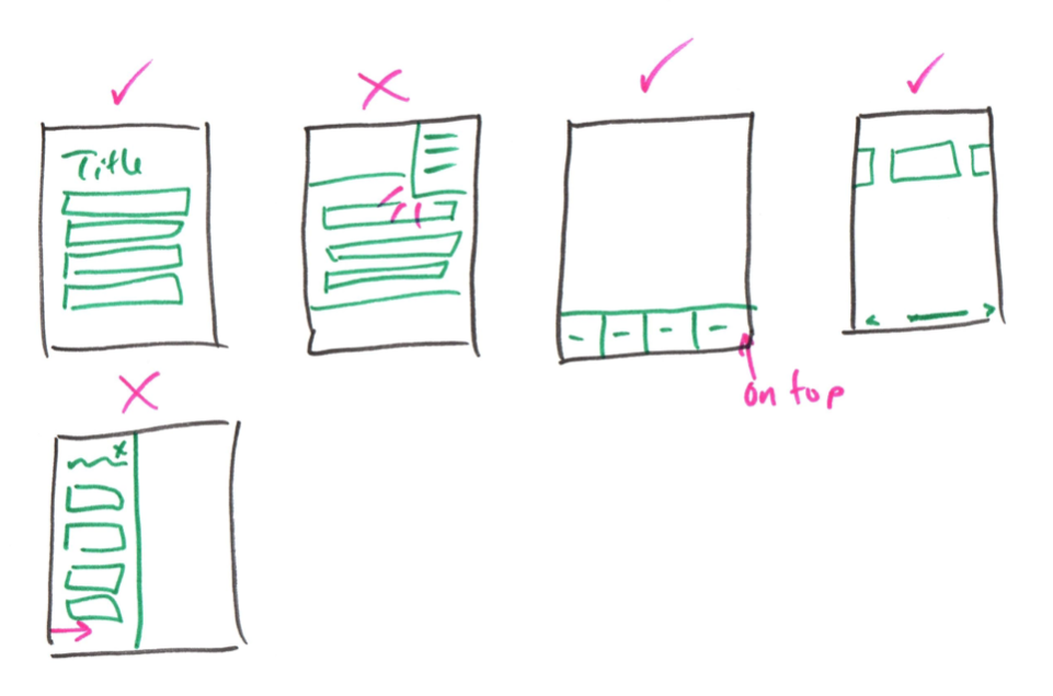
Note: Some navigation design patterns require interactivity, like a hamburger menu. We can't implement interactivity yet in this class.
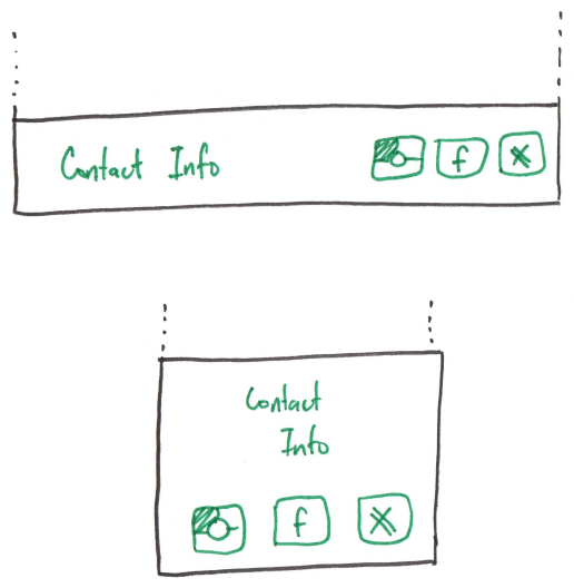
Responsive Design Patterns: Footers
Most pages use a footer for both narrow and wide layouts.
A footer often contains:
- Contact Information
- Social Media Links
- Site Map
- Privacy Policy
- Copyright Notice
- etc.
Activity: Responsive Web Design Practice (Part III)
- Sketch a responsive home page design for the Elmira Drive-In Theater on the back of your handout.
- Redesign it for both narrow and wide devices.
- Audience: a returning customer to the drive-in
-
Design considerations:
- Screen Width
- "Clickable/Tapable" Area
- Readability
- Medium (Screen/Paper)
-
Include the following content:
- Now Showing
- Upcoming Releases
- Map / Directions
Additional Responsive Considerations
Bandwidth
Users will access your website on a variety of internet connections with varying speeds and reliability.
Minimize the amount of data that needs to be transmitted to view your site.
- Shrink raster image file sizes; scale raster image files.
- Do not autoplay videos.
Gotcha: Resizing Raster Images with CSS
CSS can change the dimensions of the image rendered in the browser.
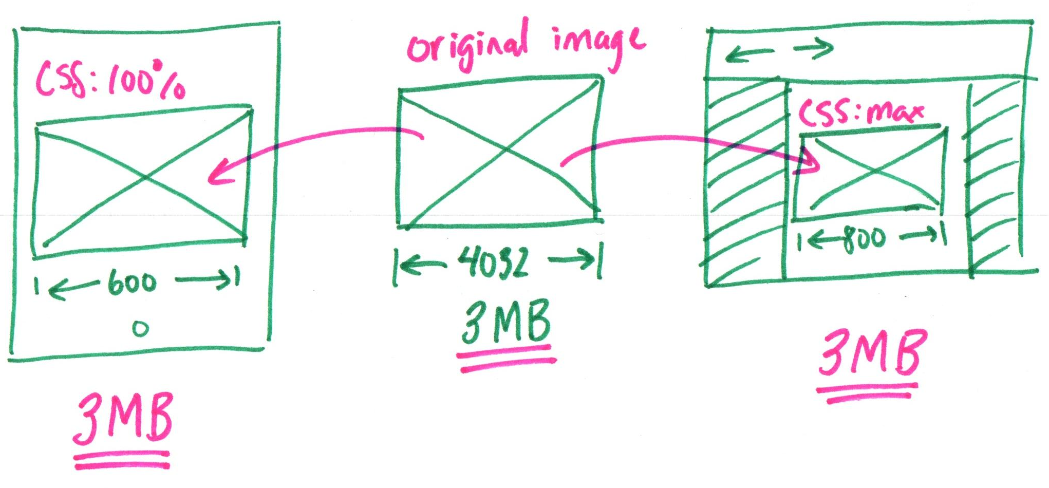
Problem: A large image file is downloaded, but only a smaller version is displayed!
Scaling Raster Image Files
Scale raster images (PNG, JPG) to the maximum sized needed for the design†.
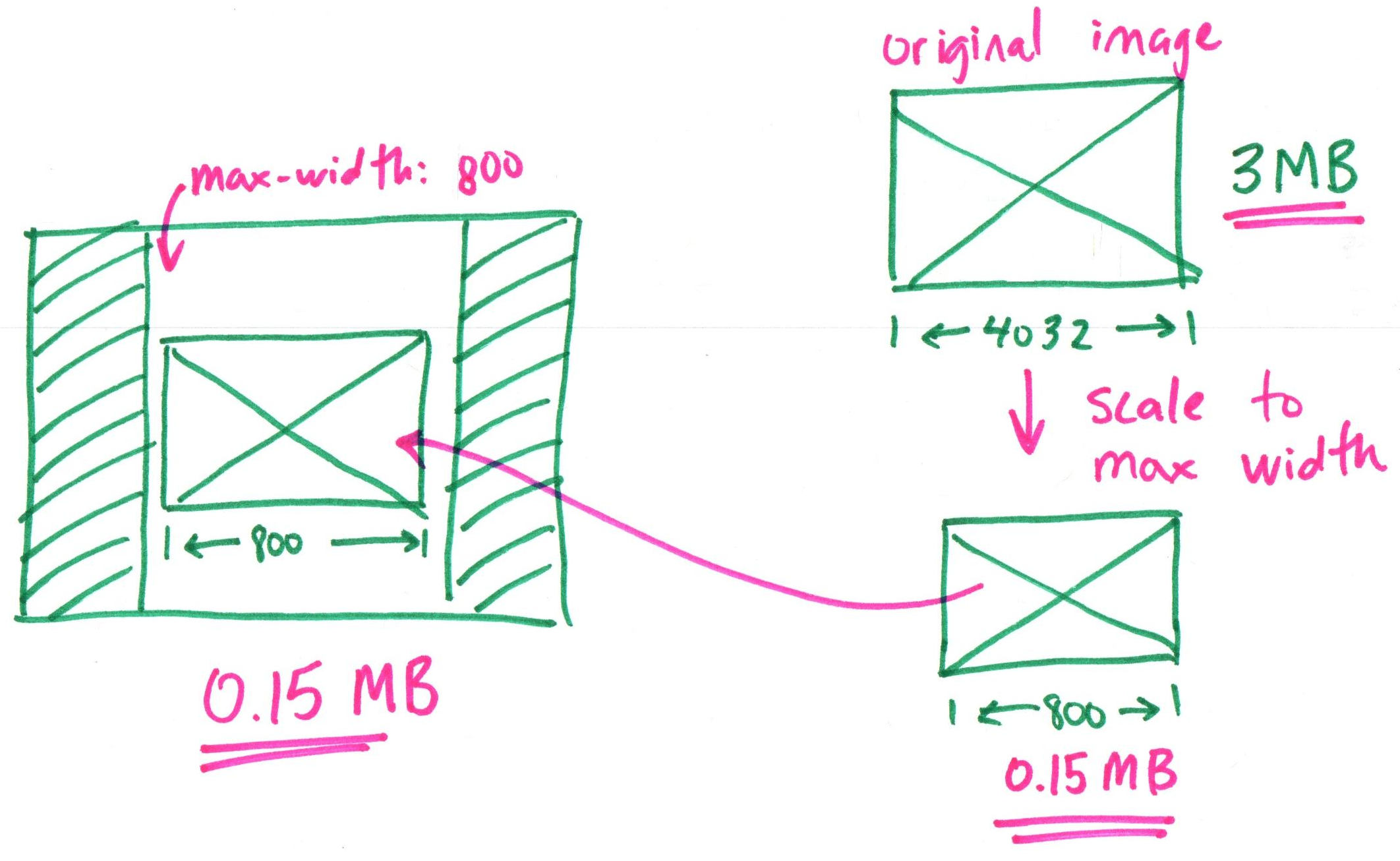
† Twice the maximum size is needed for high-resolution displays (e.g. Retina).
Gotcha: High Resolution Displays
Your images need more pixels to look crisp on high-resolution displays.
Rule of Thumb: Scale your raster images to double the maximum size needed for your design. (Assume your users have high-resolution displays.)
Example: If your design requires an image 800 pixels wide, you need to scale the image to 1600 pixels wide for high-resolution displays.
Why? High-resolution displays (e.g. Retina) have more pixels in the same physical space.
Resize vs. Scale
Resize $=$ Download the original file, then "shrink" it with CSS.
(Same file size)
Scale $=$ Shrink the image file size to the maximum size needed.
(Smaller file size)
Why Scale Raster Images?
Scaling reduces the bandwidth needed to transmit the image file to the user's computer. Resizing does not.
Scaling improves the user experience of your website on slow or unreliable internet connections.
Rule of Thumb: The less data transmitted, the faster the website will load. Faster loading improves usability.
Gotcha: Only Raster Images Can Be Scaled
PNG, JPG, GIF, and WEBP files are raster images. Raster images have a "grid" of pixels that define the image.
Scaling a raster image file creates a smaller grid of pixels. A smaller grid of pixels takes up less space thereby reducing the image file size.
Gotcha: Vector Images Cannot Be Scaled!
You cannot scale vector image files (i.e. SVG) to reduce their file size.
Because vector images are defined by mathematical equations, we cannot "shrink" the file size any further. (There is no grid of pixels to shrink.) Simply use CSS to resize the image!
How to Scale Image Files
-
Open a raster image file in an image editor.
PNG, JPG, GIF, WEBP files only! (You cannot scale SVG files.)
-
Resize the image to the twice the maximum size you need for your design.
-
Save the image as a new file.
-
Use the scaled image file in your website.
Activity: Scale Image File Practice
-
Open a photo that you've taken with your phone in an image editor.
-
The maximum width needed in the design is 800 pixels. Scale the image file.
-
Save the image as a new file.
-
Compare the original file size to the scaled file size.
Example: Scaled Image File

Summary: Responsive Design
- Design for device characteristics, not specific devices.
- Screen Width
- "Clickable/Tapable" Area
- Readability
- Medium (Screen/Paper)
- Content should be the same regardless of the device.
- Use common user interface design patterns.
- Use vertical scrolling; no horizontal scrolling
- Navigation bar/menu
- Footer
- Scale raster images files. (Not SVG)
What's Next
Homework 6 released today
Wednesday: Responsive Break Points