INFO 1300: Responsive Breakpoints & Principles of Visual Design
Class 11: Responsive Breakpoints & Visual Design Principles
- Responsive Design
- Responsive Breakpoints
- Visual Design Principles
Copyright 2026, Kyle J. Harms
Review: Responsive Design
A design that responds to the needs of users and the devices they are using.
Your website's design should respond to the user's screen width.
Use the available screen space to optimize content usability.
Don't design multiple websites (i.e. mobile and desktop) or for specific devices (i.e. iPhone 17).
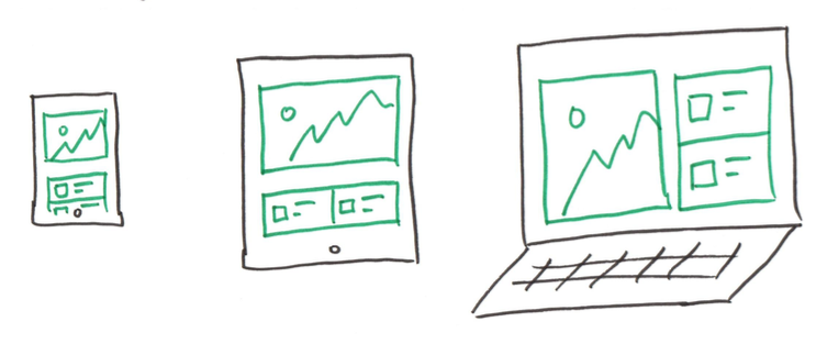
Responsive Design Considerations
Coding Responsive Design
-
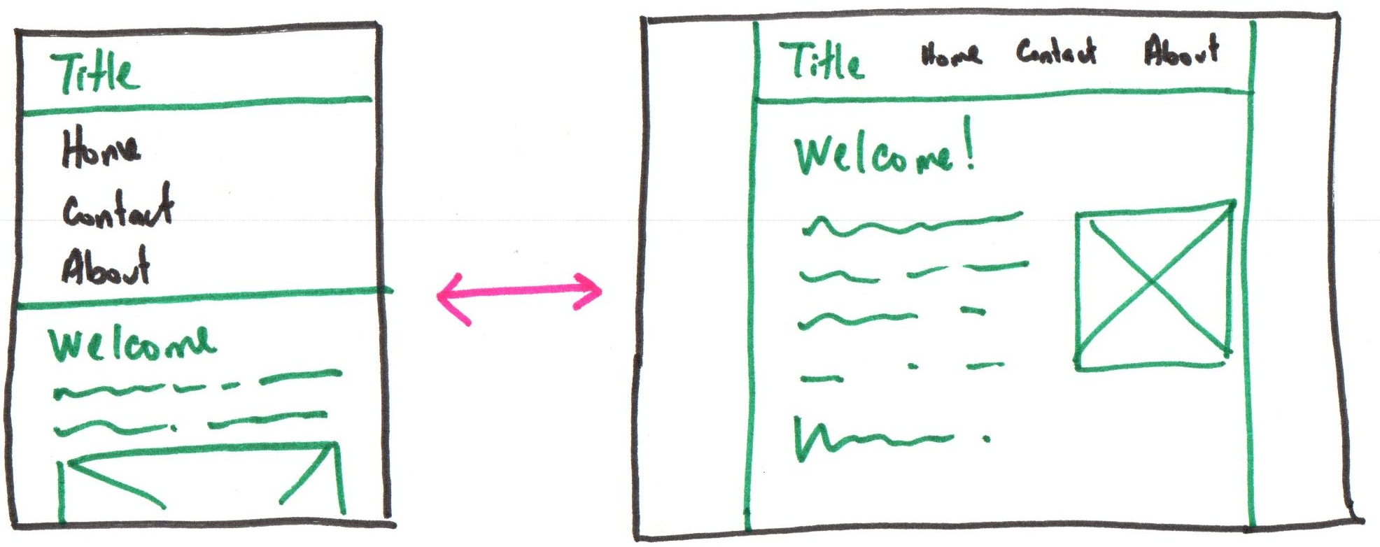
Design (sketch) your site for both narrow and wide screens.
-
Structure your content with HTML.
-
Style your site's theme in CSS.
-
Use responsive methods to implement the site's layout in CSS.
- relative dimensions (e.g.
width: 100%) - min/max widths (e.g.
min-width: 375px; max-width: 800px) - flexbox (e.g.
flex-direction: row) - media queries (Next class)
- relative dimensions (e.g.
-
Test responsiveness by resizing the width of the browser's window.
Example: Narrow and Wide Sketch
Readability
Ensure content is legible and easily read by the audience.
Usability:
- Avoid small fonts
16 point is a good choice (nothing smaller than 12pt). - Lines of text should be between 50-80 characters.
(~5 or 6 inches)
p {
  font-size: 16px;

  width: 100%;
  min-width: 375px;
  max-width: 600px; /* About 6 inches */
}
1 inch $\approx$ 96px
Order
Usability: Present content in the order that best meets your audience's goals.
Most important content should be first (often top-left).
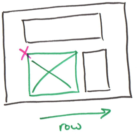
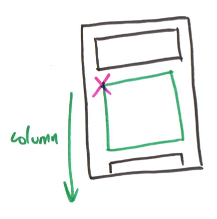
Tip: Re-Order Flexbox Children
order: 1; /* move child first */
order: 2; /* move child second */
flex-direction: row-reverse;
flex-direction: column-reverse;
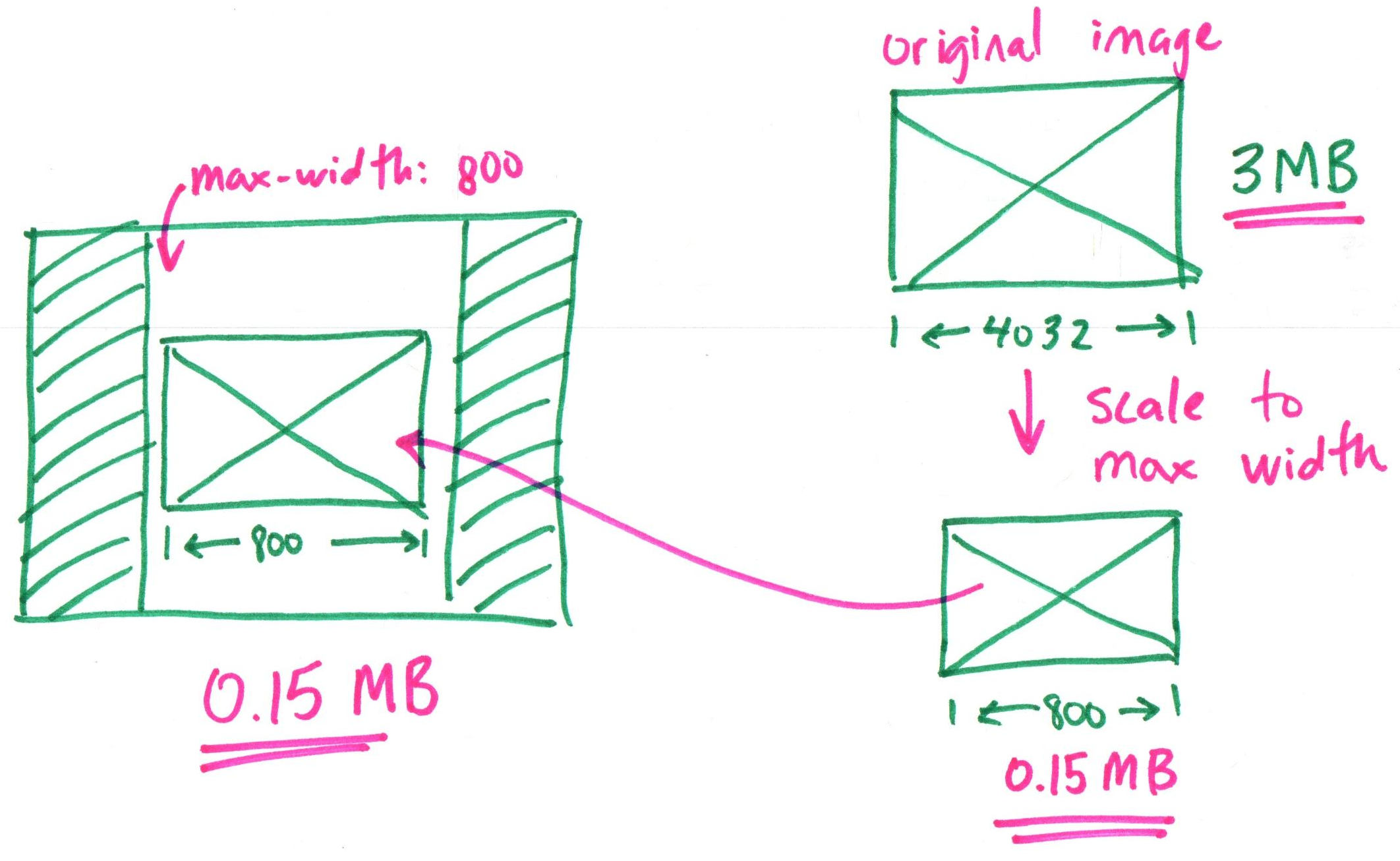
Bandwidth – Scale Raster Image Files
Shrink raster image files to twice the maximum sized needed for the design.
Responsive Design
–
Responsive Breakpoints
How to "Think" About Responsive Design
-
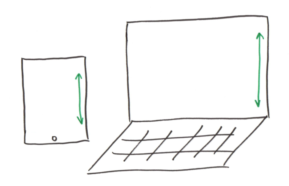
Width is often the limiting factor in our designs
- Websites typically scroll vertically.
- We have as much vertical space as we need!
-
Design to optimize content usability for the available width.
(not the device or screen height)
Optimizing Content Usability – Does it Fit?
Sizing content in responsive design:
Goal: Keep content readable and usable.
Ask yourself: "Is the content usable at this width?"
Not too big, not too small.
Tip: If the screen width doesn't lend to usable content, change the arrangement of the content so that it is usable.
Optimizing Content Usability – Does it Fit?
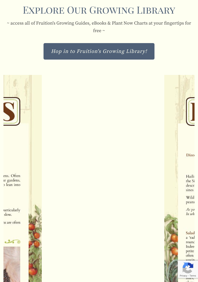
Sizing content in responsive design:
Goal: Keep content readable and usable.
Ask yourself: "Is the content usable at this width?"
Not too big, not too small.
Tip: If the screen width doesn't lend to usable content, change the arrangement of the content so that it is usable.

Demo: Responsive Breakpoints
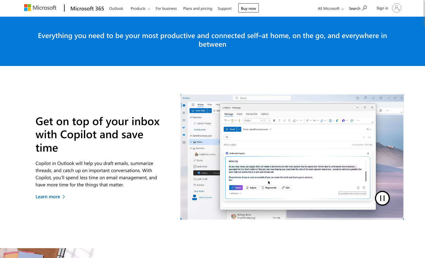
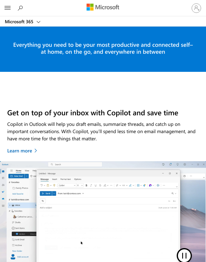
Always usable content – design adapts to the available space.
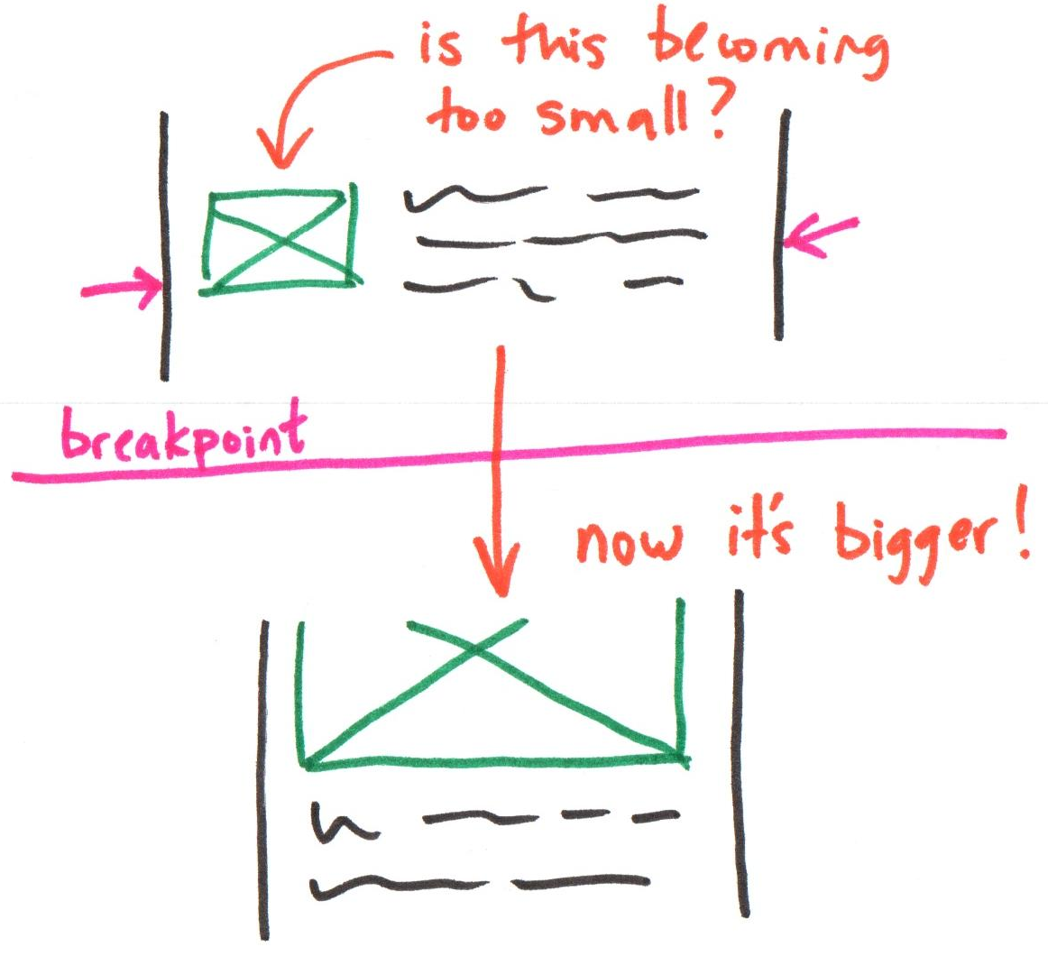
Responsive Breakpoint
The screen width when the design needs to adapt because the content will become unusable.
Is the text too narrow or too wide to easily read?
Is the image becoming too small or too big?
Activity: Responsive Design & Usable Content
Working with a peer:
- Open the activity website.
- Slowly resize the browser window from wide to narrow.
- Discuss with your partner:
- At what point does the content begin to become unusable?
- Use the Developer Tools, identify the width of the browser window at this point. Document each breakpoint on your handout:
- Problem with the content
- Width of the browser window
- Remedy to make the content usable
Review: Responsive Breakpoint
The "moment" at which a website's content and design will adapt to provide the best possible user experience.
Tip: When the content is no longer usable, you need a breakpoint to adapt the design.
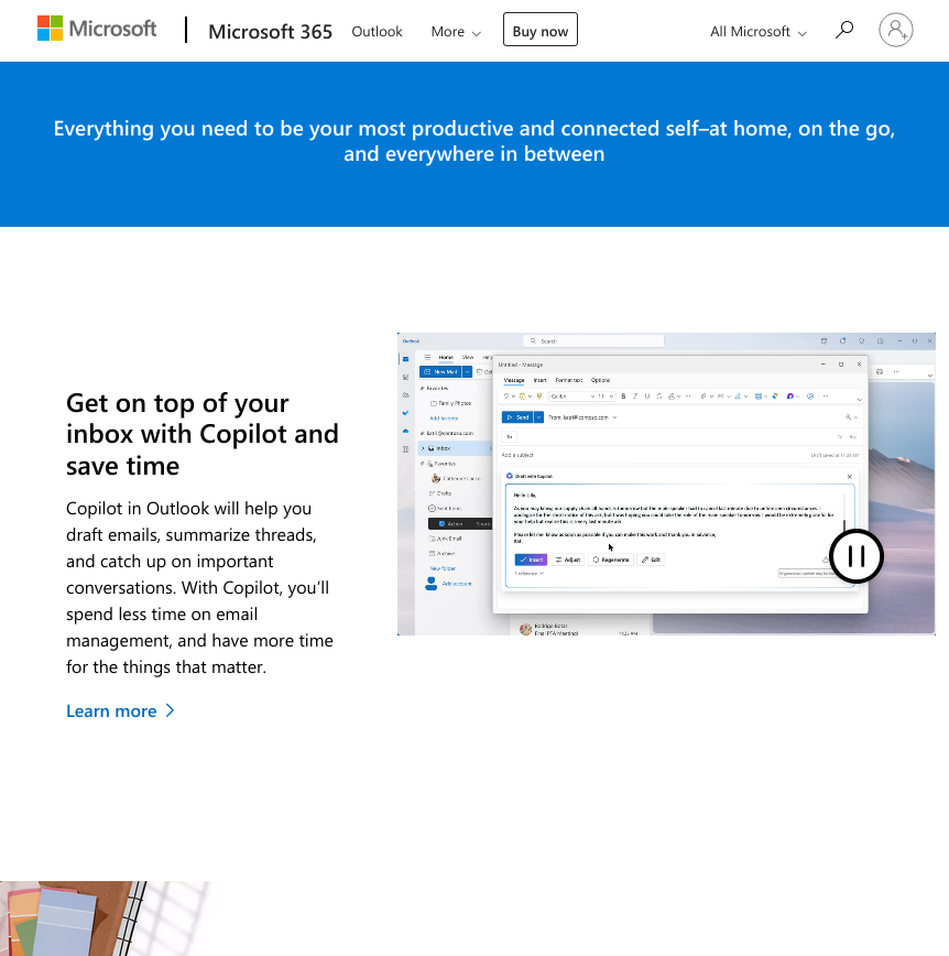
Example: Responsive Breakpoints
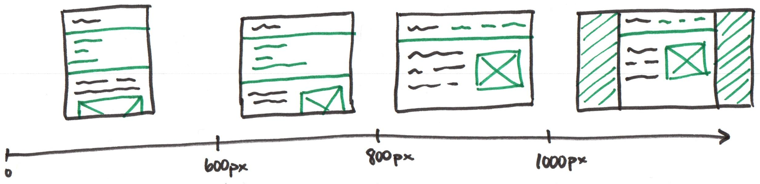
Note: These are just example breakpoints. Let your content determine your site's breakpoints.
Selecting Responsive Breakpoints
There are no "standard" mobile or desktop breakpoints.
Let your content determine your site's breakpoints.
Keep the content a usable width – not too small, not too big.
➜ If the content gets too small, you probably need a breakpoint.
➜ If the content gets too big, you probably need a brekpoint.
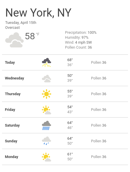
Discussion: Content Usability Critique – Narrow
Is the content usable?
Critique the usability of this site's content.
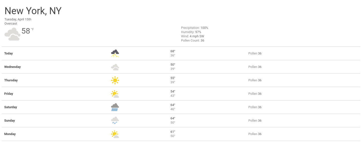
Discussion: Content Usability Critique – Wide
Critique the usability of this site's content.
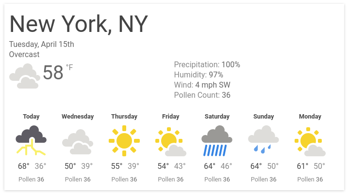
Activity: Redesign the Weather Website
On the back of the handout, design (sketch) the weather website for wide screens.
Employ the visual design principles in your design.
Example/Demo: Responsive Design
Visual Design Principles
Visual Design Principles for Web Design
- Color, Contrast
- Proximity
- Alignment
- Hierarchy
- Repetition & Consistency
Color, Contrast
Contrast: The interaction between the foreground (text) and background.
Insufficient contrast can make your text less readable.
Tip: When in doubt, lighten your light and darken your dark.
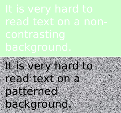
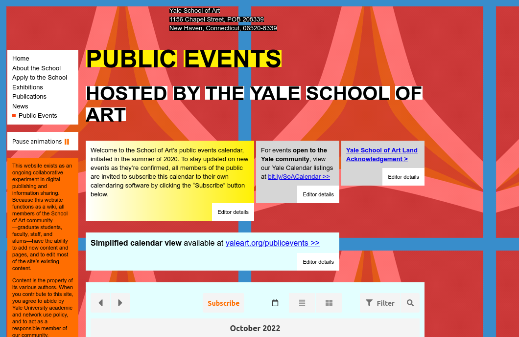
Poor Contrast: Text Over an Image

Proximity
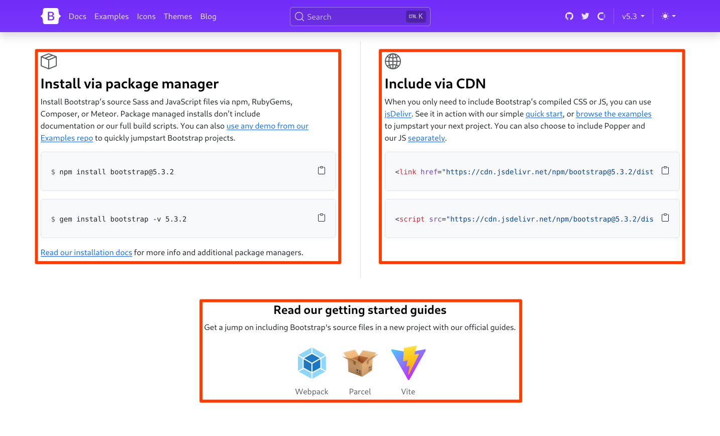
The distance between elements communicates their relationship
Usability: Elements closer together appear related; elements further apart appear less related
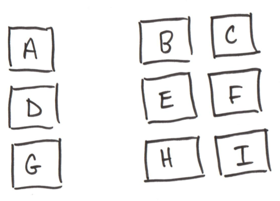
Check: Which elements are related to one another?
Discussion: Bootstrap – Proximity
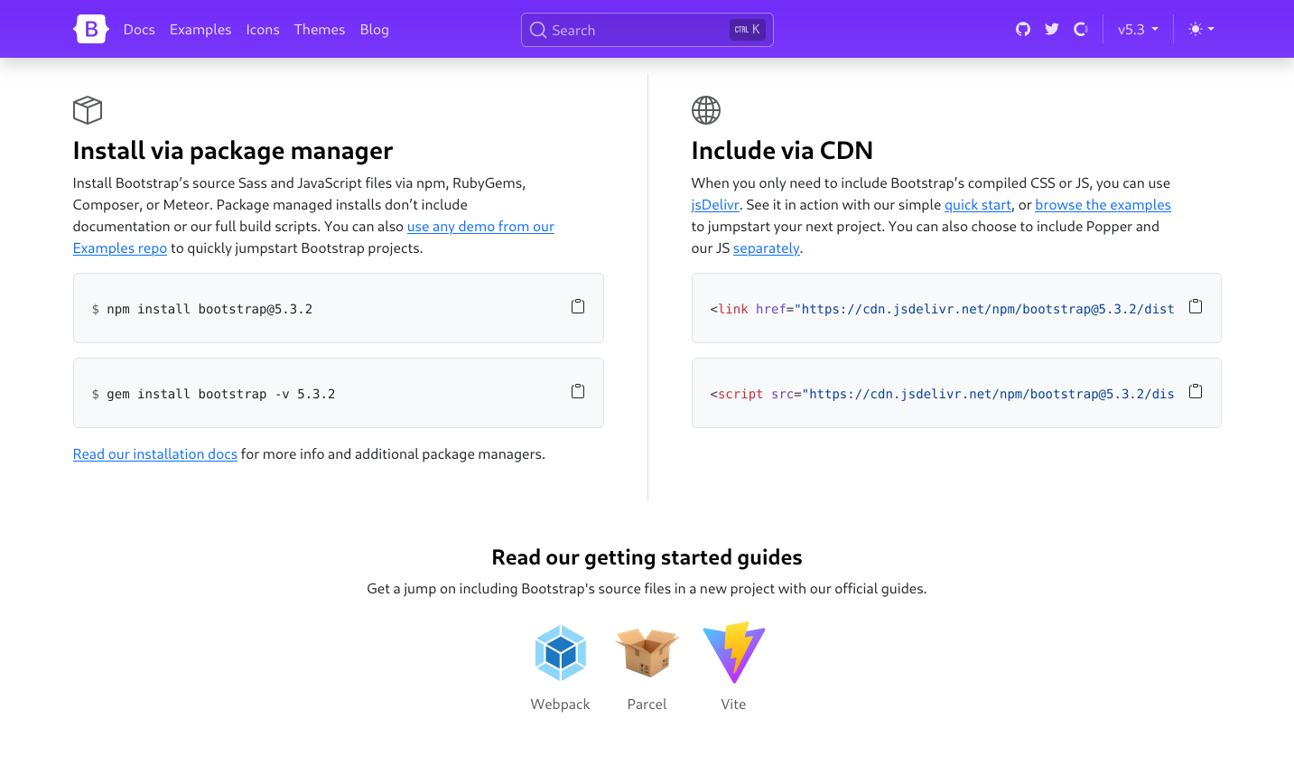
Example: Bootstrap – Proximity
Alignment
The placement of elements so that they line up in the composition (layout.)
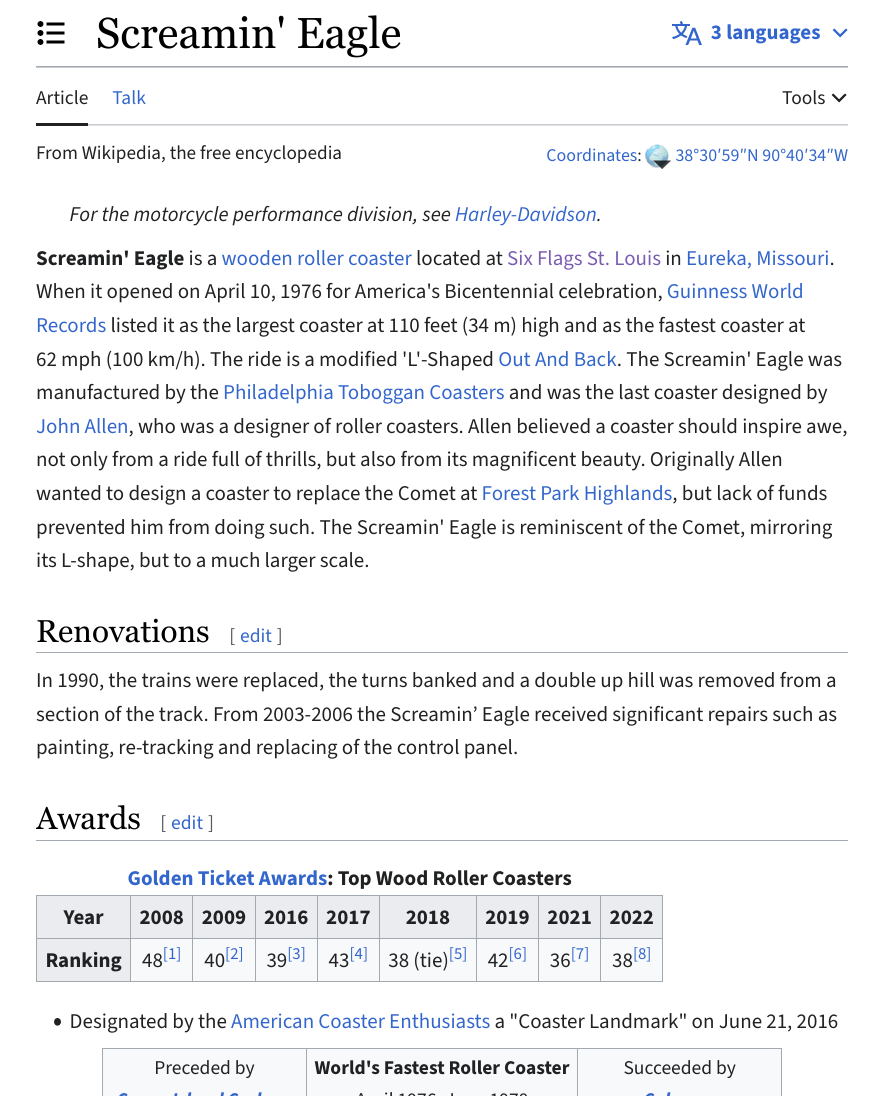
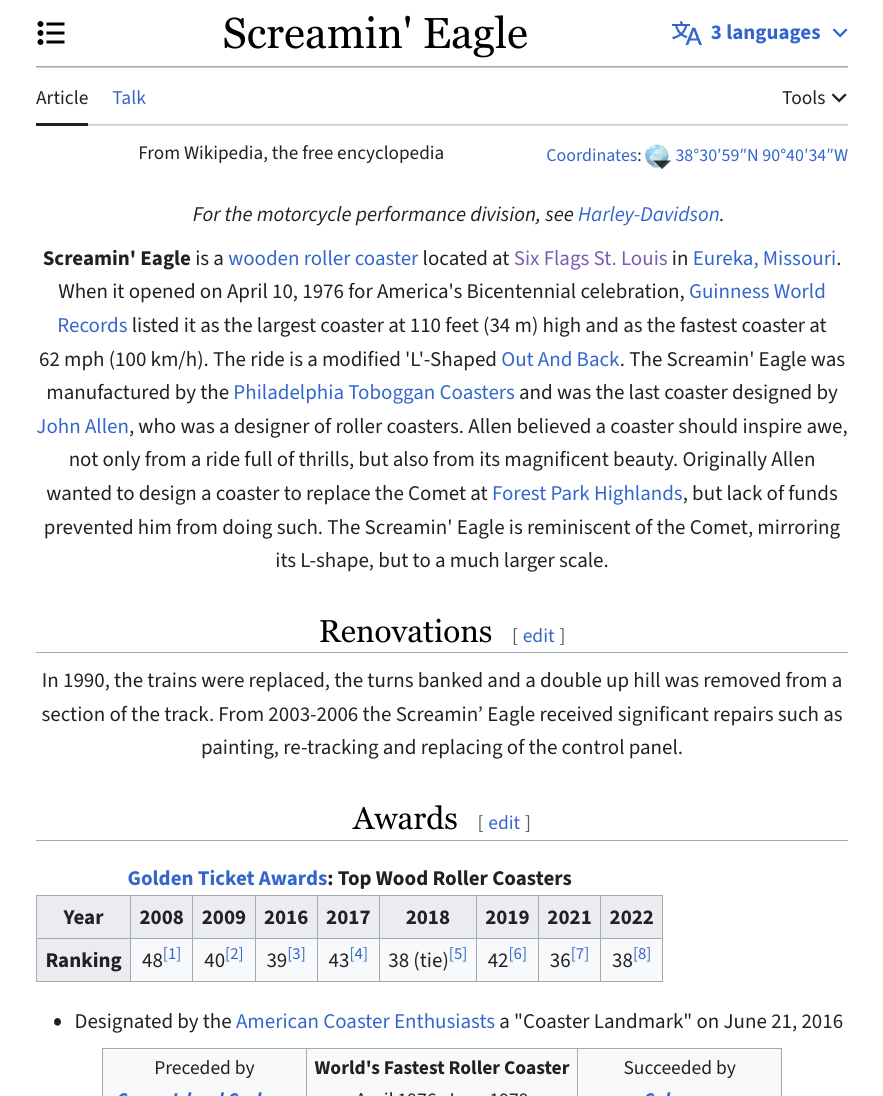
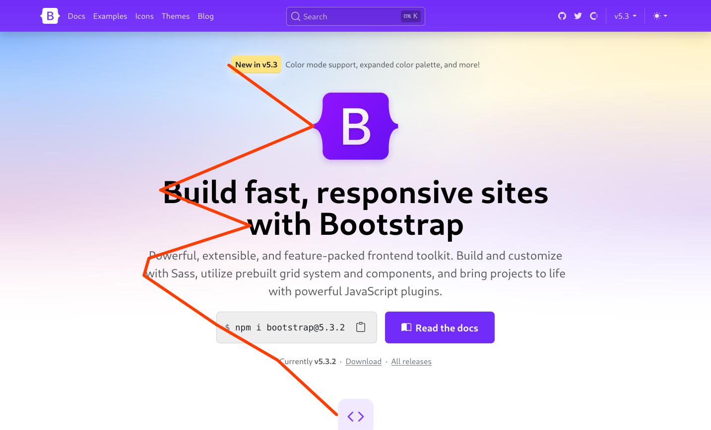
Usability: Alignment guides the user's eye through the design
Tip: We noticed patterns. Avoid slight misalignments.
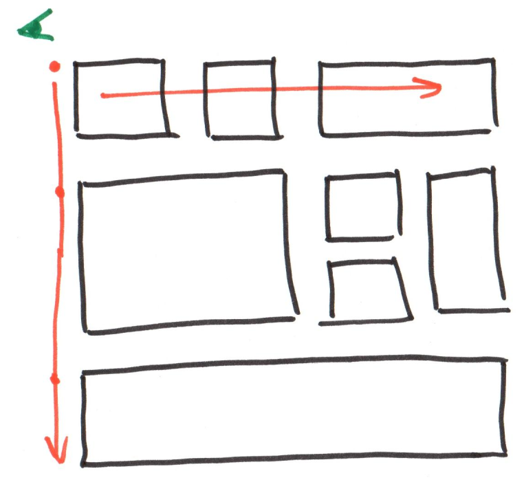
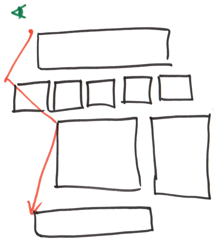
Example: Usable Alignment
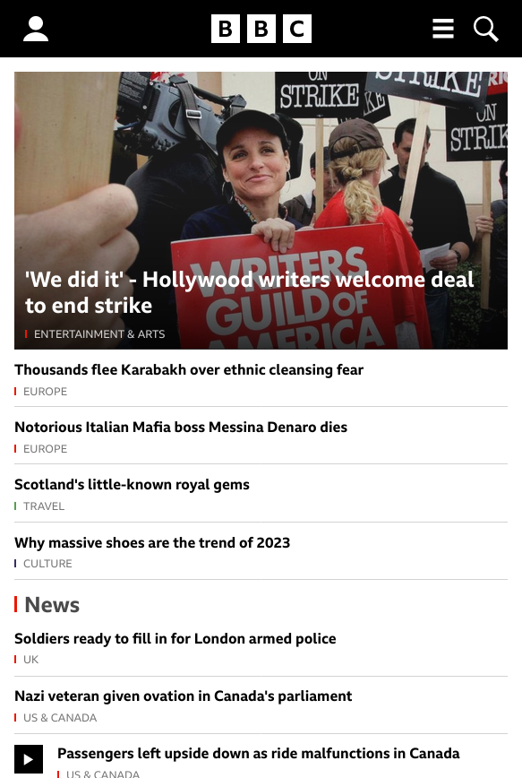

Example: Usable Alignment
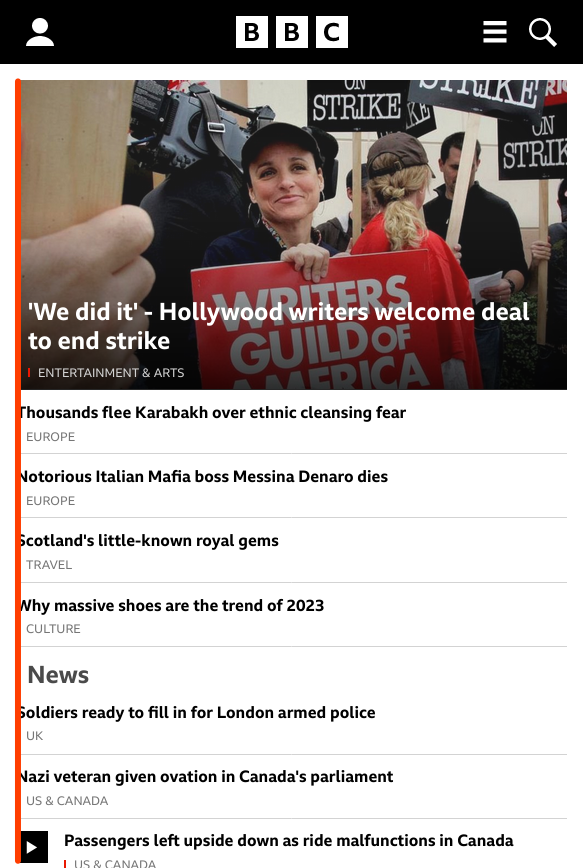
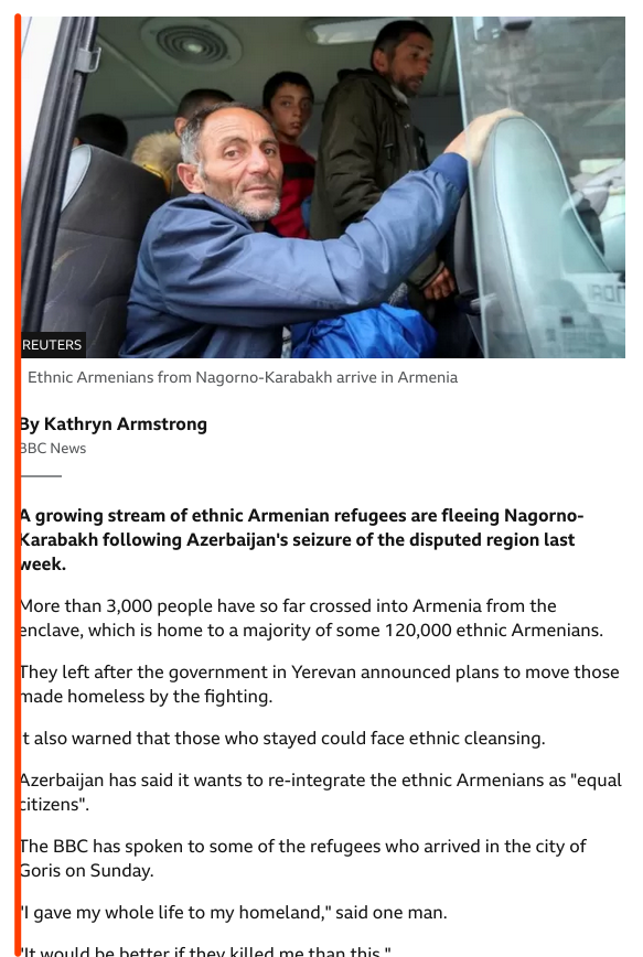
Activity: Which is Easier to Read?
Example: Center Alignment – Less Usable
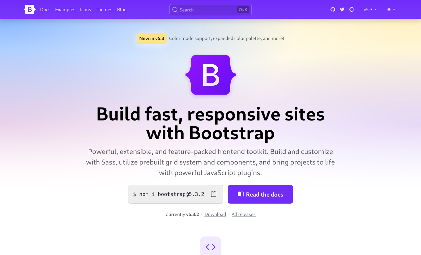
Example: Center Alignment – Less Usable
Hierarchy
The scale of elements communicates importance.
Usability: Small / Large; scale communicates importance.
Tip: Headings should be larger than the paragraph text under the heading.

Example: Hierachy

Repetition & Consistency
Repeat visual elements in pages and across pages. Provide a consistent experience across pages.
Usability: Similar design indicates that user is on the same website.
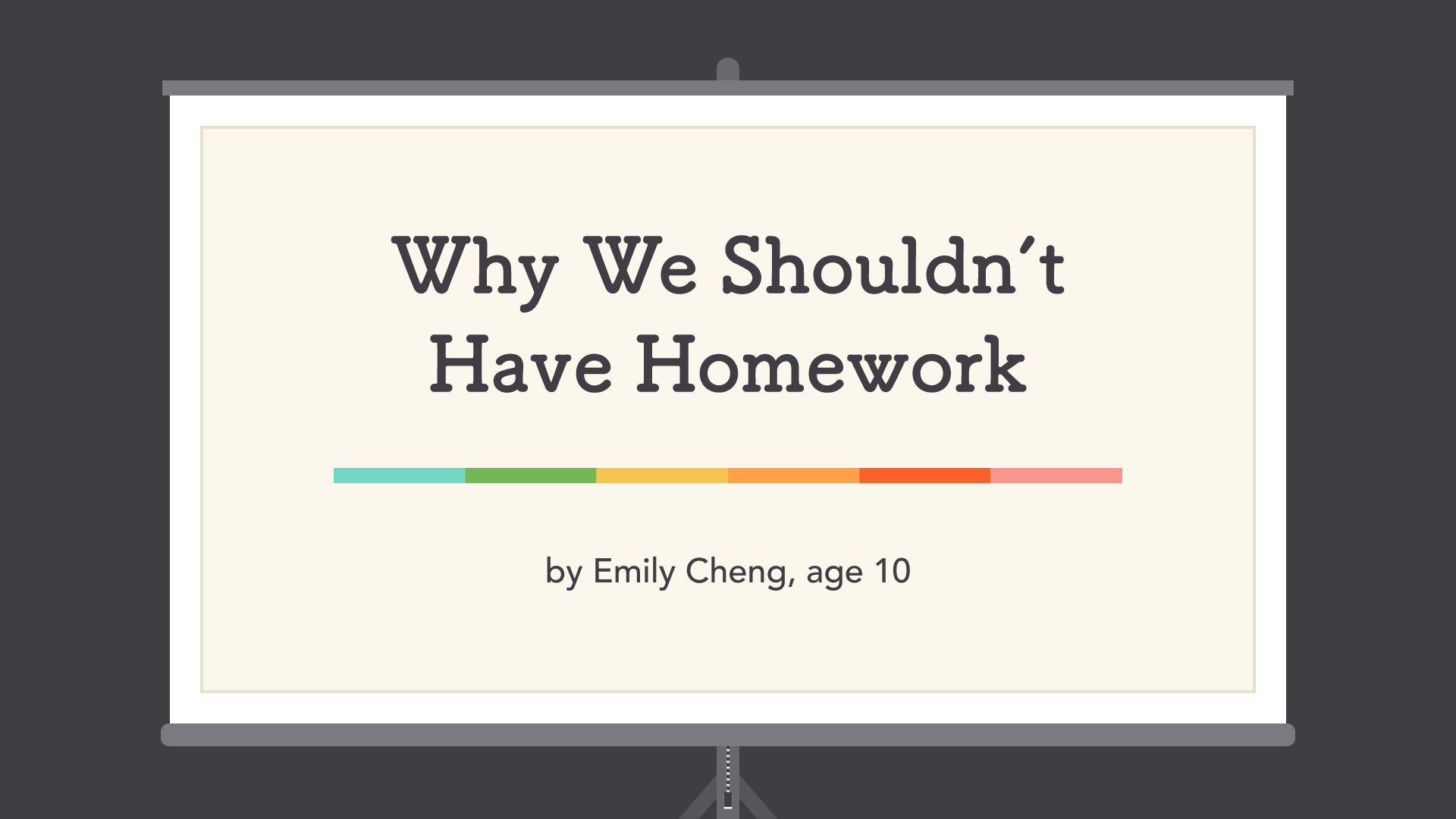
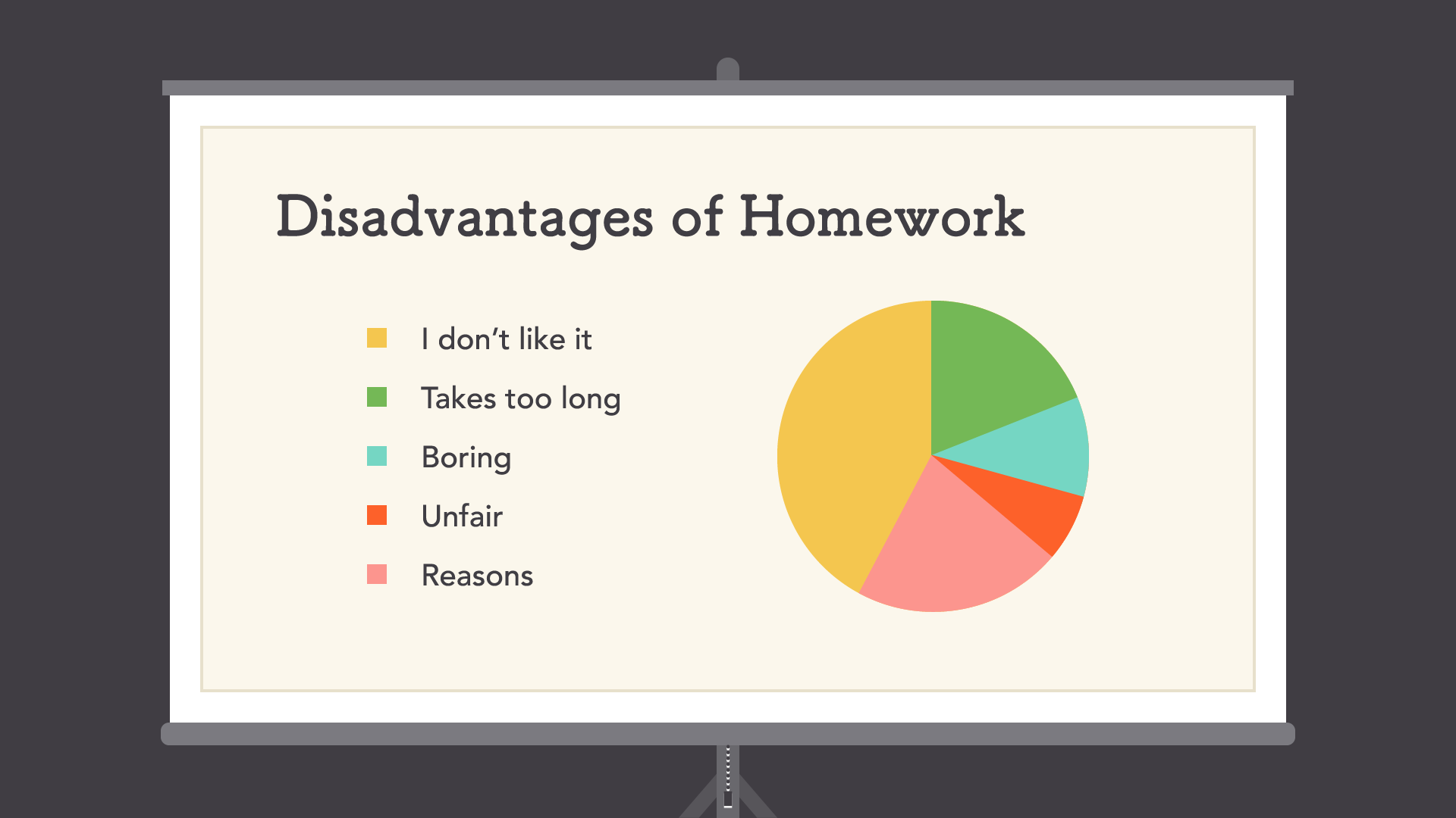
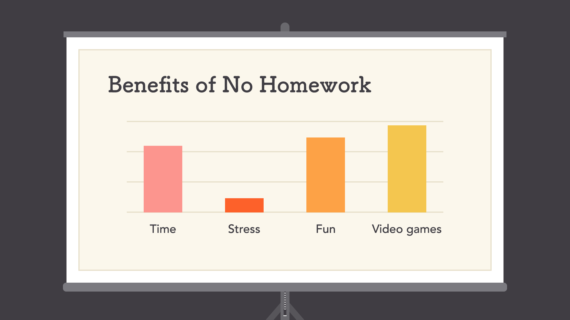
Source: https://edu.gcfglobal.org/en/beginning-graphic-design/layout-and-composition/1/
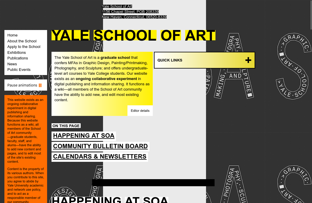
Example: Poor Repetition & Consistency
What's Next
Thursday: Study Session in CIS Ramble 5pm - 6pm
Friday: Practice Quiz 4
Monday: Homework 6 Due