INFO 1300: Responsive Methods - Media Queries
Class 12: Responsive Methods – Media Queries
- Reminder: Recording in Class
- Review: Responsive Breakpoints
- Responsive CSS – Media Queries
Copyright 2026, Kyle J. Harms
Reminder: Recording in Class
You may not record or take photographs during class without the explicit permission of the instructor.
Source: Course Syllabus
Do not record or take photos during class without the explicit permission of the instructor. Recording someone without their permission is an invasion of their privacy; please respect the privacy of your peers and the course staff.
Source: Course Attendance & Absences Policy
University Policy: Recording in Class
The openness and privacy of classroom discussions is essential to Cornell’s traditions of open inquiry and freedom of learning, which include the right to explore, experiment, try out ideas, debate, and change one’s mind in the relative openness and safety of the classroom environment. Students are not permitted to record classroom lectures and discussions, in whole or in part, or related instructional spaces like laboratories or studios, without the prior written permission of instructors. Unauthorized recording is a violation of academic integrity.
Source: Code of Academic Conduct
University Policy: Doxxing
Cornell community members should respect others’ rights to keep their personal information private.
Source: Cornell University Anti-Doxxing Policy
Classroom Wi-Fi
Connect only to eduroam.
Delete connections to Cornell-Visitor and RedRover.
Activity: Codespace Usage
Github Education benefits provide 20GB/hr per month of Codespace usage.
Each codespace is ~2GB.
Every codespace you have, goes against your 20GB/hr per month limit, even if you're not actively using it.
If you don't need a particular codespace, delete it to free up your usage for other codespaces: https://github.com/codespaces
Review
Review: Responsive Design
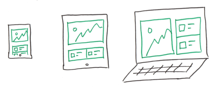
A design that responds to the needs of users and the devices they are using.
Your website's design should respond to the user's screen width.
Use the available screen space to optimize content usability.
Don't design multiple websites (i.e. mobile and desktop) or for specific devices (i.e. iPhone 17).
Review: Responsive Breakpoint
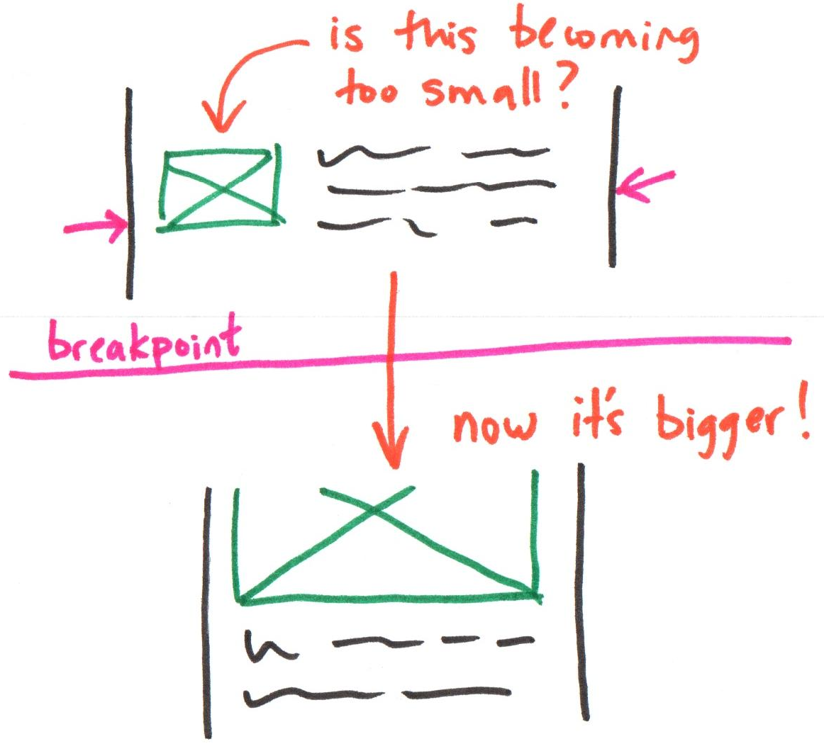
The screen width when the design needs to adapt because the content will become unusable.
Is the text too narrow or too wide to easily read?
Is the image becoming too small or too big?
Review: Responsive Breakpoints
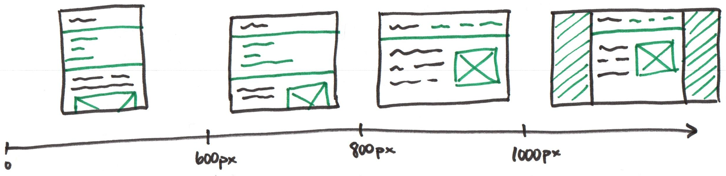
Note: These are just example breakpoints. Let your content determine your site's breakpoints.
Activity: Non-Responsive Design
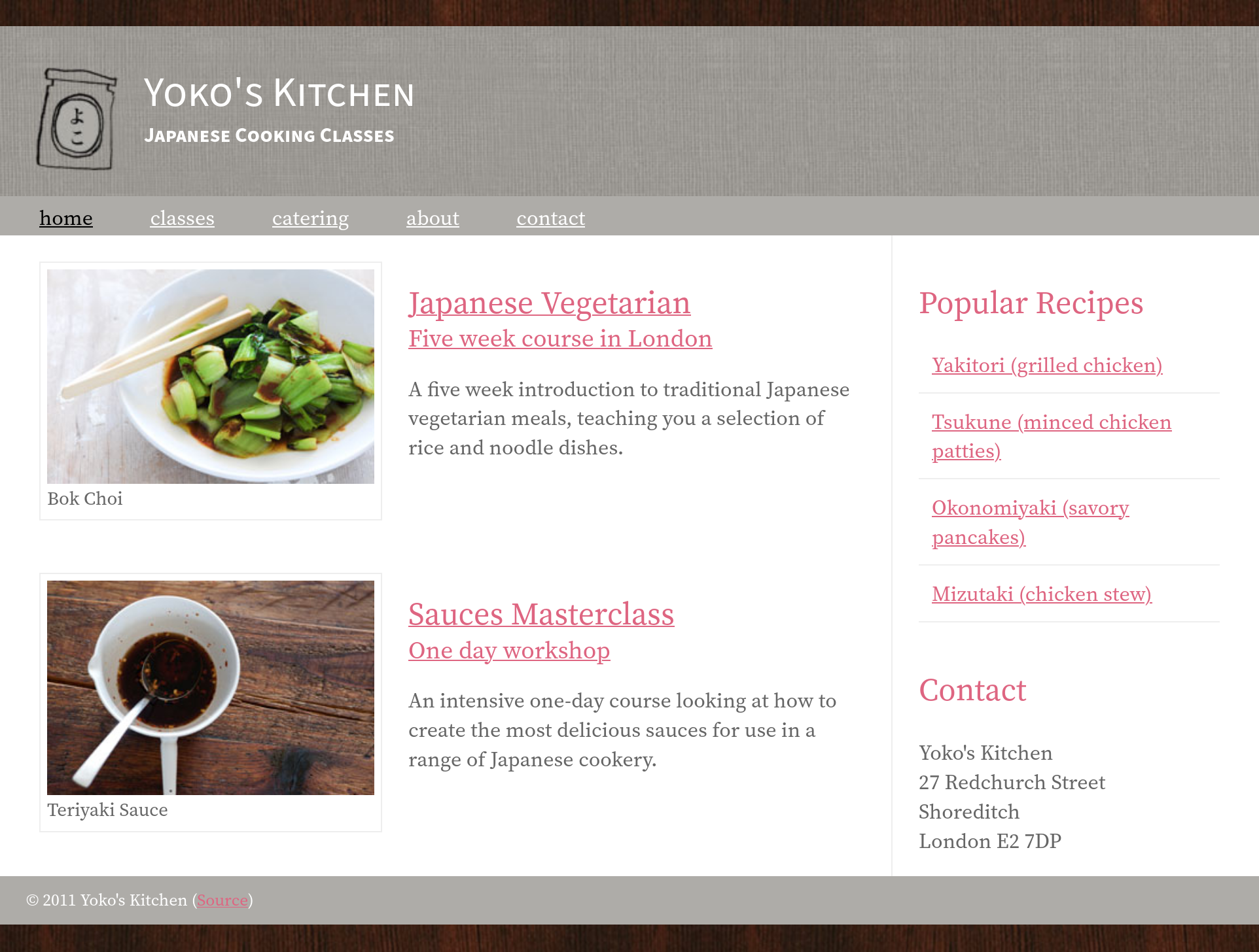
Raise your hand when you observe a responsive breakpoint.
Responsive Web Design Methods
Responsive web design isn't a separate technology — it is a term used to describe an approach to web design or a set of best practices, used to create a layout that can respond to the device being used to view the content.
Source: Mozilla
- Relative Dimensions – fill the available space
- Min/Max Widths – content that's a usable size
- Flexbox – stack content or side-by-side layout
- Media Queries – CSS (e.g. layout) for specific conditions (e.g. browser width)
Review: Relative Dimensions
Use relative dimensions to fill the available horizontal space.
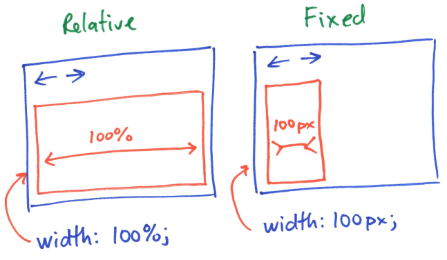
Relative dimensions are flexible across screen widths.
Review: Usable Content Dimensions
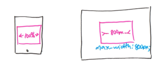
width: 100%;        /* Fill the available horizontal space */

min-width: 200px;   /* But don't let things get too small */
max-width: 800px;   /* Or get too big */
Class Activity: Responsive Methods – Part I
-
Raise your hand when you observe that the content is becoming unusable and a responsive breakpoint is needed.
-
Complete Part I on your handout.
Activity: Responsive Methods – Part I
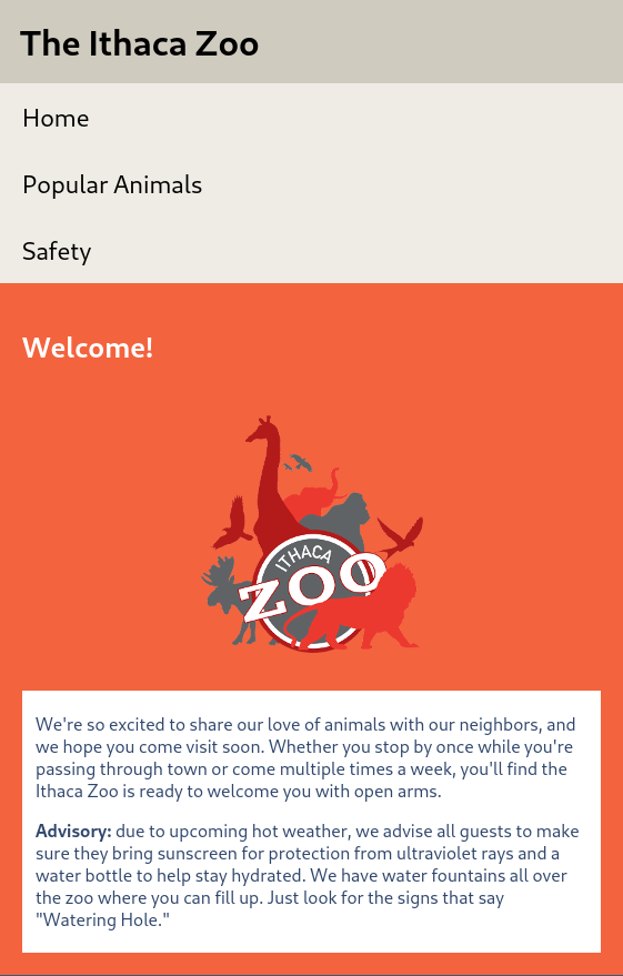
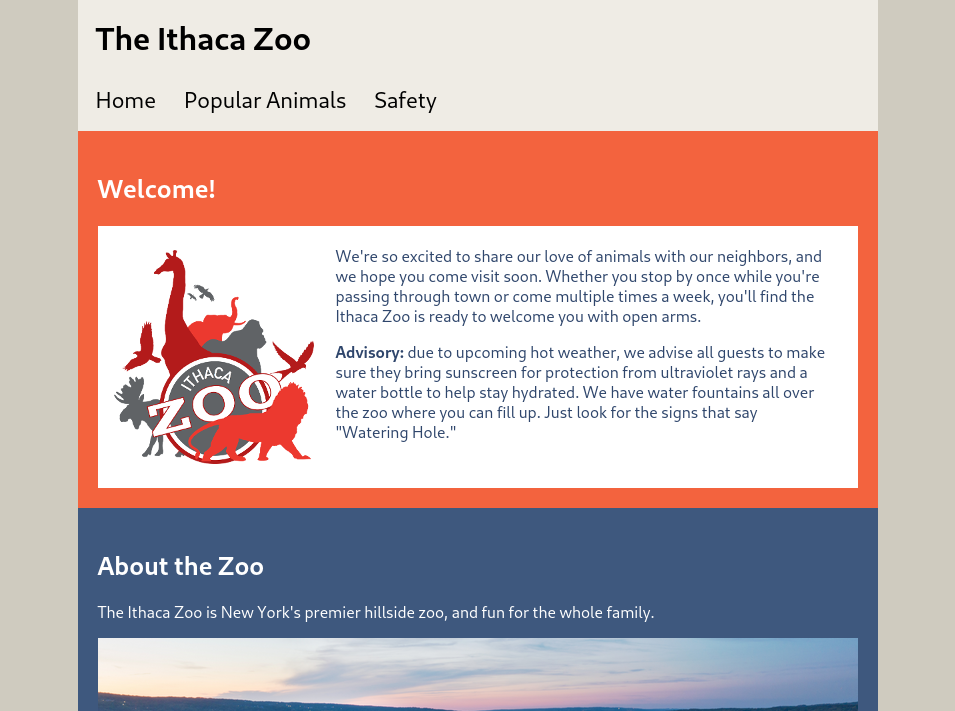
Demo: Responsive Methods – Part I
Media Queries
CSS for different screen widths
(and other device characteristics)
Media Queries
Think: Conditional CSS Rules...
Media Query: A CSS rule to adapt the presentation of the site based on various device characteristics, like width.
Common device characteristics: width, pointer precision, dark mode, and print.
CSS Media Queries
These breakpoints are the responsive breakpoints in your design.
@media BREAKPOINT {
    /* CSS for this breakpoint */
}
When "breakpoint condition" is true, the CSS located inside the media query is activated!
Note: Not all responsive breakpoints need a media query.
(i.e. min-width, max-width, etc.)
Activity: Media Query
body {
  background-color: black;
  color: white;
}

/* media query for print media */
@media print {
  body {
    background-color: white;
    color: black;
  }
}
What does this media query do?
How does the site adapt to the characteristics of the device?
On screen the site has white text on a black background. When printing, the site uses black text on a white background.
Media Queries – Breakpoints
Width Breakpoints
@media (min-width: FIXED_DIMENSION_A) {
  /* width is at least A (≥ A)*/
}

@media (max-width: FIXED_DIMENSION_B) {
  /* width is at most B (≤ B)*/
}

@media (min-width: FIXED_DIMENSION_A) and
  (max-width: FIXED_DIMENSION_B) {
  /* width is between A and B */
}
Example
@media (min-width: 360px) {
  /* Activate this CSS when
     width ≥ 360px */
}

@media (max-width: 500px) {
  /* Activate this CSS when
     width is ≤ 500px */
}
Example: Media Query Breakpoint(s)
Media Queries: Set the Viewport
Inside every HTML file:
<head>
  <meta name="viewport" content="width=device-width,initial-scale=1">
</head>
This meta tag tells mobile browsers that they should set the width of the viewport to the device width, and scale the document to 100% of its intended size, which shows the document at the mobile-optimized size that you intended.
Why is this needed? Because mobile browsers tend to lie about their viewport width.
Organizing CSS with Media Queries
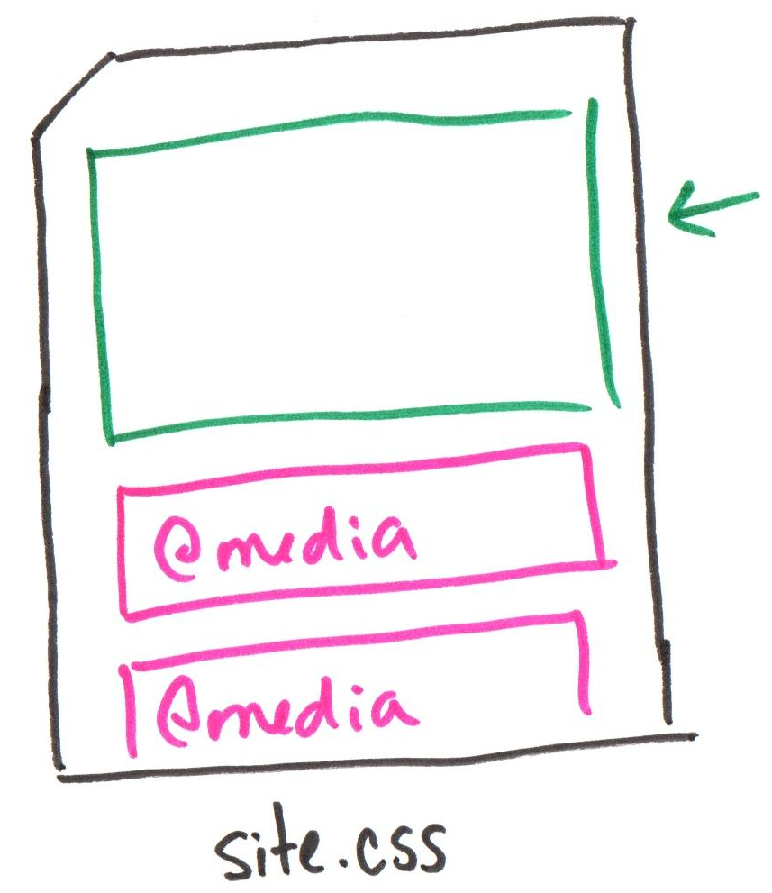
Write all your CSS for one screen width first (without media queries; no breakpoint), then add media queries to support other screen widths (breakpoints).
Example: In mobile-first development, write all your CSS for narrow screens (no media query), then add media queries for wider screens.
Activity: Responsive Methods – Part II
Complete Part II on your handout. Then implement the media query in your codespace.
@media (min-width: 360px) {
  /* Activate this CSS when
     width ≥ 360px */
}

@media (max-width: 500px) {
  /* Activate this CSS when
     width is ≤ 500px */
}
Tip: Test Media Queries
Change the background color to something loud (e.g. background-color: red;) to test that your media query is working.
@media (max-width: 500px) {
  body {
    background-color: red;
  }
}
Demo: Responsive Design & Media Queries
Coding Responsive Design – Testing
- Design (sketch) your site for narrow and wide screens.
- Structure your content with HTML.
- Theme your site using CSS.
- Use relative dimensions and media queries to implement the site's layout in CSS.
- Test your site's responsiveness by resizing the width of the browser's window.
Gotcha: Testing Responsiveness
✔️ Resize browser window
- Always accurate
- Great for checking responsiveness!
❌ Dev Tools: Responsive Design Mode
- Helpful for checking specific/popular devices
- Bad for testing usable content for all screen sizes
Demo: Testing Responsive Breakpoints
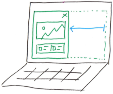
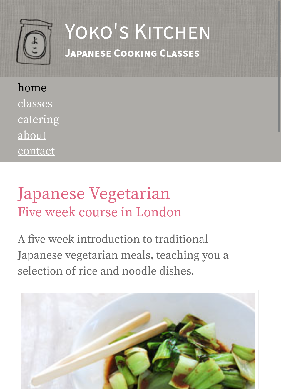
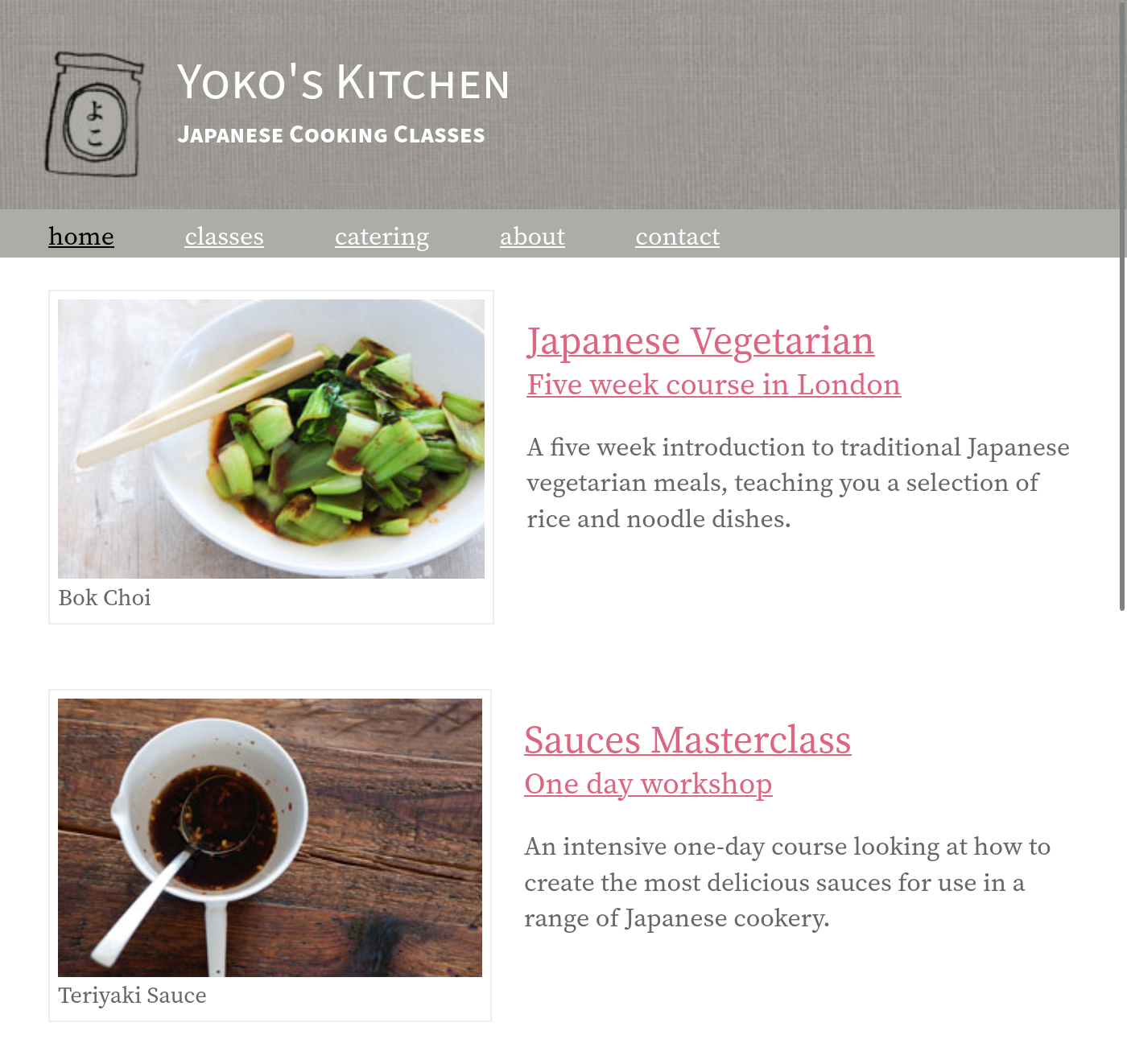
I'll resize the browser window to test responsiveness.
Gotchas
Gotcha: Overwriting CSS properties
Only overwrite the CSS properties that need to change at a breakpoint; don't repeat CSS properties that don't change.
Example: Default (No Breakpoint)
header {
  display: flex;
  flex-direction: row;
}
Example: Wide Breakpoint
@media (min-width: 700px) {
  header {
    flex-direction: column;
  }
}
Gotcha: There are no "Standard" Breakpoints
What breakpoints should I use for my mobile or desktop site?
There are no "standard" mobile or desktop breakpoints (though there are popular ones). Refer back to the "Responsive Design" lecture.
Let your content determine your site's breakpoints.
Tip: If some content isn't usable at a particular screen width, you might need a breakpoint to adapt the layout to make the content usable at that width.
Gotcha: You Don't Always Need a Media Query
Some responsive breakpoints need a media query, others don't.
Example: Framing the site's content only needs max-width;
no media query is needed to frame this website's content.
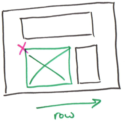
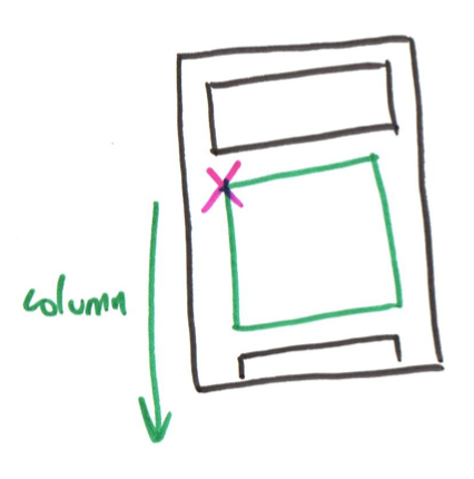
Gotcha: Re-Order Flexbox Elements
You don't need to change your HTML to change the order of flexbox elements.
@media (max-width: 500px) {
  .content-container {
    flex-direction: column;
  }

  picture {
    /* move the picture below the text */
    order: 2;
  }

  .text {
    /* stack text above the picture */
    order: 1;
  }
}
Gotcha: Invalid CSS
If your CSS is invalid, the browser may ignore your media query.
Validate your CSS!
Fix any validation errors, especially when you're having trouble with a media query.
What's Next
Homework 7 released today
Practice Quiz 5 Friday