INFO 1300: Designing Usable Static Interactivity
Class 18: Designing Usable Static Interactivity
- Review: CSS Grid Layout
- Static Client-Side Interactivity
- Common Interactivity Design Patterns
- Interactivity Design Principles
Copyright 2026, Kyle J. Harms
CSS Grid Layout
A two-dimensional layout container model.
.grid-container {
  display: grid;
  gap: 1em;
  grid-template-columns: 1fr 2fr 1fr;
}
<div class="grid-container">
  <div>1</div>
  <div>2</div>
  <div>3</div>
  <div>4</div>
  <div>5</div>
  <div>6</div>
</div>
Static Client-Side Interactivity
Static Client-Side Website Interactivity
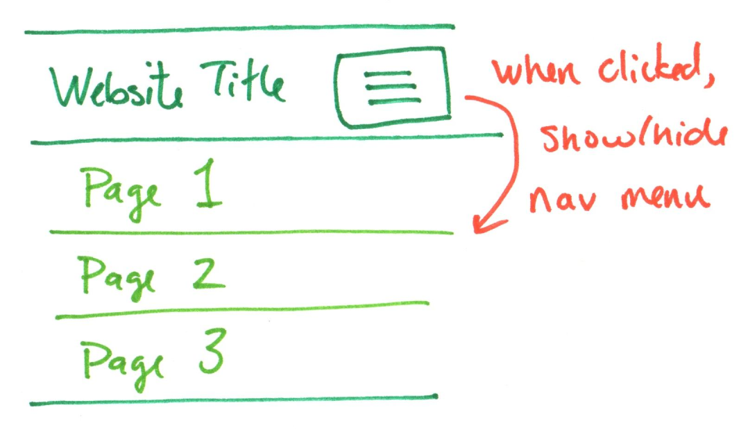
Changing the style of an existing website's content using client-side scripting (JavaScript) in response to the user's behavior. (No new content, HTML, CSS is loaded.)
Example:
When the user taps the "hamburger button", show/hide the existing navigation menu.
Example: Adaptable View Interactivity
Activity: Interactivity Design Patterns
Working with a peer:
-
Reflect:
What are some common interactivity design patterns you've seen?
-
Find an example (or two) of common interactivity design patterns.
Gotcha: Some Interactivity is Server-Side
Client-side interactivity changes the current web page using only the existing HTML, CSS, and JavaScript (static content).
Server-side interactivity sends additional requests to the web server to dynamically change the page (dynamic content).
Server-Side Interactivity
- Search
- Autocomplete
- Most filtering
- Infinite scrolling
- Shopping carts
- ...
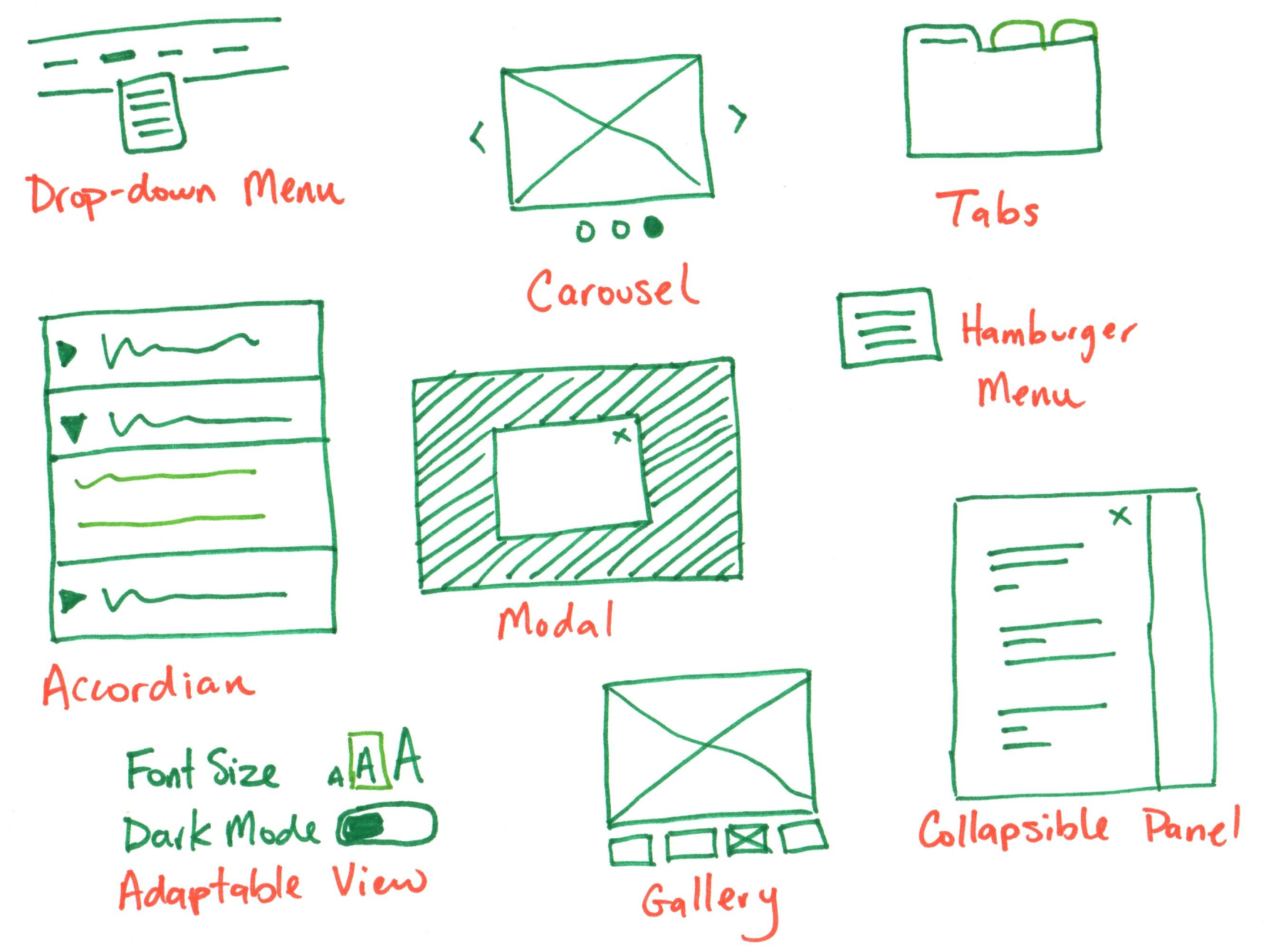
Client-Side Interactivity Design Patterns
Why Interactivity?
Your goal for the website: The site's audience is able to accomplish their goals.
Interactivity goal: Enhance the functionality of the website to assist users in pursuit of their goals.
Interactivity should enhance your audience's experience and help them accomplish their goals.
Activity: Interactivity Design Patterns
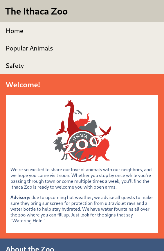
Discuss ideas for interactivity for the Ithaca Zoo website.
Hint: How might interactivity help you to utilize the limited screen space to enhance content usability?
Activity: Interactivity Design Practice
Design (sketch) interactivity for the Ithaca Zoo website on your handout.
Annotate your sketch to describe how the interactivity works. (e.g. when clicked/tapped, show/hide, etc.)
Example: Zoo Interactivity Ideas
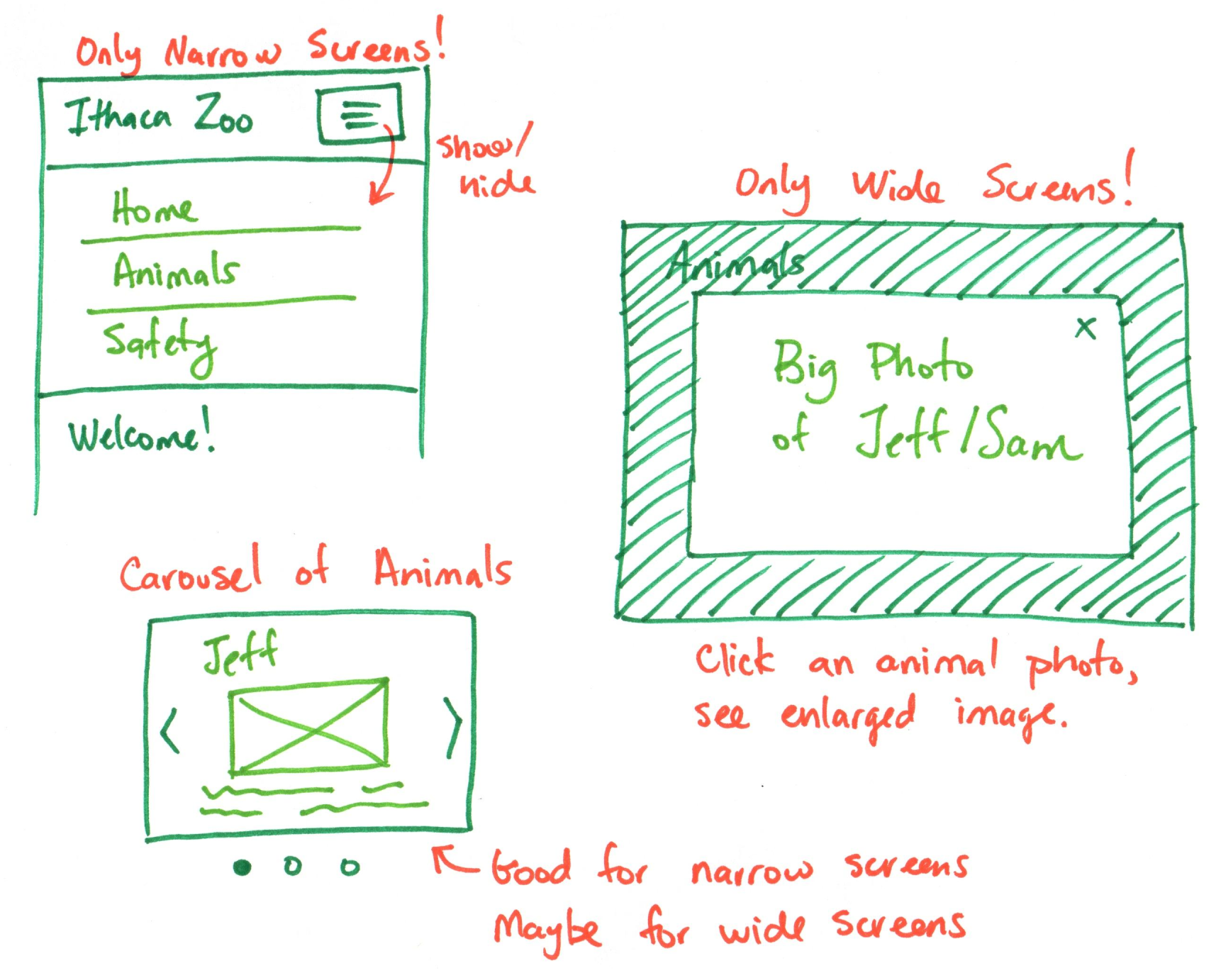
Gotcha: Non-Functional Interactivity
Don't use interactivity just because "you can!"
Avoid interactivity designed to "wow" or "impress." (e.g. scrolling backgrounds, flashy animations, etc.)
Avoid hiding content behind interactivity. Most content does not belong in a carousel or accordion.
Tip: Ask yourself, "if I were a user of this site, would I find this interactivity frustrating/annoying or helpful?" If your answer is helpful, you're probably on the right track!
Activity: Functional Interactivity Critique
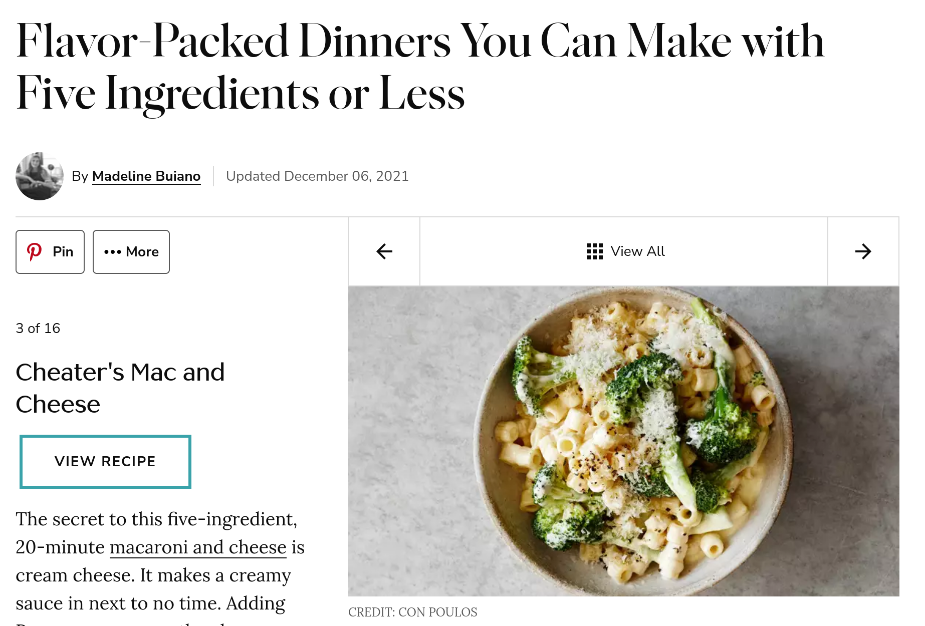
marthastewart.com previously used carousels for lists of recipes.
With a peer, critique the interactivity in regard to functionality.
Tip: "Is the interactivity frustrating/annoying or helpful?"
Tip: Functional Interactivity
Does the interactivity insert additional barriers to accomplishing the user's goals? For example, does the user need to click/tap many times to accomplish their goals?
Tip: Reduce the number of clicks/taps to accomplish a goal.
Activity: Redesign the List of Recipes
Working with a peer:
Discuss the likely audience's goals for viewing a list of recipes.
On your handout (back), redesign the list of recipes to be usable for the site's audience.
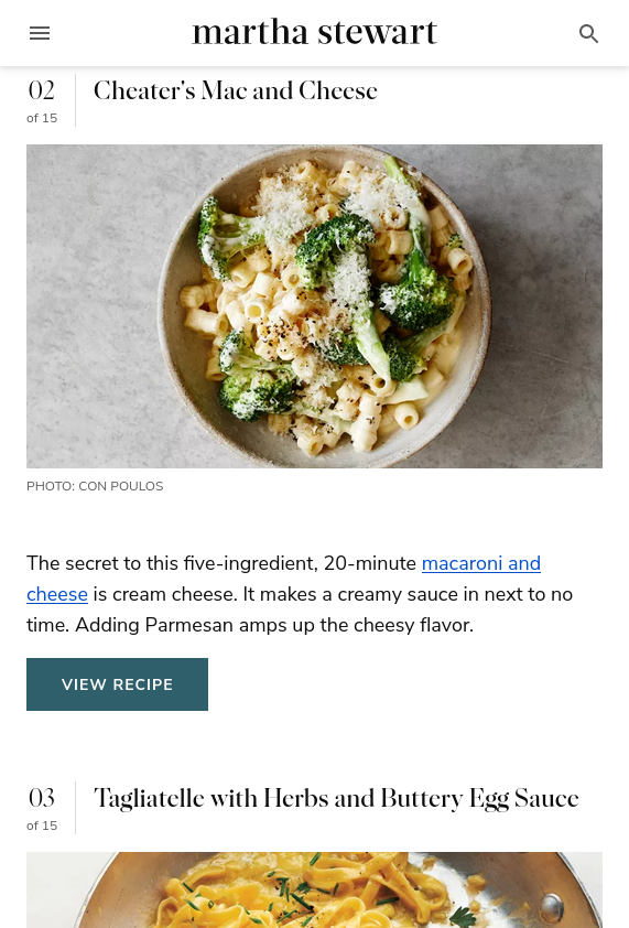
Example: Usable List of Recipes
No interactivity; no carousel.
Structure a simple list of recipes.
The interactivity required many clicks/taps to access all the content. The interactivity was a barrier to the user's goals.
Interactivity Design Principles
Interactivity Design Principles
- Functional – assists with the user's goals.
- Affordances – provide strong clues for the operation of things.
- Visibility – make the relevant parts visible.
- Feedback – give each action an immediate and obvious effect.
- Familiarity – conform to established design patterns.
Interactivity – Functional
Does the interactivity assist with the user's goals? Or is content hidden behind unnecessary clicks/taps?
Discussion: Functional Interactivity Critique
Critique the function of hamburger menu interactivity.
Example: The navigation menu takes a lot of space on limited screen sizes. One click to show/hide likely improves functionality of the page to display more content.
Interactivity – Affordances
What about the appearance gives the user clues about how the interactivity may function?
Discussion: Affordance Interactivity Critique
Critique the affordances of hamburger menu interactivity.
Example: The hamburger button indicates that users may interact with it.
Other examples:
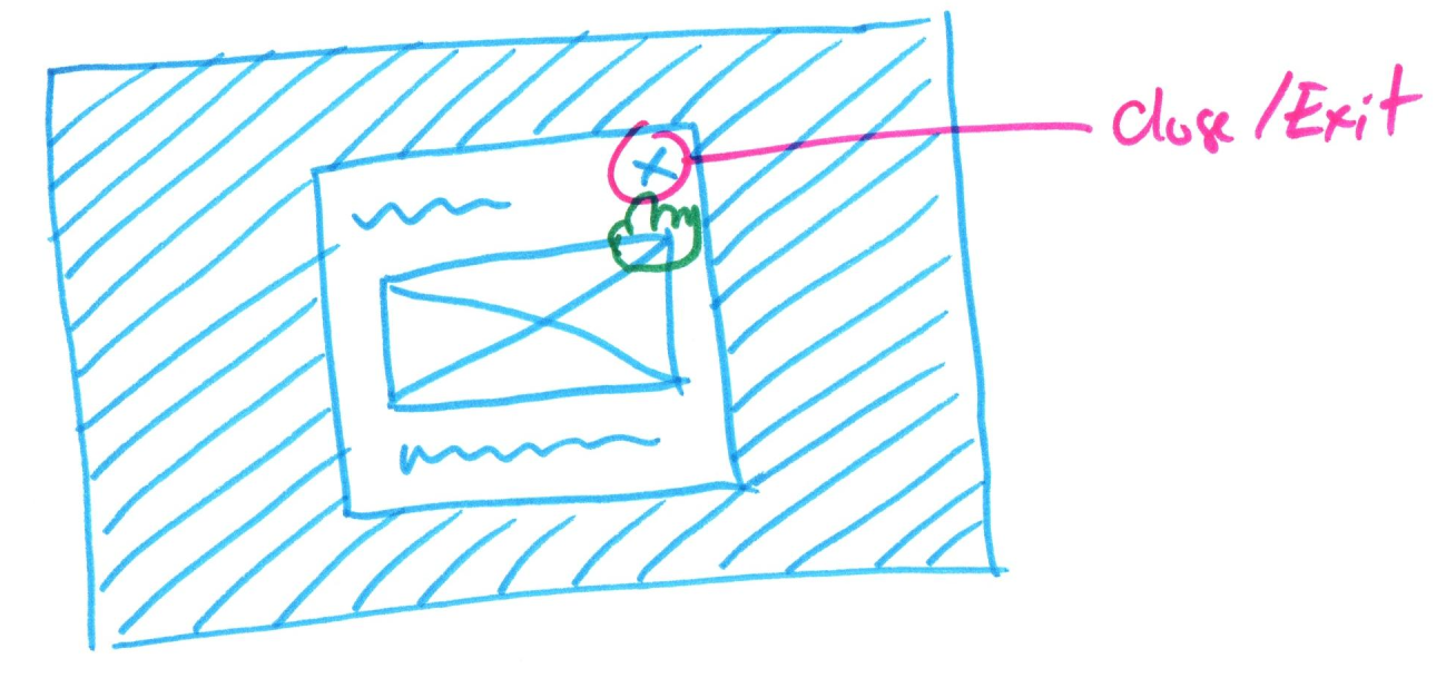
- The close button in the modal.
- The next and previous buttons in the carousel.
Interactivity – Visibility
Are the possible actions visible to the user?
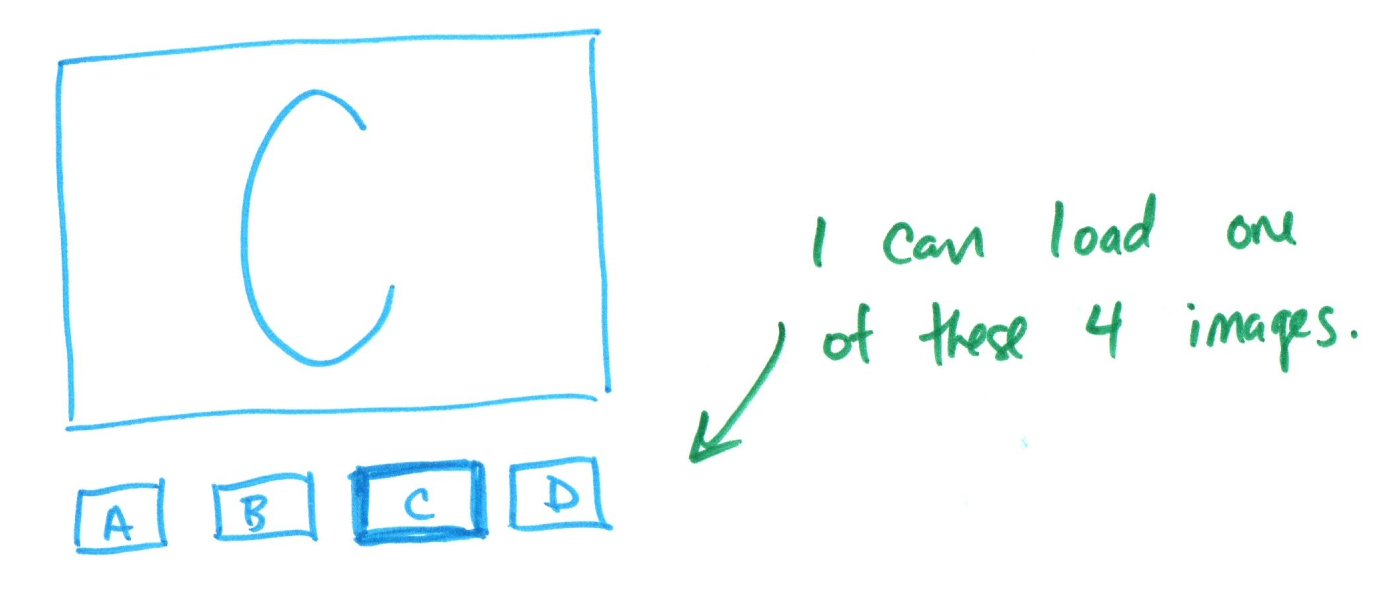
Discussion: Visibility Interactivity Critique
Critique the visibility of hamburger menu interactivity.
Hint: Are all the actions visible to the user?
Example: The open/close action is visible with the hamburger menu button.
Interactivity – Feedback
What feedback does a user get once an action is performed?
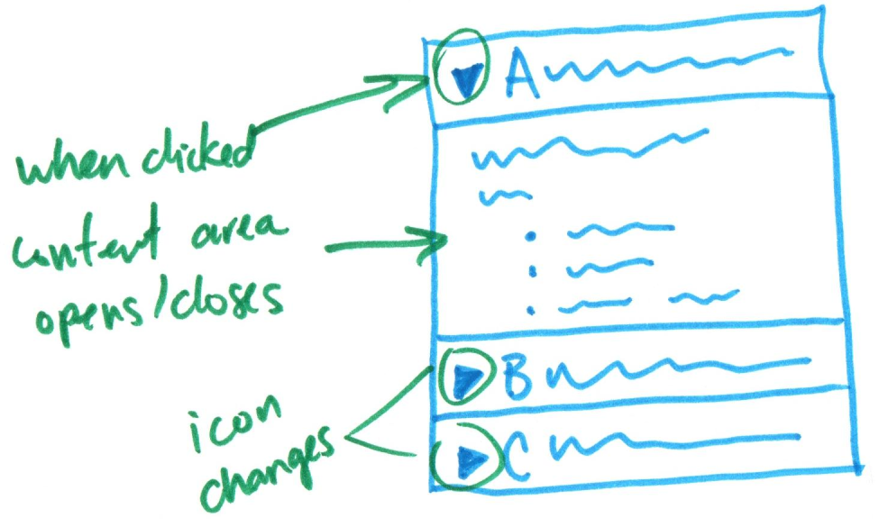
Discussion: Feedback Interactivity Critique
Critique the feedback of hamburger menu interactivity.
Tip: How does the user know that the action occurred?
Example: When the hamburger button is clicked/tapped, the menu shows/hides. The user gets immediate feedback.
Interactivity – Familiarity
Is the interactivity predictable and consistent with the user's expectations?
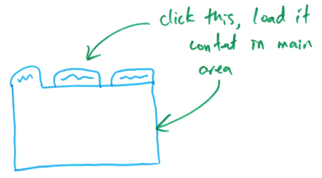
Discussion: Familiarity Interactivity Critique
Critique the familiarity of hamburger menu interactivity.
Tip: Would the user have seen this on other websites they visit?
Example: Yes, the hamburger menu is a common pattern for showing/hiding navigation on narrow screens.
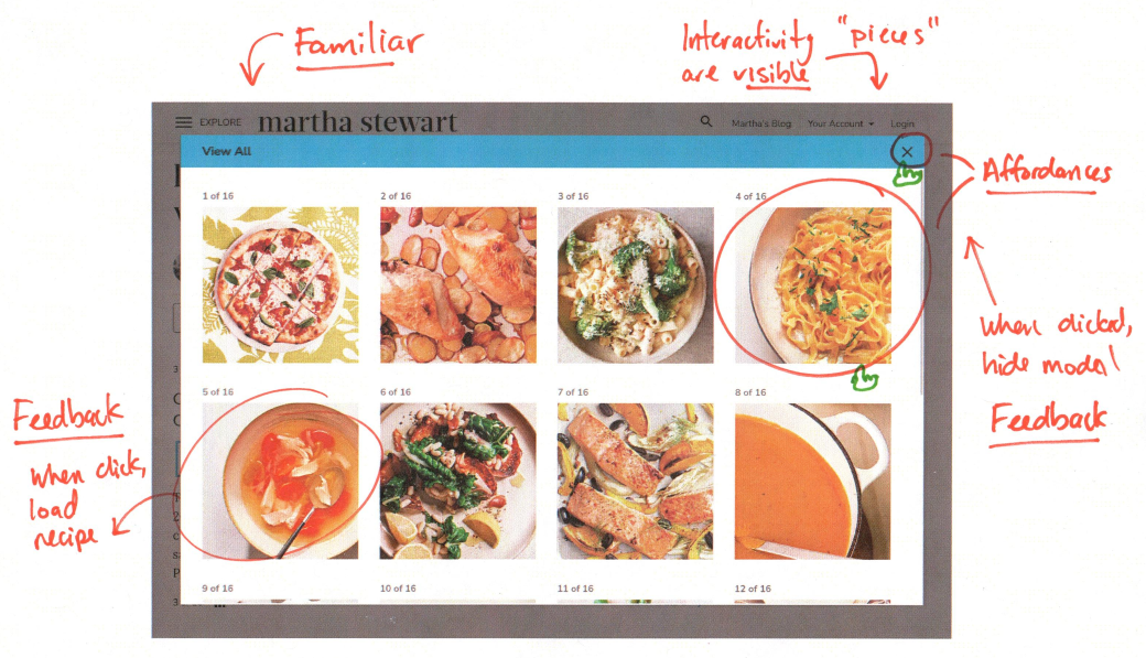
Discussion: Design Principles – Modals
- Functional
- Affordances
- Visibility
- Feedback
- Familiarity
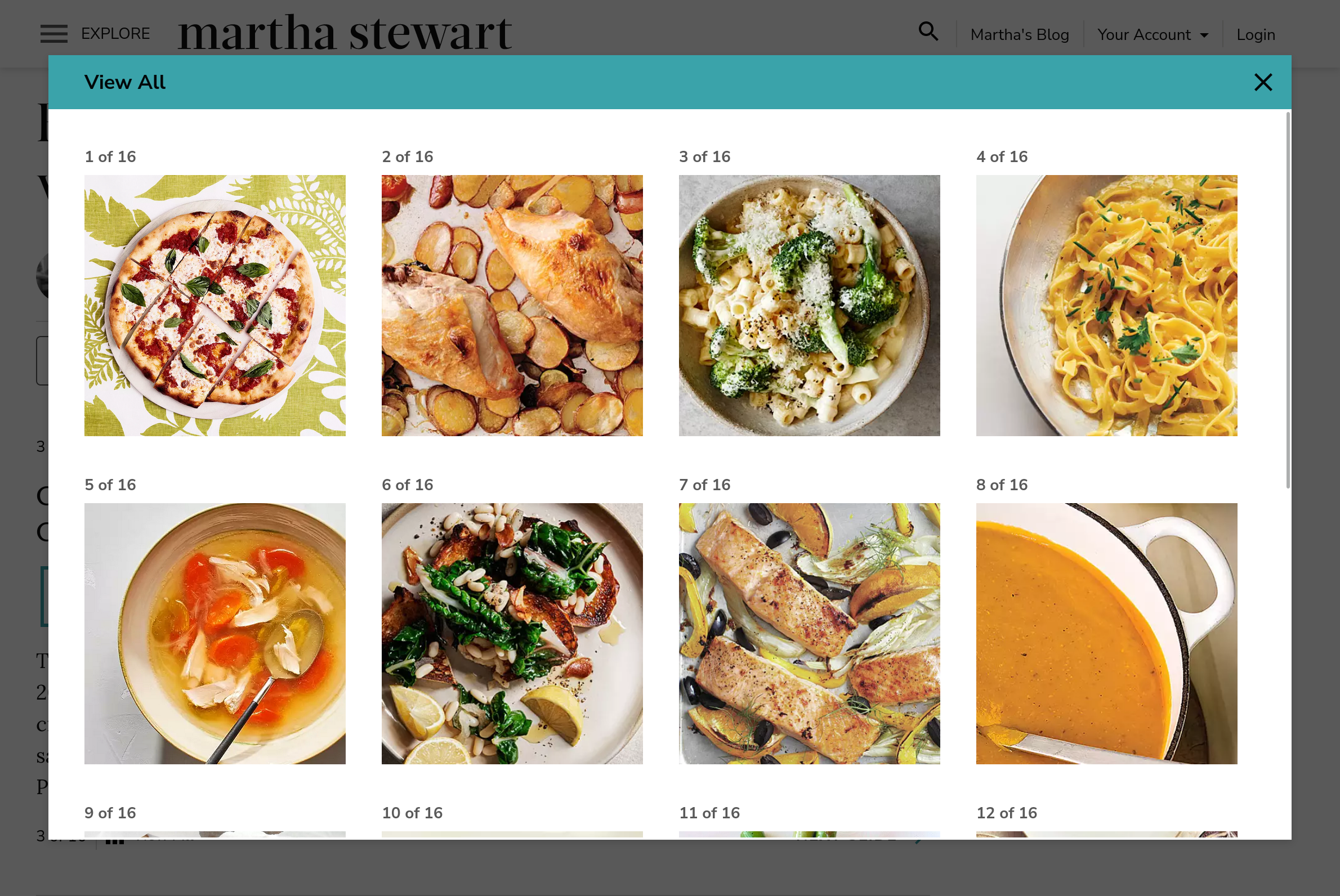
Example: Design Principles – Modals
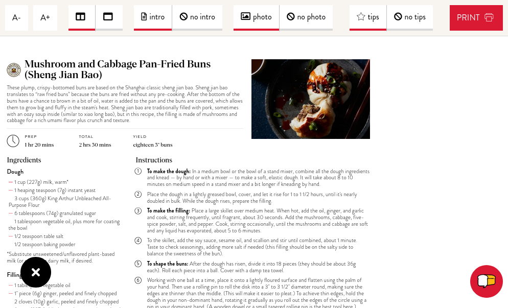
Example: Adaptable View
Design principles in this context:
- Functional
- Affordances
- Visibility
- Feedback
- Familiarity
Modal to define print view settings
Gotchas: Interactivity Design Gotchas
- Don't use interactivity to make your site "pop" or show off your skills.
- "Minimalist" or flat designs often fail to provide effective affordances.
- Use animation only if it adds meaning to the interaction (feedback).
- A website is not an app. Your site should feel like a website.
- Start with HTML & CSS and only add interactivity to enhance the user's experience.
Summary: Designing Usable Static Interactivity
- Static client-side interactivity dynamically changes existing HTML and CSS with JavaScript.
- Interactivity should enhance the audience's experience and help them accomplish their goals.
- Usable interactivity employs affordances, visibility, feedback, and familiarity.
- Avoid interactivity to "wow" or "impress."
- Design interactivity with sketches + annotations.
What's Next
Friday sections (10/30): Milestone 2 – Peer Feedback
Monday (11/2):
- Milestone 2 Due
- Milestone 3 Assigned