INFO 1300: Accessible Static Interactivity
Class 22: Accessible Static Interactivity
- Review: Interactivity Code Snippets
- Accessible Snippets
- Review: Interaction Design Principles
- Interactivity Accessibility Considerations
Copyright 2026, Kyle J. Harms
Review: Interactivity Code Snippets
Review: Implement Static Interactivity
✅ Phase I
- Plan, then code all interactivity and non-interactivity HTML + CSS.
- Plan, then code initial/default page state using only CSS classes.
✅ Phase II
- Plan, then code listening for user events in JavaScript.
- Plan, then code responding to events by adding/removing CSS classes.
Review: Snippet Types
event: When
event: click element
event: page ready
event: resize browser window
action: Do
action: add css class
action: remove css class
action: debug console message
if: Choose
if: browser narrow or wide
if: element has css class
event: snippets hold action: and if: snippets.
if: snippets hold action: snippets.
Gotcha: Console Displays Unrelated Errors
JavaScript errors are displayed in the browser's Developer Tools Console for your code and for other code, like browser extensions.
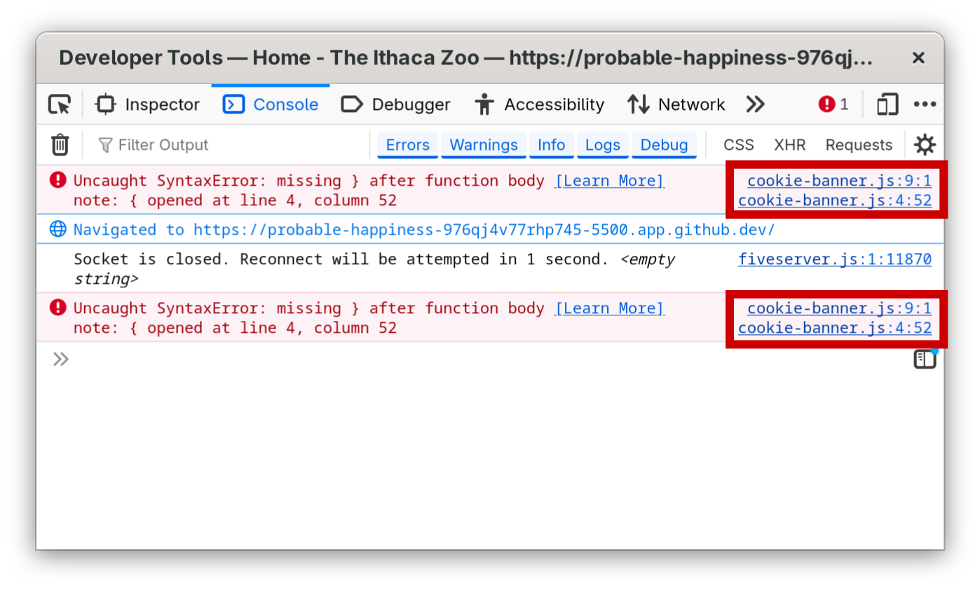
Ignore errors not from your code; Fix errors from your code (e.g. cookie-banner.js)
Gotcha: Media Queries Cannot Add/Remove Classes
Media Queries
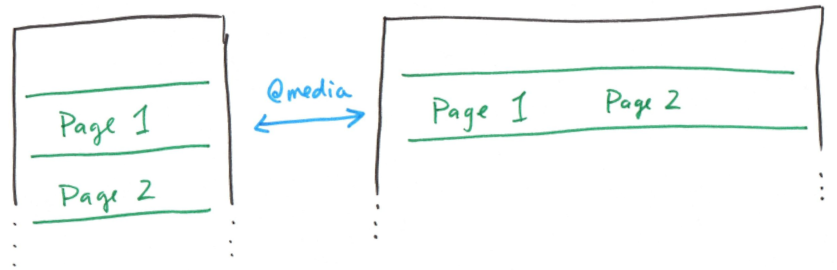
JavaScript Snippets
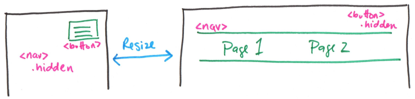
Use the page ready event to initialize adding/removing classes based on the browser's width when the page initially loads.
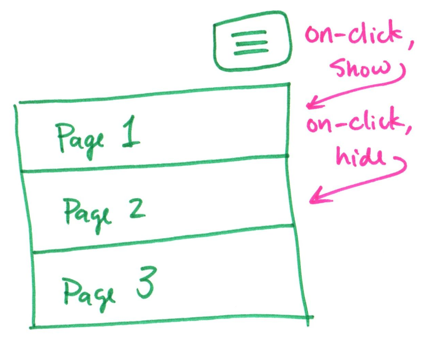
Activity: Hamburger Menu Snippets
Working with a peer, complete #1, 2, and 3 on the handout.
Tips:
- When the hamburger button is clicked, you need to toggle showing/hiding the navigation.
- When the page loads, you need to show the navigation on wide screens and hide it on narrow screens.
Accessible Snippet Interactivity
Accessible Snippet Interactivity
1. Accessible Hidden
display: none hides content from assistive technologies.
Solution: Use a CSS class that visually hides content but keeps it available for screen readers.
2. Accessible Modal
display: none can show/hide a <dialog> element.
Gotcha: When the modal opens, the browser's focus is still on the <button> that opened it! (CSS classes can't move focus.)
Solution: Use action: open modal and action: close modal to control focus and the Escape key.
1. Accessible Hidden
Inaccessible Hidden
.hidden {
  display: none;
}
Assistive technologies, like screen readers, cannot access content hidden with display: none.
Accessible Hidden
.accessible-hidden { /* .sr-only */
  position: absolute;
  left: -10000px;
  top: auto;
  width: 1px;
  height: 1px;
  overflow: hidden;
}
The content is visually hidden. However, it is still available for assistive technologies.
2. Accessible Modal
CSS classes change how an element is rendered. A modal <dialog> also needs accessible browser behavior that a CSS class can't trigger:
- Move keyboard focus away from the
<button>that triggered it and into the modal (and back). - Block the page behind the modal.
- Close the modal with the escape key.
Modal Plan: Overlay + <dialog>
<div id="overlay" class="hidden"> <!-- transparency effect -->
<dialog id="modal"> <!-- the modal -->
...
<button id="modal-close">Close</button>
</dialog>
</div>
- Place CSS classes (e.g.
.hidden) on the overlay, never on the<dialog>. - Remove CSS classes from the overlay before opening the modal (action).
- The close button only closes the modal (action), it does not hide the overlay.
- Hide the overlay for the modal is closed event (close button or Escape).
All Snippets
event: When
event: click element
event: page ready
event: resize browser window
event: modal closed
action: Do
action: add css class
action: remove css class
action: open modal
action: close modal
action: debug console message
if: Choose
if: browser narrow or wide
if: element has css class
event: snippets hold action: and if: snippets.
if: snippets hold action: snippets.
Review: Interaction Design Principles
Review: Interaction Design Principles
- Functional – assists with user's goals.
- Affordances – provide strong clues for the operation of things.
- Visibility – make the relevant parts visible.
- Feedback – give each action an immediate and obvious effect.
- Familiarity – conform to established design patterns.
Discussion: Interactivity Design Critique
Critique this carousel design.
- Affordances – provide strong clues for the operation of things.
- Visibility – make the relevant parts visible.
- Feedback – give each action an immediate and obvious effect.
- Familiarity – conform to established design patterns.
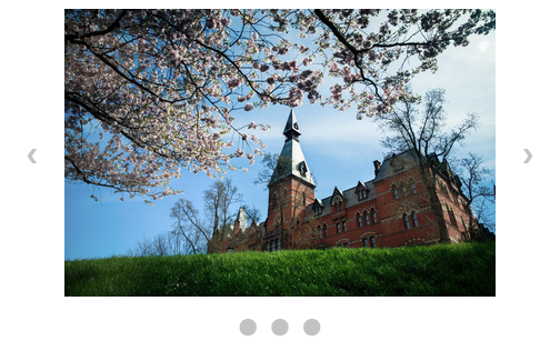
Critique: Affordances
Affordances – provide strong clues for the operation of things.
- ✅ Next and previous icons
- ✅ Dot icons for each slide
- ❌ Icons are too small
- ❌ No clearly clickable/tapable areas
- doesn't look like a button
- no button shape/outline
- no hover effect
- no cursor change
Critique: Visibility
Visibility – make the relevant parts visible.
- ✅ all actions are shown to the user:
- next slide
- previous slide
- jump to a particular slide
Critique: Feedback
Feedback – give each action an immediate and obvious effect.
- ✅ Slide changes
- ❌ Dots do not indicate current slide
Critique: Familiarity
Familiarity – conform to established design patterns.
- ✅ Left/right change slide buttons on the sides of slide
- ✅ Dots to indicate all slides on bottom of slide
- ❌ Dots do not indicate current slide
Accessible Interactivity Design
Accessible Interactivity Design ➜ Interaction Design Principles
- Affordances – provide strong clues for the operation of things.
- Visibility – make the relevant parts visible.
- Feedback – give each action an immediate and obvious effect.
- Familiarity – conform to established design patterns.
Affordances
Use the pointer cursor
cursor: pointer;
:hover CSS pseudo-class
button:hover {
  color: #ffffff;
  background-color: #b31d28;
}
Accessibility: Affordances
Support keyboard navigation – tab, tab, tab, ...
Use <button> for actions; avoid events on other elements, like <div> or <a>.
<button>supports keyboard navigation.- Other elements, like
<div>do not support keyboard navigation. <a>is only for links, do not use for actions.
Accessibility: Affordances
Provide screen reader labels for non-text actions
(or text that doesn't "standalone")
Use aria-label= to provide an understandable text alternative.
<button id="hamburger-menu" aria-label="show navigation">
  <img alt="" src="images/hamburger-icon.svg">
</button>
Screen Reader: "Show navigation, button"
Activity: Accessible Affordances Critique
Critique the accessibility of the affordances for the thumbnail gallery interactivity on the back of your handout.
Cookie Banner
- ✅ pointer cursor
- ✅ hover effect
- ✅ button
- ✅ understandable text
Thumbnail Gallery
- ❌ no pointer cursor
- ❌ no hover effect
- ❌ no buttons
- ❌ no text alternative
Feedback
Always indicate that a change has occurred when a user takes an action.
Examples
- show or hide an element
- change an element in some way (e.g. draw a border, etc.)
- use a status indicator
- ...
Accessibility: Feedback
Always show the "focus" outline.
Avoid turning off the focus ring:
outline: none;
outline: 0;
If necessary, offset the focus ring:
outline-offset: 2px;
Activity: Accessible Feedback Critique
Critique the accessibility of the feedback for the thumbnail gallery interactivity on the back of your handout.
Cookie Banner
- ✅ disappears upon accept
- ✅ accessible focus ring
Thumbnail Gallery
- ✅ some images change
- ❌ not all images change
- ❌ no focus ring
Visibility
All actions must be "visible" to all users.
visible $\neq$ seen
<button>Next</button>
<button aria-label="next slide"> ❯ </button>
Make actions visible on-screen and also via screen reader (including other accessible technologies)!
Accessibility: Visibility
Large clickable/tappable targets
Small targets are not accessible
Large clickable/tappable areas
Accessibility: Visibility
All content must be "visible" to all users.
Inaccessible "Hidden"
.hidden {
  display: none;
}
display: none, visibility: hidden hide content from screen readers and other accessibility software.
Accessible "Hidden"
.accessible-hidden {
  position: absolute;
  left: -10000px;
  top: auto;
  width: 1px;
  height: 1px;
  overflow: hidden;
}
Note: Commonly called .sr-only
When to use .accessible-hidden?
Does the user need to use the interactivity to access the content?
Alternative: Would the user be misled if the hidden content was made available without the interactivity?
Yes! Use non-accessible .hidden
Examples: form feedback, dismissed alerts (e.g. cookie banner), etc.
No. Use .accessible-hidden
Examples: tabs, carousel, accordion, hamburger menu, etc.
Accessibility: Modal Keyboard Focus
A modal should command keyboard focus.
Snippets: action: open modal and action: close modal command focus:
- Bring keyboard focus into the modal upon opening.
- Keyboard navigation is disabled outside the modal.
- Pressing the escape key closes the modal.
- Keyboard focus returns to the page when the modal closes.
Cookie Banner – focus on page
<dialog open> + .hidden
Gallery Modal – focus on dialog
action: open modalaction: close modal
Activity: Accessible Visibility Critique
Critique the accessibility of the visibility for the thumbnail gallery interactivity on the back of your handout.
Cookie Banner
- ✅ reasonable target
- ✅ content is visible if not seen
- ✅ content should not be available when hidden
Thumbnail Gallery
- ✅ large target
- ❌ content is not visible if not seen
- ❌ content should be available when hidden
- ❌ alt text is not descriptive
Familiarity
Does your interactivity look and behave like interactivity your users have seen elsewhere?
Familiarity is helpful for users with cognitive impairments.
- Looks like a carousel.
- Acts like a carousel.
- It's a carousel!
Accessibility: Familiar Focus Ring
Use the system focus ring
Some users change their system settings to make the focus ring work for them. Use their focus ring, not yours!
Activity: Accessible Familiarity Critique
Critique the accessibility of the familiarity for the thumbnail gallery interactivity on the back of your handout.
Cookie Banner
- ✅ looks like a cookie banner
- ✅ acts like a cookie banner
- ✅ system focus ring
Thumbnail Gallery
- ✅ looks like a gallery
- ❌ doesn't act like a gallery
- ❌ no focus ring
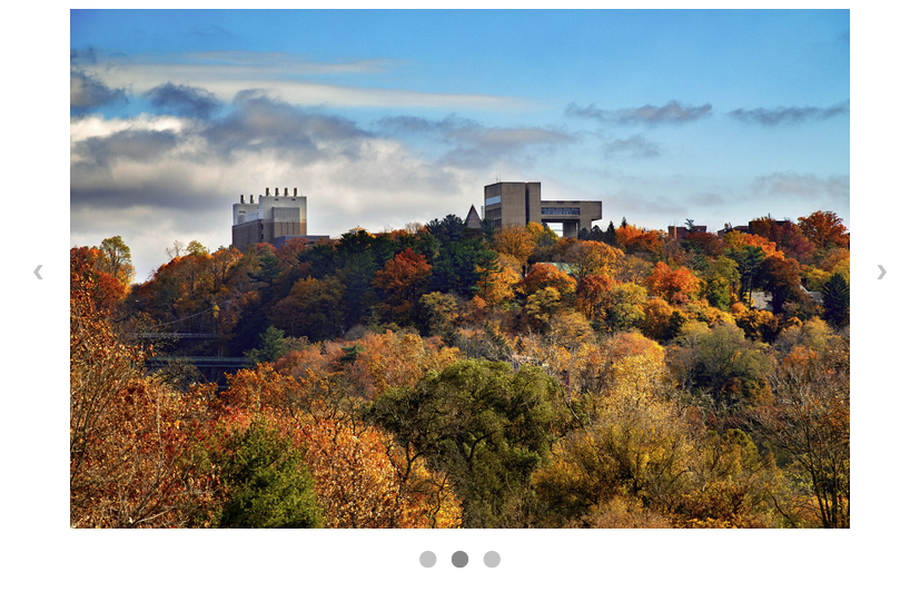
Example: Inaccessible Carousel
Demo: Accessible Carousel
What's Next?
Friday Sections: Office Hours
Monday: Homework 8 Due