Class 10: Handler Props & Controlled Inputs
- Review: Last Class
- Handler Props
- Controlled Inputs
- React Developer Tools
Review
Review: A Single Source of Truth
When multiple components need to share state, we need to lift the state up to their closest common ancestor.
When we lift state up, we move the state variable and the state update function to the closest common ancestor of the components that need to share the state.
Review: Component Tree
A diagram to visualize the component hierarchy and the flow of data (props) and state.
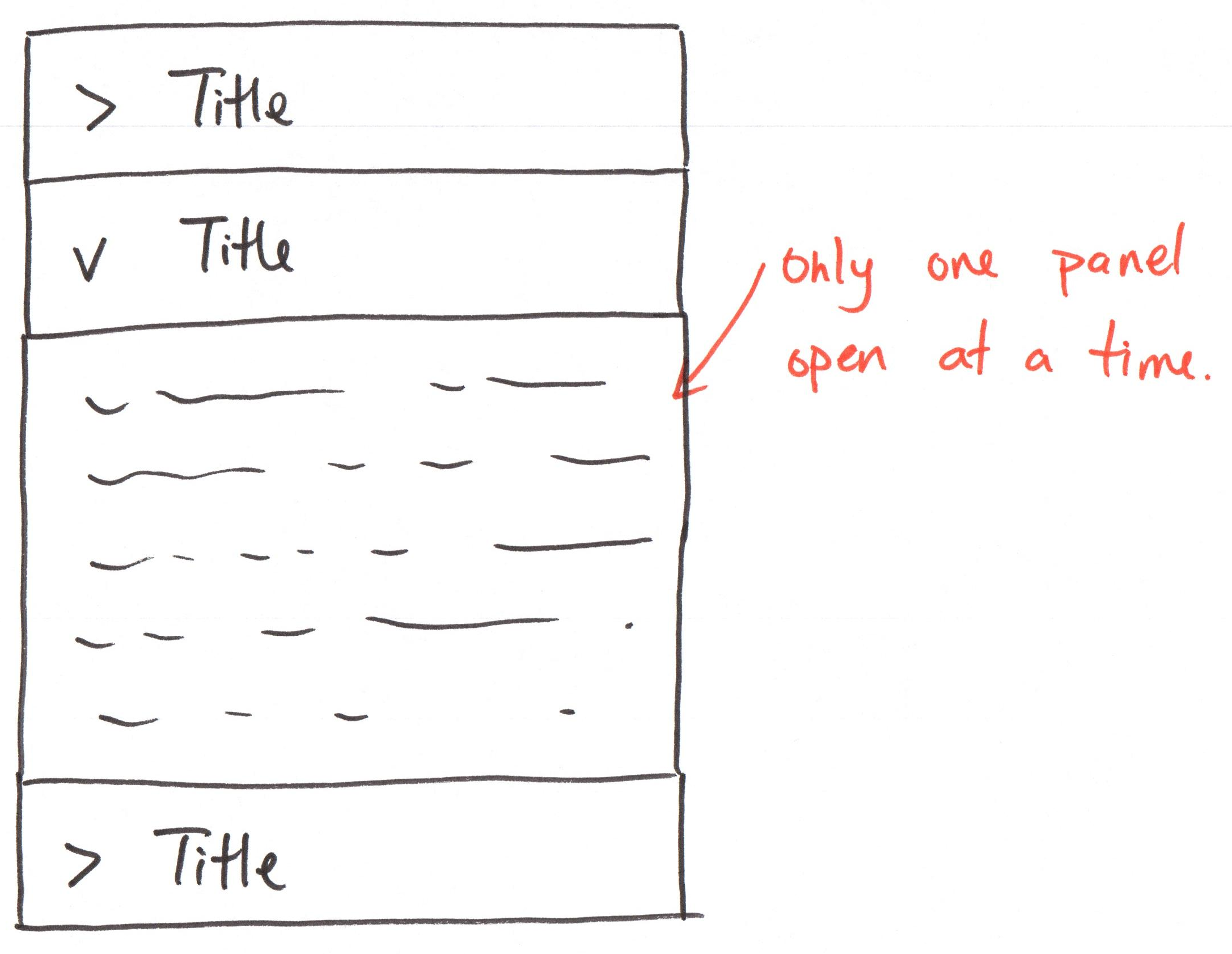
Activity: Accordion Component Tree
Working with your peers (2-4):
Draw the component diagram on the handout with lifted state so that only one panel can be expanded at a time.
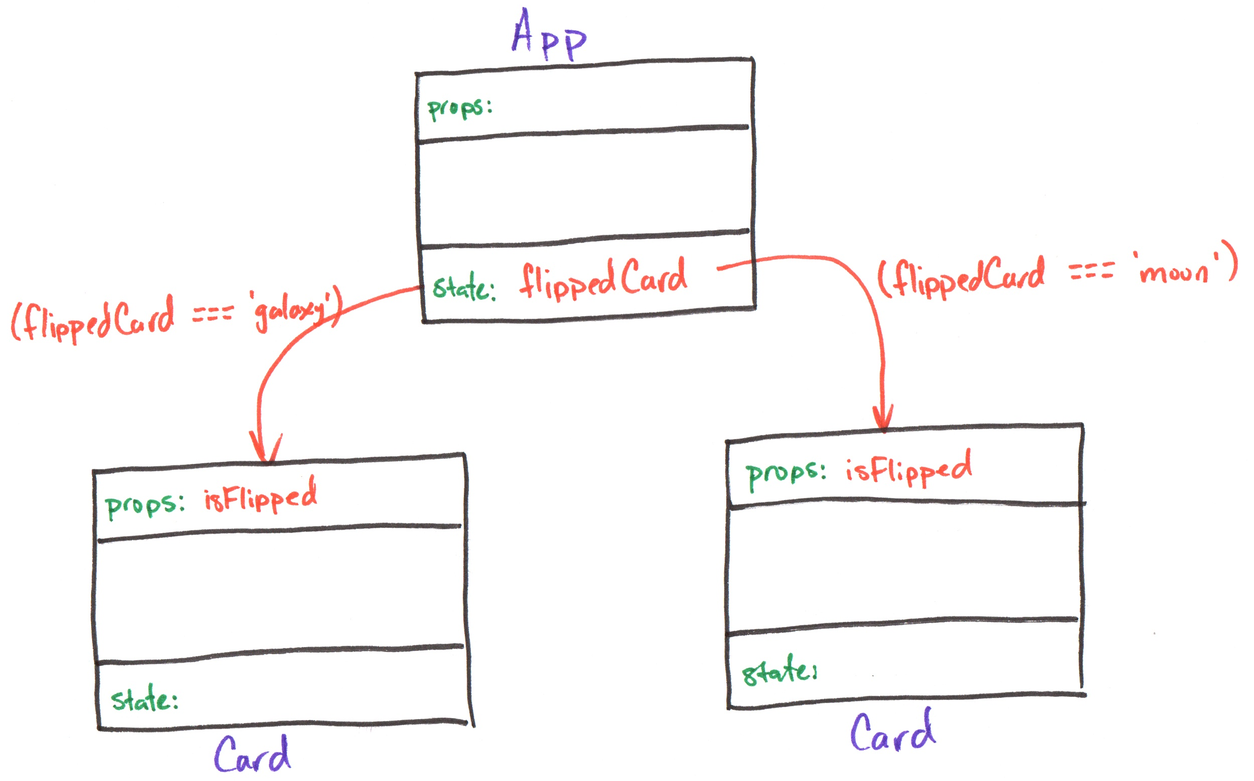
Review: Lifted State
App
export default function App() {
  const [flippedCard, setFlippedCard] = useState('null')
  return (
    <div className="gallery">
      <Card
        imgUri="/images/galaxy.webp"
        altText="galaxy"
        isFlipped={flippedCard === 'galaxy'}
      />
      <Card
        imgUri="/images/asteroid.webp"
        altText="asteroid"
        isFlipped={flippedCard === 'asteroid'}
      />
    </div>
  )
}
Card
export default function Card({ imgUri, altText, isFlipped }) {
  return (
    <div className="card">
      <button aria-label="flip card">
        <img src="/icons/flip.svg" />
      </button>

      {!isFlipped && <img src={imgUri} alt={altText} />}
      {!!isFlipped && <>
        {!!caption && <Caption text={caption} />}
        {!!citation && <Citation citation={citation} />}
      </>}
    </div>
  )
}
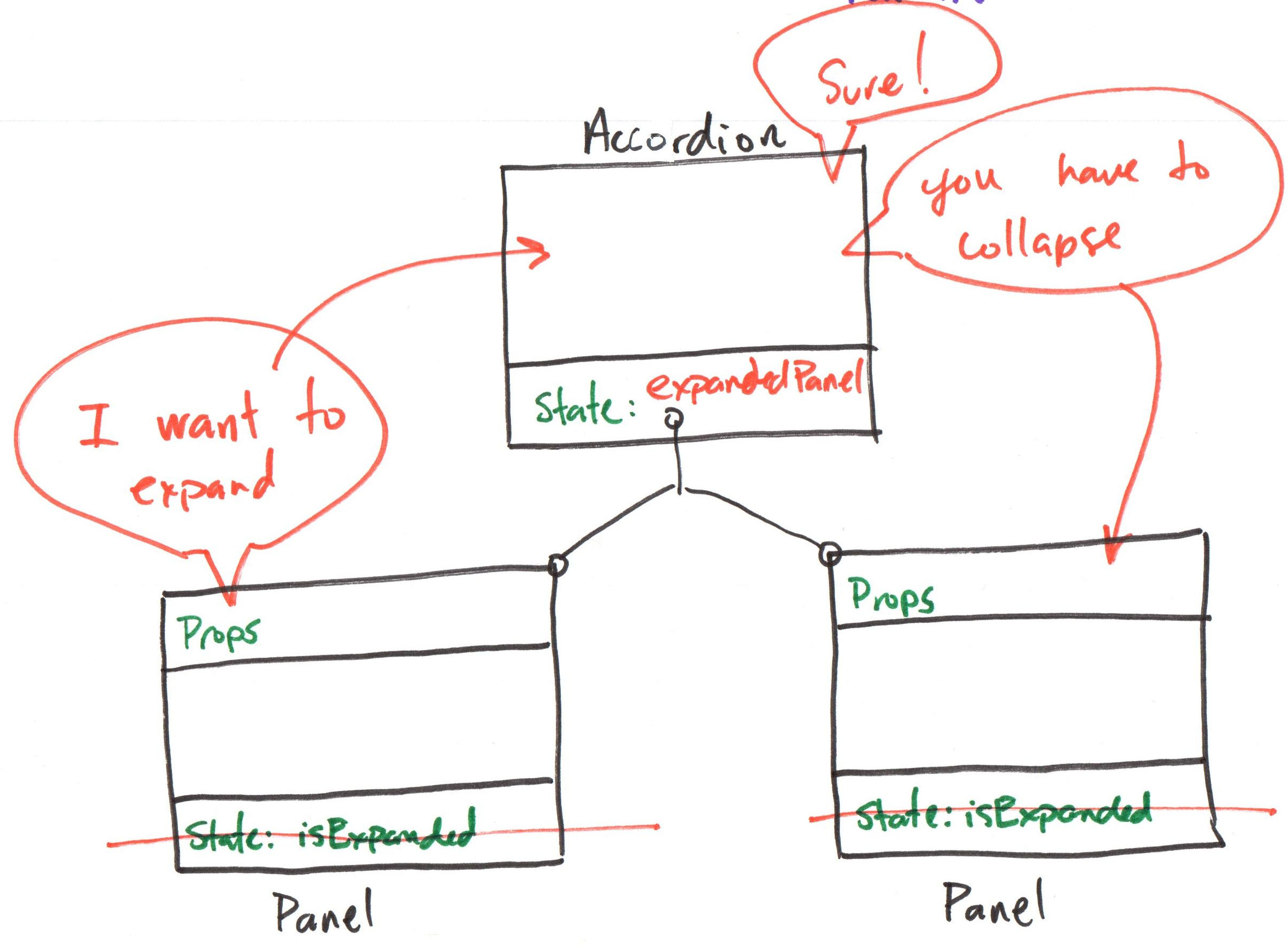
Activity: Accordion Lifted State
Working with your peers (2-4), code the Accordion and AccordionItem components with lifted state so that only one panel can be expanded at a time.
Gotcha: Remove event handlers from the AccordionItem components for now.
"Handler" Props
Discussion: Child to Parent Communication
Each Card has a flip button. How do we flip the card, when the state is lifted up to the App component?
Review: Event Handlers
onClick is a prop.
function handleClick() is a function declaration.
handleClick is passed as a function reference to the onClick prop.
When the <button> is clicked, it calls handleClick().
export default function Component() {
  function handleClick() {
    console.log('clicked')
  }

  return (
    <button onClick={handleClick}>
      Click Me
    </button>
  )
}
"Handler" Props
A component provides prop that accepts a function reference as a value.
When the component needs to trigger an event, it calls the function reference passed as a prop.
Props
Send data into a component from the parent.
"Handler" Props
Send data out a component to the parent component!
Component Tree: Handler Prop
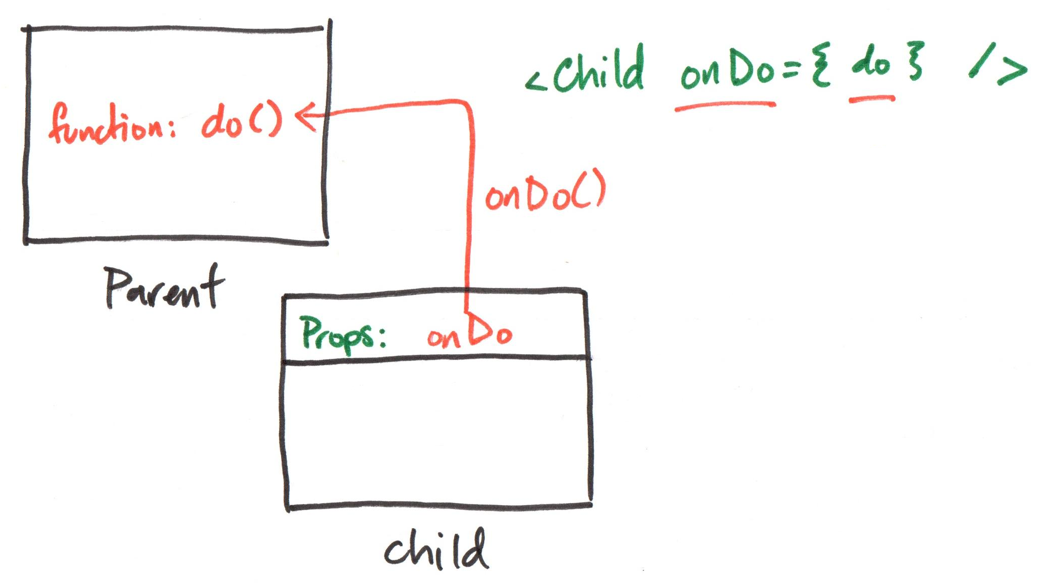
Example: Handler Prop
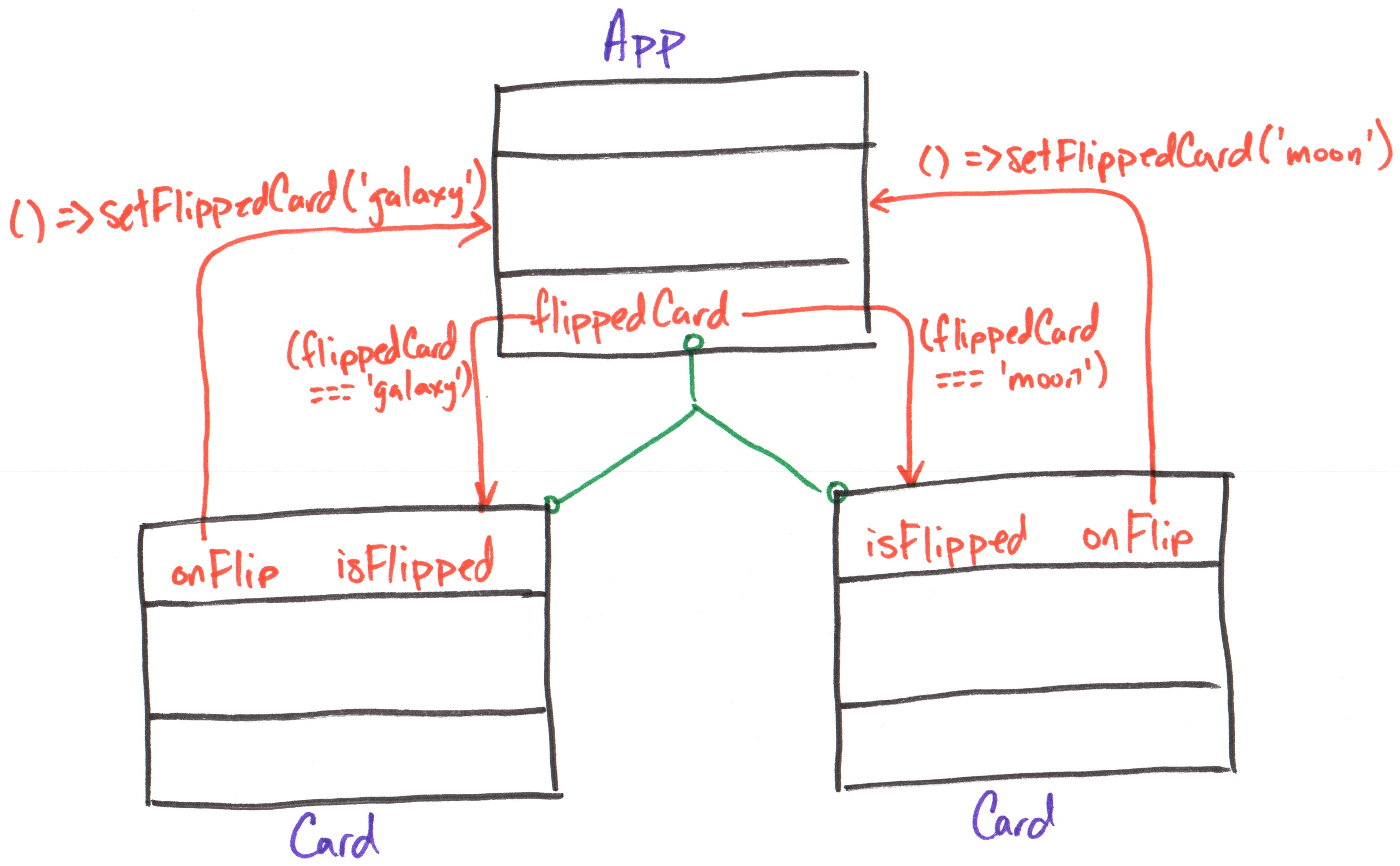
Demo: Handler Prop
App
export default function App() {
  const [flippedCard, setFlippedCard] = useState('null')
  return (
    <div className="gallery">
      <Card
        imgUri="/images/galaxy.webp"
        altText="galaxy"
        isFlipped={flippedCard === 'galaxy'}
        onFlip={(isFlipped) =>
          setFlippedCard(isFlipped ? 'galaxy' : null)}
      />
      <Card
        imgUri="/images/asteroid.webp"
        altText="asteroid"
        isFlipped={flippedCard === 'asteroid'}
        onFlip={(isFlipped) =>
          setFlippedCard(isFlipped ? 'asteroid' : null)}
      />
    </div>
  )
}
Card
export default function Card({ imgUri, altText,
  isFlipped, onFlip }) {
  return (
    <div className="card">
      <button aria-label="flip card"
        onClick={() => onFlip(!isFlipped)}>
        <img src="/icons/flip.svg" />
      </button>

      {!isFlipped && <img src={imgUri} alt={altText} />}
      {!!isFlipped && <>
        {!!caption && <Caption text={caption} />}
        {!!citation && <Citation citation={citation} />}
      </>}
    </div>
  )
}
Activity: Accordion Handler Prop
Working with your peers (2-4), add a handler prop to the AccordionItem component so that when a panel is clicked, it notifies the Accordion component to update the expanded panel state in the component tree on your handout.
Then, update the code.
Controlled Inputs
HTML Input Elements
Input elements collect data from the user.
<input type="text" />
<input type="checkbox" />
<input type="radio" />
<select>
  <option value="option1">Option 1</option>
  <option value="option2">Option 2</option>
</select>
<textarea></textarea>
See the HTML reference documentation for more input types, like color pickers and date pickers.
Controlled Input
How do we set the value of input elements in React? How do we read the value of input elements in React?
A controlled input is an input element that has its value controlled by React state. (This is also known as data binding.)
The input's value is set to a state variable. When the input's value is changed, its value is reflected in the state.
Controlling an Input Element
-
Add an input element to your component.
-
Create a state variable to hold the input's value.
-
Set the value of the input element to the state variable using an appropriate prop (e.g.
valuefor text inputs,checkedfor checkboxes). -
Update the state variable when the input's value changes using an event handler (e.g.
onChange).
Tip: Use the Reference Documentation
Example:
const [termsAccepted, setTermsAccepted] = useState(false)

return (
  <label>
    <input type="checkbox"
      checked={termsAccepted}
      onChange={(e) => setTermsAccepted(e.target.checked)}
    />
    Accept terms and conditions
  </label>
)
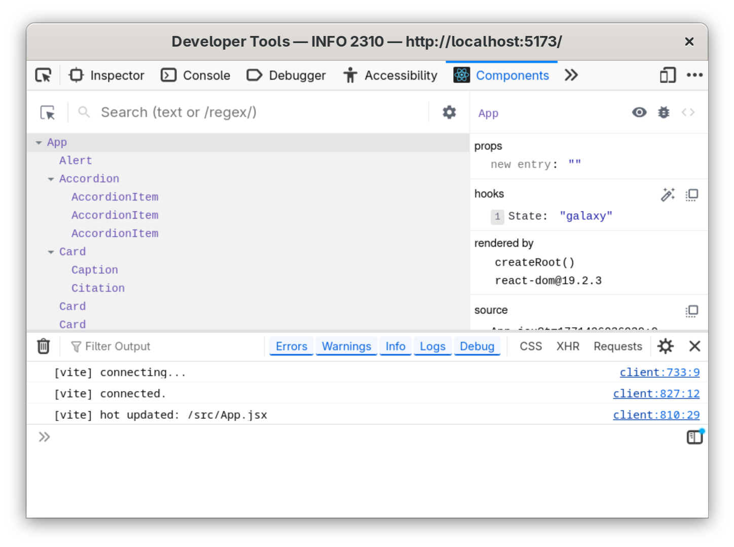
React Developer Tools
React Developer Tools
A browser extension that allows you to inspect the React component tree, view props and state, and debug your React applications.
Install: https://react.dev/learn/react-developer-tools
Demo: Check the State
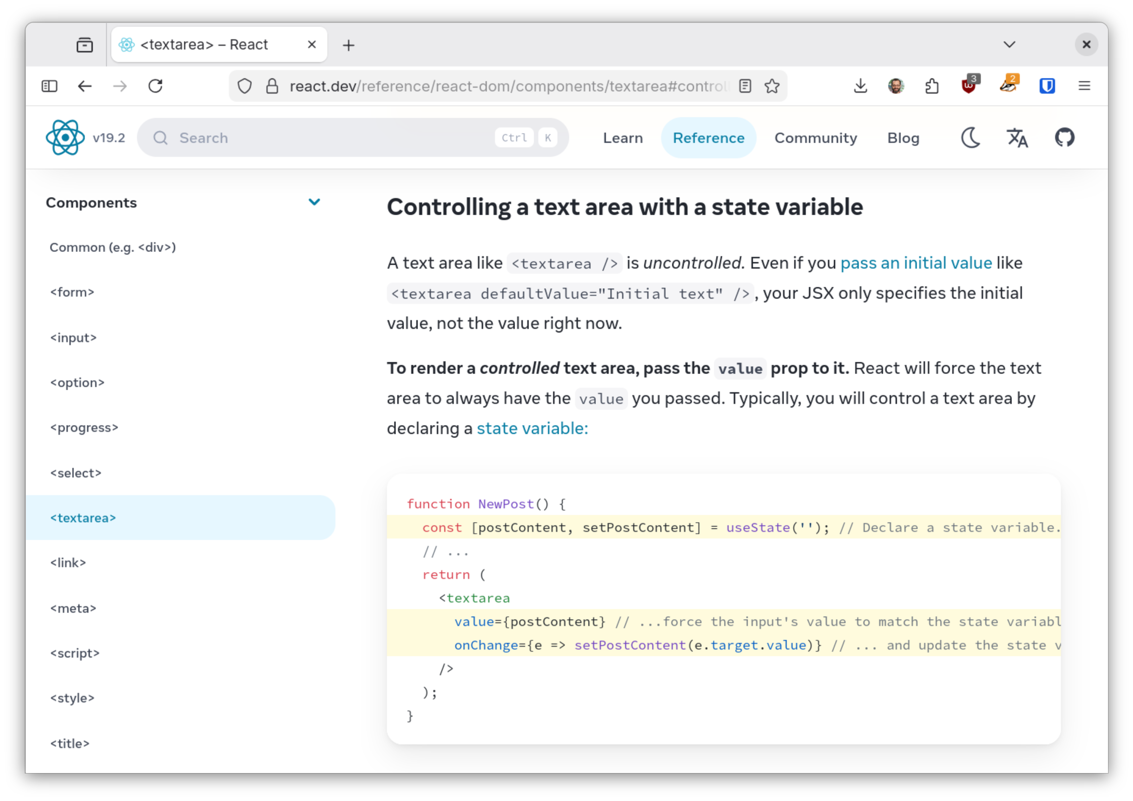
Activity: Controlled <textarea>
Working with your peers (2-4), create a controlled <textarea> component that allows the user to enter their bio in App.
Check that the state updates correctly using React Developer Tools.
Hint: Use the React documentation for <textarea>.
Summary
- When multiple components need to share state, lift the state up to their closest common ancestor.
- A component can provide a "handler" prop that accepts a function reference as a value.
- A controlled input is an input element that has its value controlled by React state.
- React Developer Tools is a browser extension that allows you to inspect the React component tree, view props and state, and debug your React applications.
What's Next
Friday: Practice Problem Workshop (Lifted State & Controlled Inputs)
Monday: Project 1, Milestone 3 due