Class 16: Design Systems & Utility-First CSS
- Review: Last Class
- Design Systems
- Style Guide
- Component Library
- Pattern Library
- Utility-First CSS
Review
Review: Design Pattern
A recurring, reusable solution that can be applied to solve a design problem.
Trending Examples for Interactive Web Applications:
- Content first
- Content organized as cards
- Modal dialogs for additional information and actions
- Filter chips for filtering and refining displayed content
- Visible search bar for finding specific content
- Skeletons for loading content
Review: Key Design Principles
Structure: Group related pieces of information
Spacing: Define clear relationships between pieces of information
Rhythm: Create a visual flow that guides the user through the content.
Contrast: Differences attract attention, create hierarchy, enhance readability, and evoke emotions.
Review: Rhythm -- Design System
Design Systems
Design System
A design system is a complete set of standards to manage design at scale by using reusable components and patterns while creating a shared language and visual consistency across different pages and channels. Typically this includes: a style guide, a component library, and a pattern library.
Idea: We've got a lot of products that our organization supports. The design system is a shared set of design principles, patterns, and components that we can use across all of our products to create a consistent user experience across all of our products.
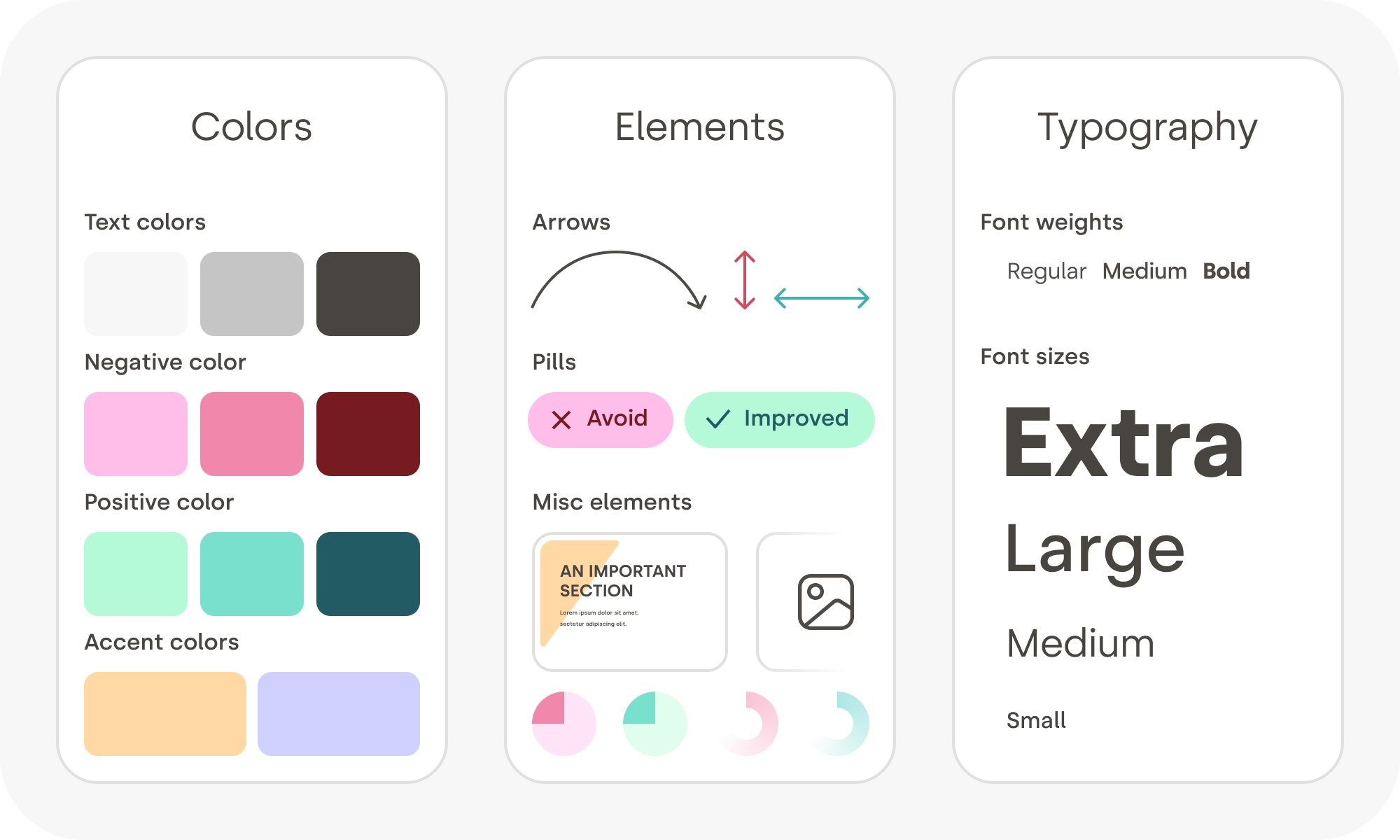
Style Guide
A style guide is a document that provides specific implementation guidelines, visual reference, and design principles for the visual design of a product.
Typically, a style guide focuses on branding: colors, typography, etc. However, some style guides also offer guidance on content (i.g. tone of voice).
Style Guides for Web Applications
Typically, a style guide for a web application will often include:
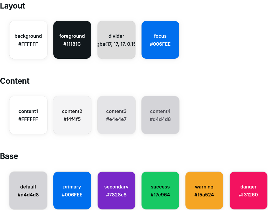
- Colors
- Layout: foreground, background, content, accents, focus, etc.
- Base: primary, secondary, success, warning, danger, etc.
- Typography
- Font family (serif vs. sans-serif)
- Font sizes (headings vs. body)
- Font weight (light vs. bold)
- Shape
- Border radius (square vs. rounded)
- Shadow (flat vs. shadowed)
- Spacing (spacious vs. compact)
Example: Color Style Guide
Example: Primary & Default Buttons
Activity: Design a Style Guide
Working with your peers (2-4), design the major design elements of a style guide for your community events SPA.
- Colors
- Layout: foreground, background, content, accents, focus, etc.
- Base: primary, secondary, success, warning, danger, etc.
- Typography
- Font family (serif vs. sans-serif)
- Font sizes (headings vs. body)
- Font weight (light vs. bold)
- Shape
- Border radius (square vs. rounded)
- Shadow (flat vs. shadowed)
- Spacing (spacious vs. compact)
Gotcha: A Design System is Not a Style Guide
Style Guide: A style guide is a document that provides specific implementation guidelines, visual reference, and design principles for the visual design of a product.
Design System: A design system is a complete set of standards to manage design at scale by using reusable components and patterns, including style guides.
Component Library
A component library is a collection of reusable components that are designed to be used in a design system.
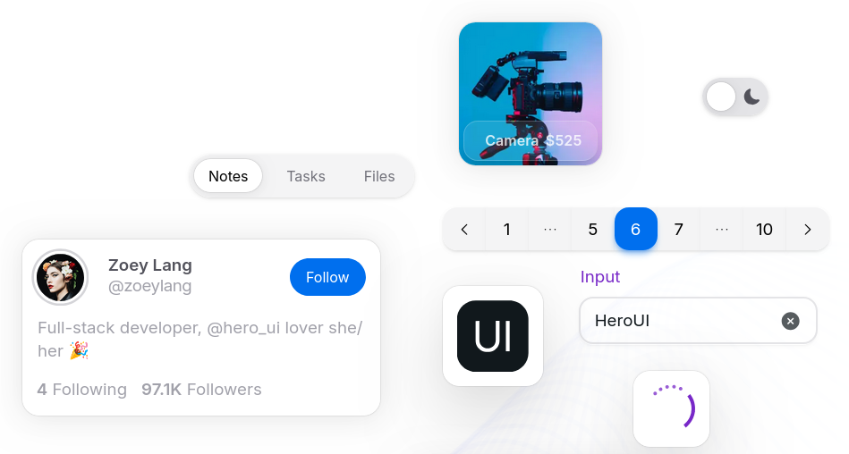
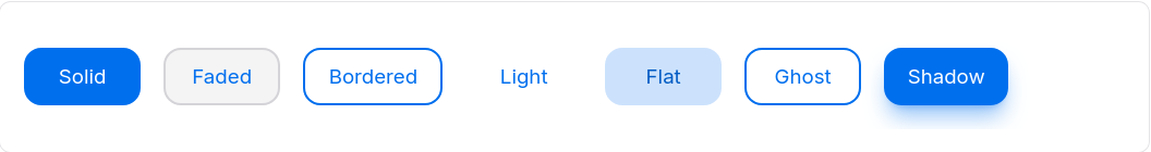
Example: Component Library -- Button
Colors:
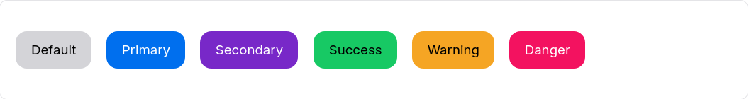
Variants:
Demo: Component Library -- Button
export default function Button({ color = "default", children }) {
  return <button>{children}</button>;
}
Activity: Implement a Library Component
Working with your peers (2-4), implement a reusable component for your community events SPA that follows the design principles of your style guide.
Your component should be reusable for all applications.
Include props for colors or variants if necessary.
Ideas:
- Cards
- Search Fields
- Chips / Pills
- Modal Dialogs
- etc.
Component Library: Rhythm
The design of the components in a component library should reflect the rhythm of the design system.
For example, if the design system employs a "rounded" rhythm, then the components in the component library should consistently follow that rhythm.
Gotcha: Component Library Components Are Not App-Specific
A component library is a collection of reusable components that are designed to be used in a design system. These components should be designed to be reusable across multiple applications, not just a single application.
Warning: Do not add event-specific data/props, etc. to the components in your component library.
Pattern Library
A pattern library is a collection of reusable design patterns that are designed to be used in a design system.
Examples:
- Main content as cards
- Search bar visible in header
- Filter chips/pills displayed above content
(We covered this in the previous class.)
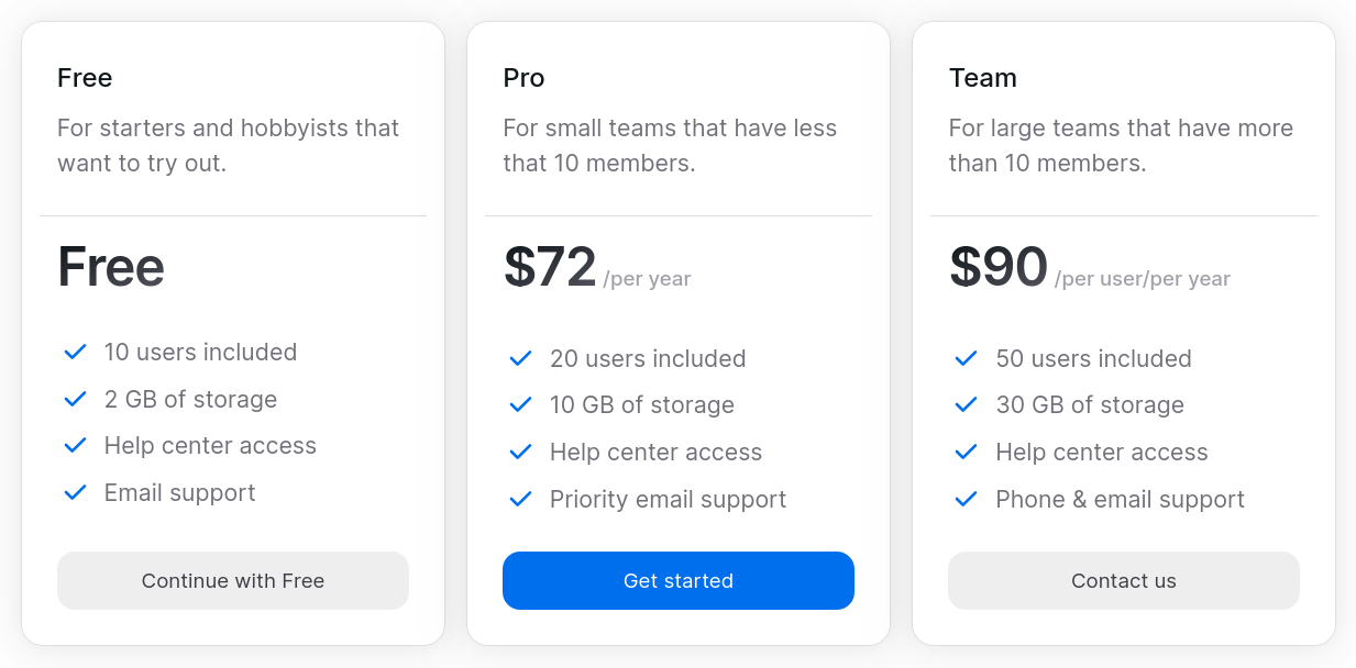
Example: Pattern Library -- Pricing Cards
Component Library Styling
Utility-First CSS
Review: Component Library Styling
Traditional CSS: Write custom CSS for each project, often with a custom design system.
BEM: A methodology for writing CSS that emphasizes the use of class names to create reusable components and patterns.
Utility-First CSS: A methodology for writing CSS that emphasizes the use of utility classes to create reusable components and patterns.
CSS Cascade Layers: A new feature in CSS that allows developers to organize their CSS into layers, which can help manage specificity and improve maintainability.
Best Practice: Utility-First CSS
Utility-first CSS work wells with React's component-based architecture.
Pros
- Works well with design systems
- Avoids specificity issues
- Encourages consistency
Cons
- Understanding the styling for an element can be challenging
- Changing design systems can be difficult
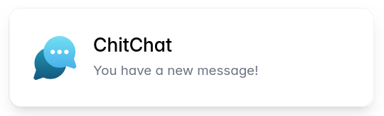
Example: Tailwind CSS
Tailwind CSS is a popular utility-first CSS framework that provides a large set of utility classes for styling web applications.
<div class="mx-auto flex max-w-sm items-center
  gap-x-4 rounded-xl bg-white p-6 shadow-lg
  outline outline-black/5">
  <img class="size-12 shrink-0"
    src="/img/logo.svg" alt="ChitChat Logo" />
  <div>
    <div class="text-xl font-medium text-black">
      ChitChat
    </div>
    <p class="text-gray-500">
      You have a new message!
    </p>
  </div>
</div>
Tailwind CSS Documentation
How do you know which CSS class name to use for a given style?
Activity: Explore Tailwind CSS Documentation
Working with your peers (2-4), explore the Tailwind CSS documentation to find utility classes that match the design principles of your style guide.
On your handout, include one utility class for each of the major design elements.
- Colors
- Layout: foreground, background, content, accents, focus, etc.
- Base: primary, secondary, success, warning, danger, etc.
- Typography
- Font family (serif vs. sans-serif)
- Font sizes (headings vs. body)
- Font weight (light vs. bold)
- Shape
- Border radius (square vs. rounded)
- Shadow (flat vs. shadowed)
- Spacing
- Spacious vs. compact
Demo: Tailwind CSS
export default function Button({ color = 'default', children }) {
  const base = 'px-4 py-2 font-semibold rounded cursor-pointer';
  const styles = {
    default: 'bg-slate-100 text-black hover:bg-slate-500 hover:text-white',
    primary: 'bg-blue-400 text-white hover:bg-blue-600',
  };
  return <button className={`${base} ${styles[color]}`}>{children}</button>;
}
Activity: Implement a Component with Tailwind CSS
Working with your peers (2-4), implement a reusable component for your community events SPA using only Tailwind CSS utility classes to style the component according to the design principles of your style guide.
export default function Button({ color = 'default', children }) {
  const base = 'px-4 py-2 font-semibold rounded cursor-pointer';
  const styles = {
    default: 'bg-slate-100 text-black hover:bg-slate-500 hover:text-white',
    primary: 'bg-blue-400 text-white hover:bg-blue-600',
  };
  return <button className={`${base} ${styles[color]}`}>{children}</button>;
}
Summary
Summary
- A design system specifies the design principles, patterns, and components for a product or organization.
- A design system typically includes a style guide, a component library, and a pattern library.
- A component library is a collection of reusable components that are designed to be used in a design system.
- Utility-first CSS is a methodology for writing CSS that emphasizes the use of utility classes to create reusable components and patterns.
- Tailwind CSS is a popular utility-first CSS framework that provides a large set of utility classes for styling web applications.
What's Next
Today: Project 2, Milestone 2 Releasted
Friday: Practice Problem Workshop