INFO 4340/5440: App UI Design Patterns
Class 15: App UI Design Patterns
- Review: Model Context Protocol (MCP)
- Website vs. App UI Design Patterns
Copyright 2026, Kyle J. Harms
Review: Model Context Protocol (MCP)
MCP is an open protocol that lets AI agents connect to external servers that provide tools (actions the agent can call), resources (data/docs), and prompts.
Tools: Executable functions/actions that the AI agent can call.
Resources: Data or documentation that the AI agent can access.
Prompts: Predefined templates or workflows that guide the interactions between the user and the AI model.
App UI Design Patterns
Design Patterns
A user interface design pattern is a reusable solution to a common problem in user interface design.
Examples:
- Navigation patterns (e.g., tab bars, side menus)
- Form patterns (e.g., input validation, error handling)
- Layout patterns (e.g., cards, grid systems, responsive design)
- Interaction patterns (e.g., drag-and-drop, infinite scrolling)
- Feedback patterns (e.g., notifications, progress indicators)
- Accessibility patterns (e.g., keyboard navigation, screen reader support)
Activity: Website vs. App Design Comparison
On your handout, compare the design patterns used for an app's website and its mobile app.
Discussion:
- What are common design patterns for websites?
- What are common design patterns for apps?
- Are the design patterns the same or different? Why?
Website vs. App Design Patterns
| Website Design Patterns | Mobile App Design Patterns |
|---|---|
| Logo in top left corner | Logo for the app's icon |
| Navigation bar at the top of the page (scrolls away) | Navigation panel fixed to the bottom of the screen |
| Content is centered with wide margins | Content fills the entire screen |
| Headings are used to organize content | Headings are rarely used; content is organized with cards, lists, etc. |
| Links are used to navigate to other pages or sections | Buttons are used to perform actions or navigate to other screens |
| Focuses on information/explanation | Focused on the functionality and the user's tasks |
Insight: Website $=$ Branding?
A website has to sell itself. Who it is. What it is. This is really about branding.
When a user installs an app, they have already chosen to use it. They know what it is and who it is from. The app's design should focus on the user's tasks and functionality, not on marketing or branding.
Tip: Design Apps for Tasks
Assume the user has already chosen to use your app.
Use screen real estate to support the user's tasks.
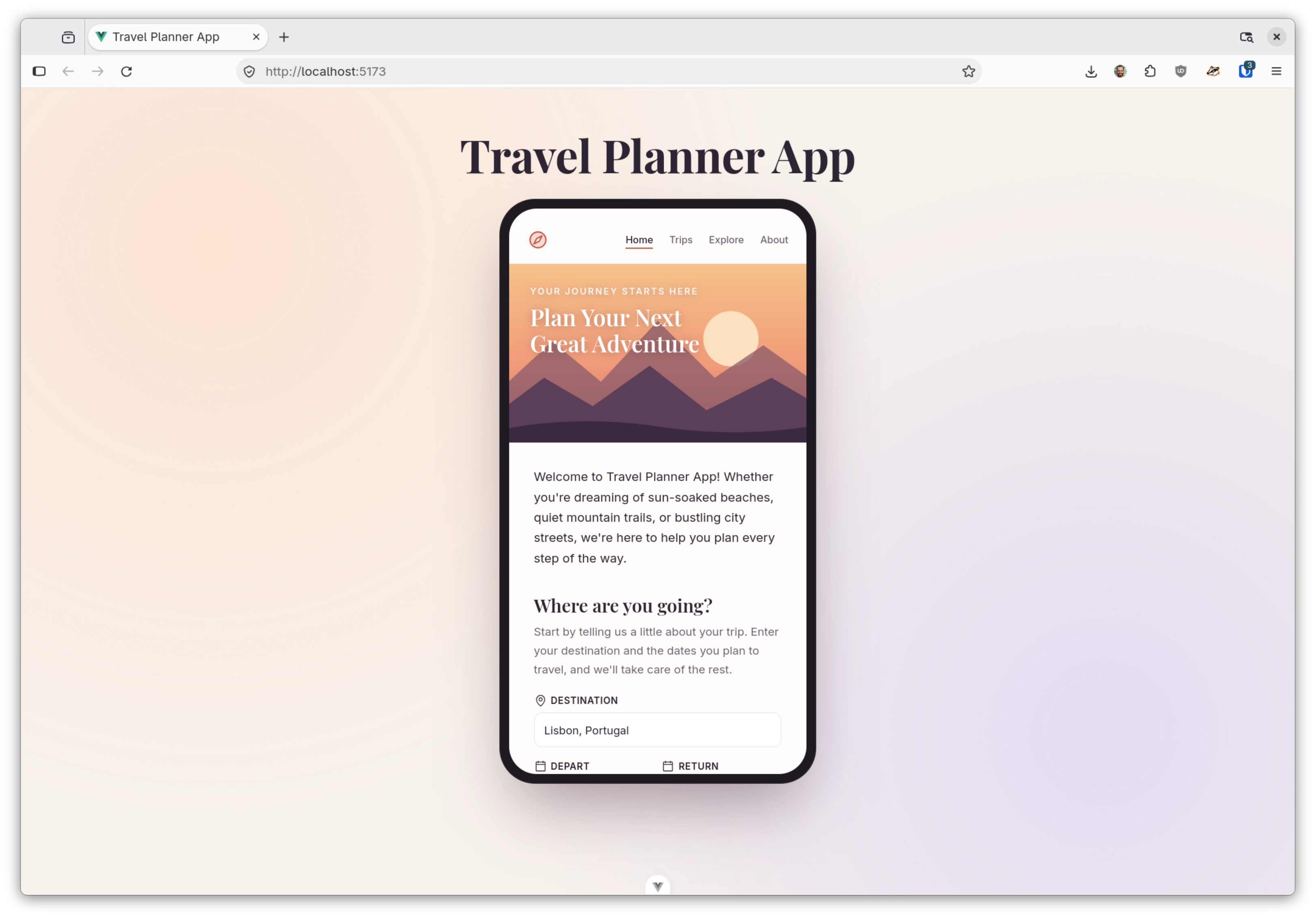
Website Smells
- App name or logo as a header on working screens
- Hero sections, taglines, or “Get Started” landing-page buttons
- Paragraphs explaining what the app does
- Top navigation menus or footers instead of a fixed tab bar
- Primary actions placed at the top, out of thumb reach
Activity: App Redesign
Studio: Homework 4
Work on your task specific (or domain/discipline specific) chatbot.
What's Next
Oral exam 2 coming soon
Project starts soon