Class 6: TailwindCSS
- Review: Last Class
- TailwindCSS
- Studio: Homework 3
- Overview: Input Buildings
- Summary
Review: Last Class
Review: Props
Custom attributes that allow JavaScript data to be passed from a parent component to a child component.
Defining Props
ChildComponent.vue:
<script setup>
defineProps(['propName1', 'propName2', ...])
</script>
Passing Props
<script setup>
import ChildComponent
  from './components/ChildComponent.vue'
</script>
<template>
  <ChildComponent
    propName1="sample string 1"
    propName2="sample string 2" />
</template>
Review: Slots
Placeholders inside a child component that allow HTML content to be passed from a parent component to a child component.
Passing Slot Content
<script setup>
import ChildComponent
  from './components/ChildComponent.vue'
</script>
<template>
  <ChildComponent>
    <p>This is slot content.</p>
  </ChildComponent>
</template>
TailwindCSS
TailwindCSS
TailwindCSS is a utility-first CSS framework for rapidly building custom user interfaces.
Instead of writing custom CSS styles, you apply pre-defined utility classes directly in your HTML or Vue.js templates.
Example:
<button class="bg-blue-500 text-white font-bold py-2 px-4 rounded">
  Next
</button>
How to Use TailwindCSS
- Refer to the reference documentation.
- Identify the utility classes you need for your design.
- Apply the utility classes directly in your HTML or Vue.js templates.
Gotcha: TailwindCSS does not automatically include all utility classes by default. It includes only the classes that are used in your project files to minimize file size. When adding a new class, you may need to refresh your browser to see the changes.
Demo: TailwindCSS
<button class="bg-blue-500 text-white font-bold py-2 px-4 rounded">
  Next
</button>
Activity: TailwindCSS Practice
Working with your peers (2-4), complete the handout exercises to practice using TailwindCSS utility classes to style components.
Homework 3
Accessibility Contrast Checker Prototype App
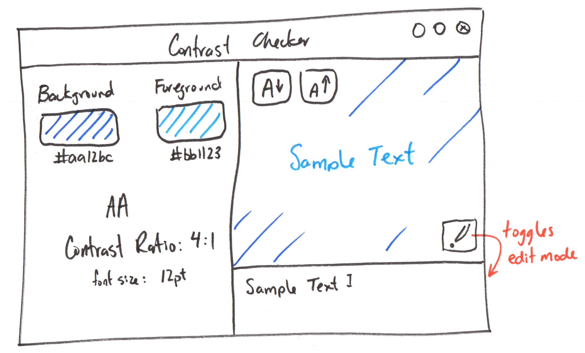
Studio: Homework 3
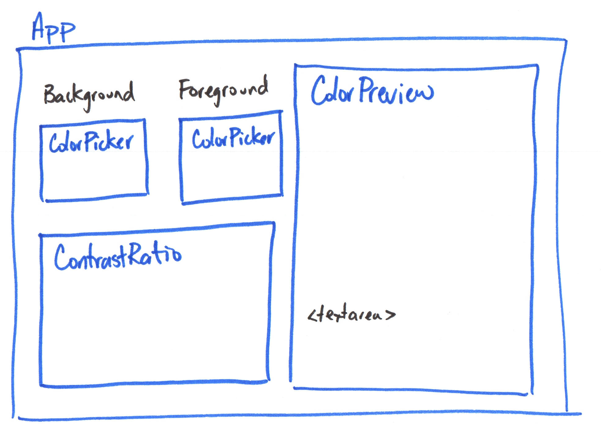
Overview: Input Buildings
Bind user input data from input elements (i.e. <input>, <textarea>, <select>) and to a ref using the v-model directive.
<script setup>
import { ref } from 'vue'

const message = ref('')
</script>

<template>
  <p>Message is: {{ message }}</p>
	<input v-model="message" />
</template>
Summary
- TailwindCSS is a utility-first CSS framework for rapidly building custom user interfaces.
- Apply pre-defined utility classes directly in your HTML or Vue.js templates to style your components.
v-modeldirective creates a two-way binding between an input element and a Vueref.
What's Next?
Next Class: Input Binding Continued
Homework: Complete the released parts of Homework 3. (class preparation)