Homework 3: Accessibility Contrast Checker Prototype App
For this homework you'll build an accessibility contrast checker prototype app using Vue.js and TailwindCSS.
Learning Objectives
- Implement a prototype app in Vue.js from a reference design.
- Employ TailwindCSS utility classes to style a Vue.js app.
- Use the composition API to manage state and implement interactivity in a Vue.js app.
- Use custom events to communicate between components in a Vue.js app.
- Use the
watchfunction to react to changes in state in a Vue.js app. - Employ node packages to add functionality to a prototype without implementing the functionality from scratch.
- Publish a prototype as a Progressive Web App (PWA) using GitHub Pages.
Help & Support Resources
We want you to get the help and support you need. Use the course's support resources for help with this assignment.
Git Repository & Codespace
-
Create your submission repository.
Visit https://landrace.infosci.cornell.edu/courses/info4340-2026sp/repos/hw3 in your browser.
-
Open your repository in GitHub.
After creating your repository, visit https://landrace.infosci.cornell.edu/courses/info4340-2026sp/repos/hw3 in your browser and follow the link to open the repository on github.com.
-
Open your repository as a codespace.
Overview
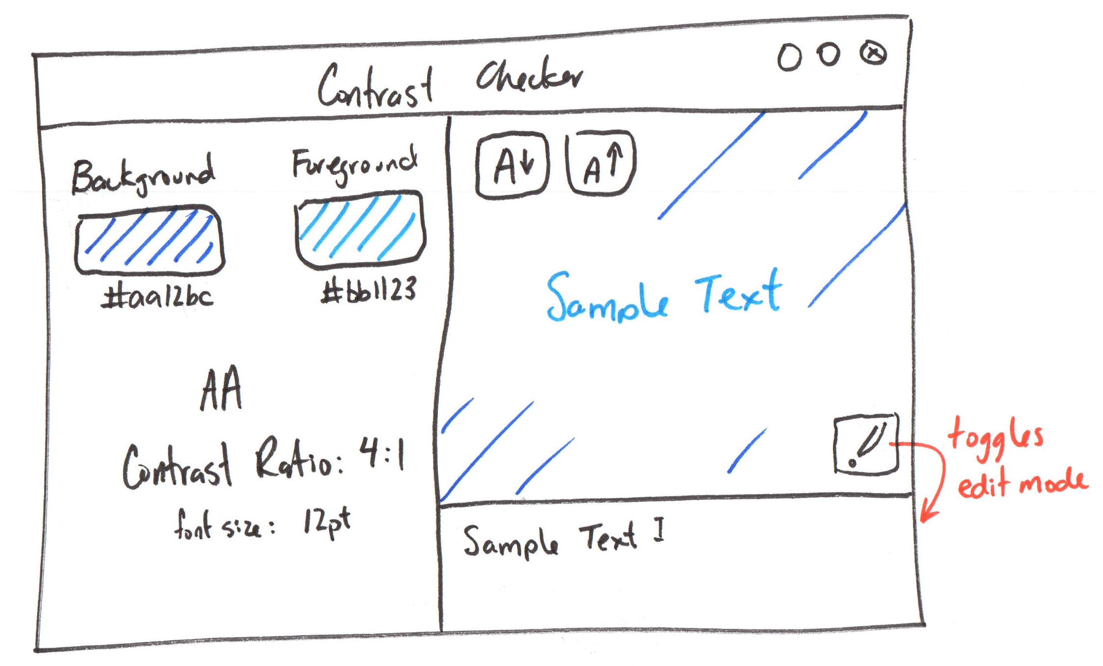
You will implement an accessibility contrast checker prototype in Vue.js using the following design:
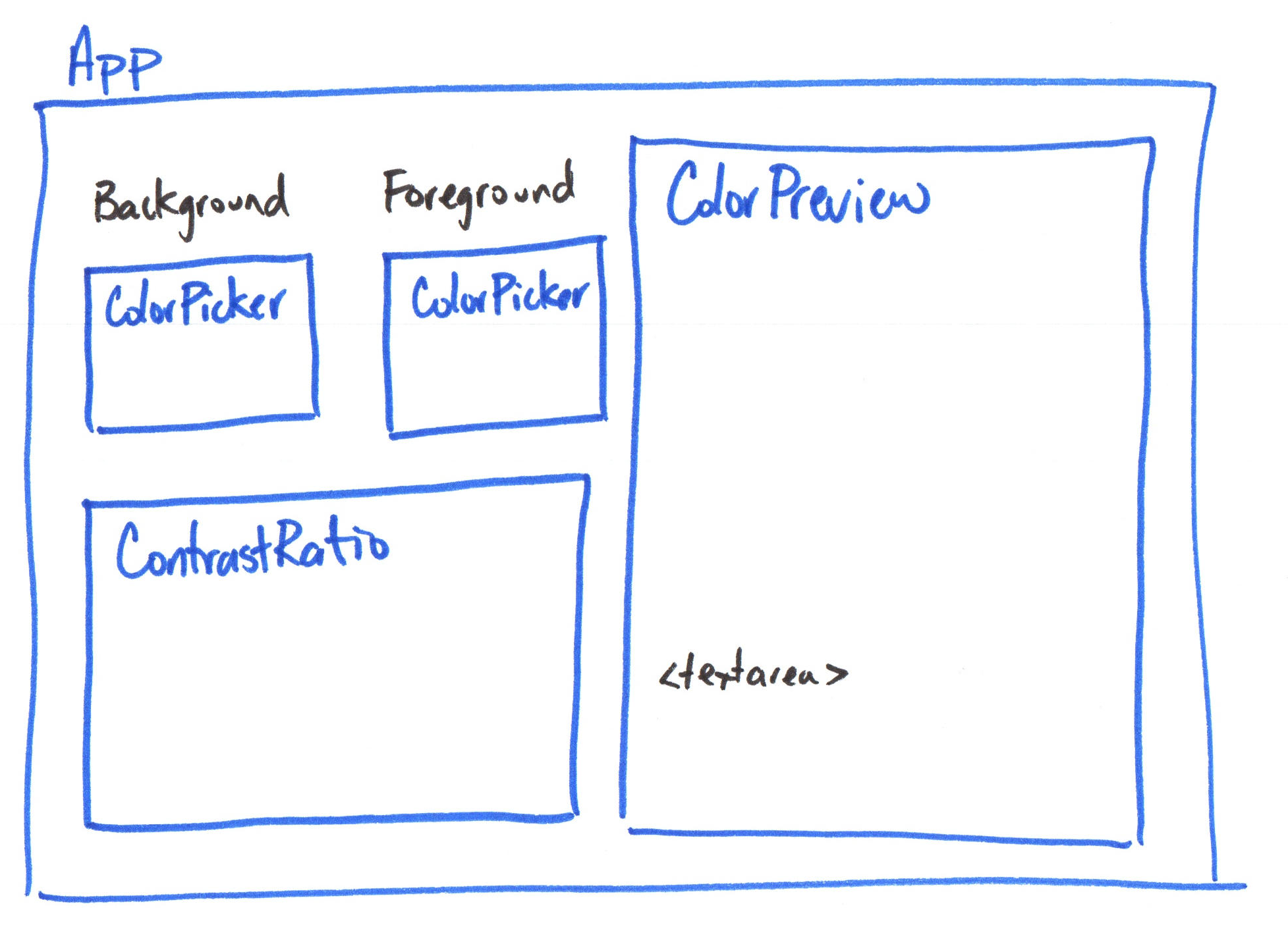
You will implement the following components to implement the prototype:
Requirements
Use only TailwindCSS utility classes for styling; no custom CSS is allowed.
All resources should be hosted locally; no CDN links; no hotlinking.
Use the composition API and only the methods and directives covered in class so far. No credit is provided for using additional Vue.js features not yet covered in class. No exceptions.
Part I: Preview Component
Credit: ~8 points. Completion credit provided for meeting all the requirements below.
Create a Preview component with no props and add it to App. The component should be non-functional. You are only implementing the static layout and styling for this part.
The Preview component should display a preview area with a background color and text color using the sample text (hard-coded for this part). This will be non-functional for this part. Simply hard-code a foreground and background color using inline styling and hard-code some sample text to display in the preview area.
The component should also have an edit mode feature that allows users to toggle the visibility of a <textarea> for editing the sample text. For this part, do not implement the functionality to update the sample text based on user input; the <textarea> must be non-functional. However, toggling the edit mode should show/hide the <textarea> for this part.
Add 2 buttons in to increase and decrease the font size of the preview. Do not implement the functionality to change the font size; the buttons should be non-functional for this part.
Using only TailwindCSS utility classes, style the component to match the provided design as closely as possible. You may not use any custom CSS for styling; only TailwindCSS utility classes are allowed.
Use Phosphor for the icons. Use the @phosphor-icons/vue package for the icons for the prototype. (Install via npm. Do not install globally. Import each icon as a component.)
Part II: Set Color Component
Credit: ~8 points. Completion credit provided for meeting all the requirements below.
Create ColorPicker component for selecting a color and add two to App. The component should be non-functional. You are only implementing the static layout and styling for this part.
The ColorPicker component should display a color input element (<input type="color">) for selecting a color. Below the color input, display a text input element (<input type="text">) for entering a hex color code. (Do not include the Background/Foreground label in this component.)
Style the component using only TailwindCSS utility classes to match the provided design as closely as possible.
Part III: Contrast Ratio Component
Credit: ~8 points. Completion credit provided for meeting all the requirements below.
Create a ContrastRatio component that displays contrast ratio information (i.e. accessibility level, contrast ratio, and font size) and add it to App. The component should be non-functional. You are only implementing the static layout and styling for this part.
Hard-code sample contrast ratio information in the component. Do not implement any functionality to compute or update the contrast ratio for this part.
Part IV: Styled App with TailwindCSS
Credit: ~8 points. Completion credit provided for meeting all the requirements below.
Style the entire app using TailwindCSS utility classes to match the provided design as closely as possible.
Your design should work on desktop screens and should be responsive to resizing the window. h-screen and w-screen may be helpful for this part. Do not code fixed dimensions for the app.
All resources should be hosted locally; no CDN links; no hotlinking.
Part V: Sample Text Input Binding
Credit: ~8 points. Completion credit provided for meeting all the requirements below.
Implement two-way binding for the sample text in the Preview component using the v-model directive.
When the user types in the <textarea>, the sample text displayed in the preview area should update in real-time to reflect the user's input.
Part VI: Color Input Binding
Credit: ~8 points. Completion credit provided for meeting all the requirements below.
Implement two-way binding for the two color inputs in the ColorPicker component using the v-model directive.
When color input changes or text input changes when the user types a hex color code into the text input, the value of both inputs should update to reflect the new color value.
Part VII: Font Size Buttons
Credit: ~8 points. Completion credit provided for meeting all the requirements below.
In the Preview component, there are two buttons for increasing and decreasing the font size of the sample text in the preview area. Implement functionality for these buttons to update the font size of the sample text in the preview area using one ref to store the font size.
Bind the font size ref to the preview area's sample text using a v-bind directive to update the font size in real-time when the user clicks the buttons.
Part VIII: Color Changed Custom Events
Credit: ~8 points. Completion credit provided for meeting all the requirements below.
A component accepts data via its props and outputs data via custom events.
Declare a custom event: colorChanged in your ColorPicker component. emit the colorChanged event from the ColorPicker component whenever the color value is updated by the user changing either of the color inputs. The event should include the new color value as a payload.
Listen to colorChanged event in App and then pass the changed color to the Preview component via a prop using v-bind. Update the background color and text color of the preview area in the Preview component based on the color value passed from the colorChanged event. Hint: You will need to declare a ref in App to store the background and foreground colors from the event payload.
Thoroughly test that changing the background and foreground color via the color input or typing a hex code live updates the preview area's background and text color in real-time.
All refs, props, and event payloads should hold one piece of data as a JavaScript primitive (e.g. string, number, boolean). Do not use objects or arrays for this assignment.
Part IX: Font Size Changed Custom Events
Credit: ~8 points. Completion credit provided for meeting all the requirements below.
Declare a custom event: fontSizeChanged in your Preview component. emit the fontSizeChanged event from the Preview component whenever the font size is updated by the user clicking the increase or decrease font size buttons. The event should include the new font size as a payload.
In App, listen for the fontSizeChanged event emitted by the Preview component and pass it via v-bind to the ContrastRatio component as a prop. Display the font size value in the ContrastRatio component. Hint: You will need to declare a ref in App to store the font size value from the event payload.
All refs, props, and event payloads should hold one piece of data as a JavaScript primitive (e.g. string, number, boolean). Do not use objects or arrays for this assignment.
Part X: Contrast Ratio Calculation
Credit: ~8 points. Completion credit provided for meeting all the requirements below.
Pass the foreground and background colors from the colorChanged event into the ContrastRatio component via props.
Next, install the color-contrast-checker package from npm and use it to calculate the contrast ratio between the foreground and background colors. Display the contrast ratio in the ContrastRatio component.
Store the contrast ratio value and the accessibility level (i.e. "Fail", "AA", "AAA") in refs in the ContrastRatio component and update them whenever the foreground or background color changes using the watch.
Part XI: Published Progressive Web App
Credit: ~8 points. Completion credit provided for meeting all the requirements below. If you app fails to install or does not work after installing, you will not receive credit for this part.
A progressive web app (PWA) is a web application that can be installed on a user's device and can work offline. For this part, you will publish your prototype as a PWA using GitHub Pages.
-
Commit and push your code from your previous parts before starting this part.
-
Merge your
mainbranch withupstream/mainto ensure your code is up to date with the latest changes.tipUse
git remote updateto fetch the latest changes fromupstream. Then mergeupstream/maininto yourmainbranch.Tip 2If you have a merge conflict with
package-lock.json, runnpm installto regenerate thepackage-lock.jsonwithout the conflict. -
Resolve any merge conflicts and commit and push the merged code.
-
Run
npm installto install any new dependencies from the merge. -
Update the PWA manifest installation attributes in
vite.config.jsandindex.htmlto set the name of your app to "Contrast Checker" (or a different name of your choice). This will be the name that appears when users install your app.At a minimum you should update the
name,short_name,description, andtheme_colorattributes in the PWA manifest invite.config.jsandtitleinindex.html. -
(Optional) Replace
public/favicon.svgwith your own SVG icon to be used as the icon for your app when installed. -
Run your PWA and open it in Chrome on your laptop. Check that it gives you the option to install the app.
If you aren't given the option to install the app, check the Application tab in the Chrome DevTools and select Manifest in the left sidebar. Address any manifest errors.
infoThis step need not work for credit. If this doesn't work try stopping your dev server, running
npm installagain, then running the dev server again, and hard refreshing the page in Chrome (Ctrl + Shift + Ron Windows,Cmd + Shift + Ron Mac).ImportantAfter trying that, if it still doesn't work, continue on to publishing to GitHub Pages in the following steps. It may work with GitHub Pages (which is the part we grade for credit.)
:::
-
Run
npm run buildto build your PWA. -
Publish your built PWA to GitHub Pages:
npm run publish-pwaOnce the command has finished, and you've waited about 2-5 minutes, your PWA should be published to GitHub Pages.
Visit
https://cornell-info4340-2026sp.github.io/TODO_YOUR_REPO_NAME/in Chrome. Test that your prototype is functional.tipSometimes GitHub Pages fails to publish after running
npm run publish-pwa. Visit the GitHub Pages settings for your homework repository (https://github.com/cornell-info4340-2026sp/TODO_YOUR_REPO_NAME/settings/pages) and make sure the branch is set togh-pagesand the folder is set to/ (root). If it isn't, change the settings to match that and save. Then wait a few minutes and check your published PWA again.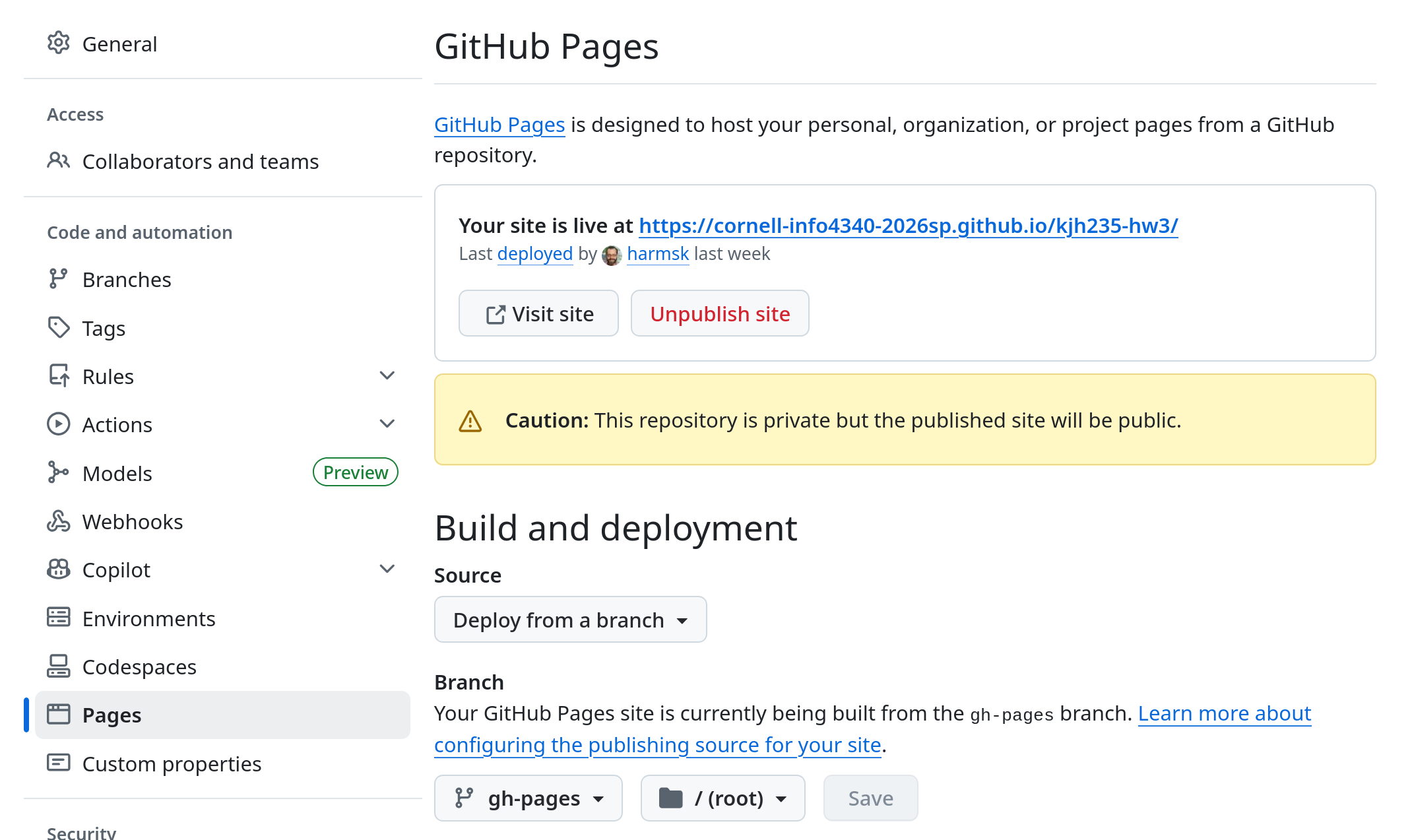
You may also need to hard refresh the page in Chrome (
Ctrl + Shift + Ron Windows,Cmd + Shift + Ron Mac) to see the changes. -
Install your published PWA from Chrome.
Part XII: A Polished Prototype
Credit: ~8 points. Completion credit for a prototype that matches the reference design, is fully functional, responsive, and is published as a PWA.
Review each of the previous parts and make any necessary improvements to ensure that your app is polished and meets all the requirements. Make sure to test all functionality thoroughly.
Your app should fill the entire window when installed (right to left, top to bottom) and should be responsive to resizing the window. h-screen and w-screen may be helpful for this part. As well as items-stretch for your flexbox containers. Do not code fixed dimensions for the app.
(Optional) If your app's window is too big when the installing the app, you can change the default size in main.js.
After you make any changes, build and publish your updated PWA to GitHub Pages again. (This is what we will grade.)
In the above sketch, "Contrast Checker" with the three dots is meant to represent the window's frame provided by your operating system after installing your prototype. Do not implement this frame as part of your app.
Submission
Stage, commit and push all changed files in your Git repository to the GitHub server. (All commits should reside on the main branch.)
Complete the submission form for hw3 to submit the assignment.
Note: The submission form asks you to check your submission. Checking your work will ensure you receive credit for this assignment. We ask you to check your submission because this is where some students lose points. It's easy to forget something and checking your work prevents the heartache of getting a 0 because your submission wasn't submitted in a way that we can access and grade it.
Contributors
Copyright © 2023 - 2026:
- Kyle Harms